


Priori Acute
Designed by Jonathan Barnbrook in 2009. More...
Related fonts: Priori
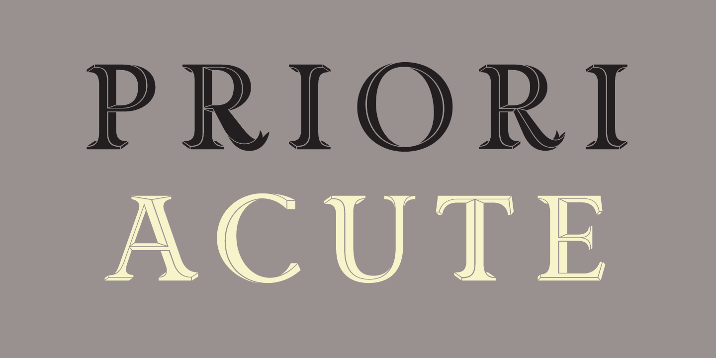
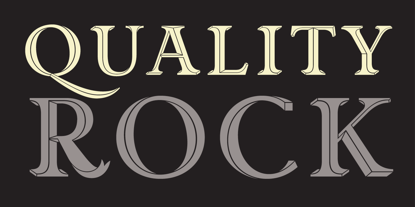
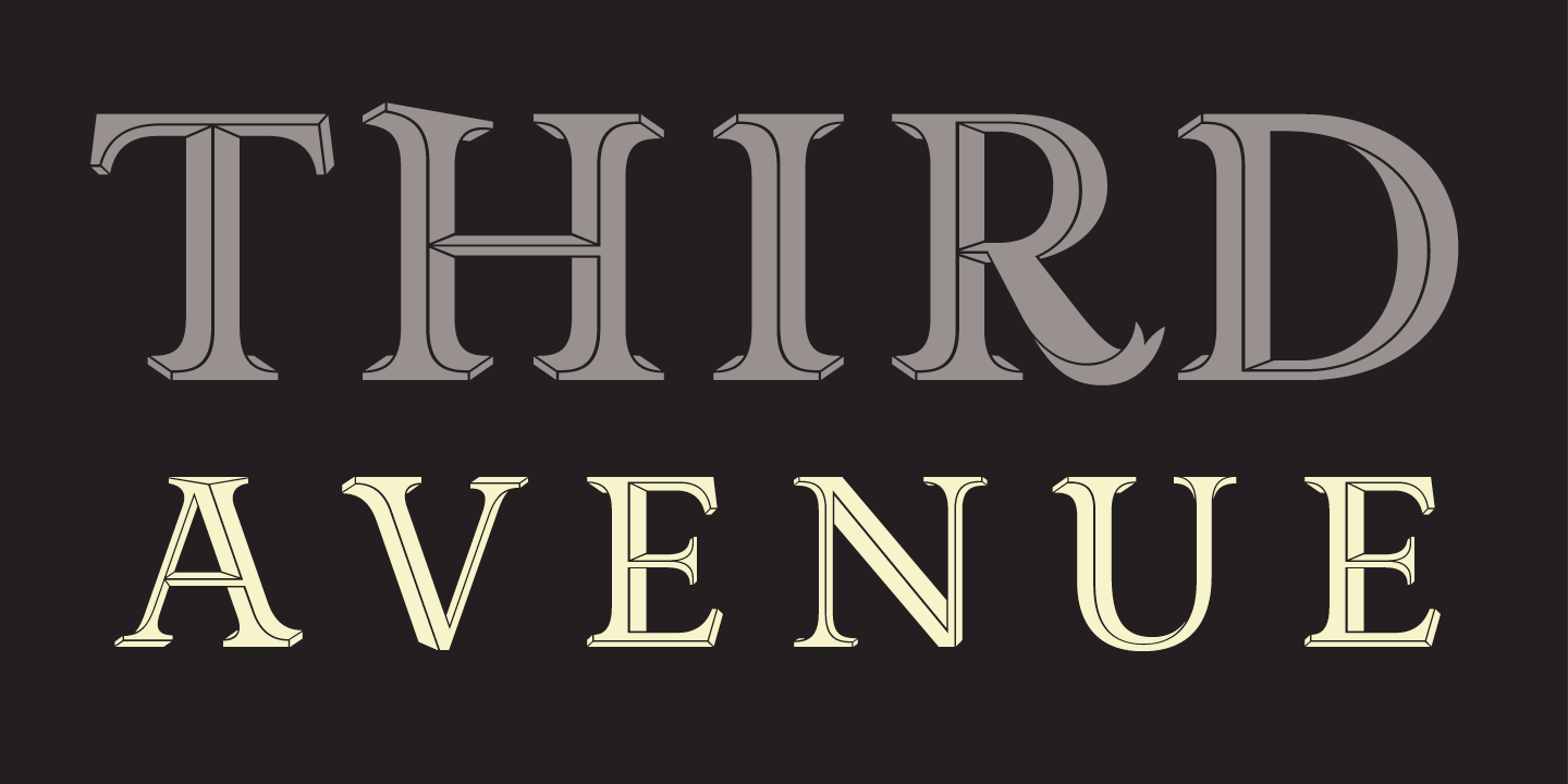
Priori Acute is the latest addition to the Priori family. It is the result of a series of experiments into three-dimensional letter form design inspired by 19th Century display and artistic printing types. However, instead of simply adding drop shadows or fake relief to create the illusion of depth, the designers at Jonathan Barnbrook’s studio took their cue from such diverse sources as the angles on the Stealth bomber and the visual conceit in the work of the Dutch graphic artist M.C. Escher.
The resulting forms are a playful exhibit of incongruous perspectives and twisting shapes that fold into themselves tricking the eye to shift the plane. At first glance and at small sizes the effect is subtle and the original letter forms themselves remain intact, retaining the history of British early 20th century typography, which was an inspiration for the original Priori family. But when blown up, the individual Priori Acute characters become beautifully animated and work well in selective situations such as initial caps, short headlines or logo design.
As a bonus, the Priori Acute font includes a collection of ornamental elements that can be combined into unlimited mesmerizing patterns.
Aesthetic production for the design of Priori Acute was provided by Marcus Leis Allion.
