

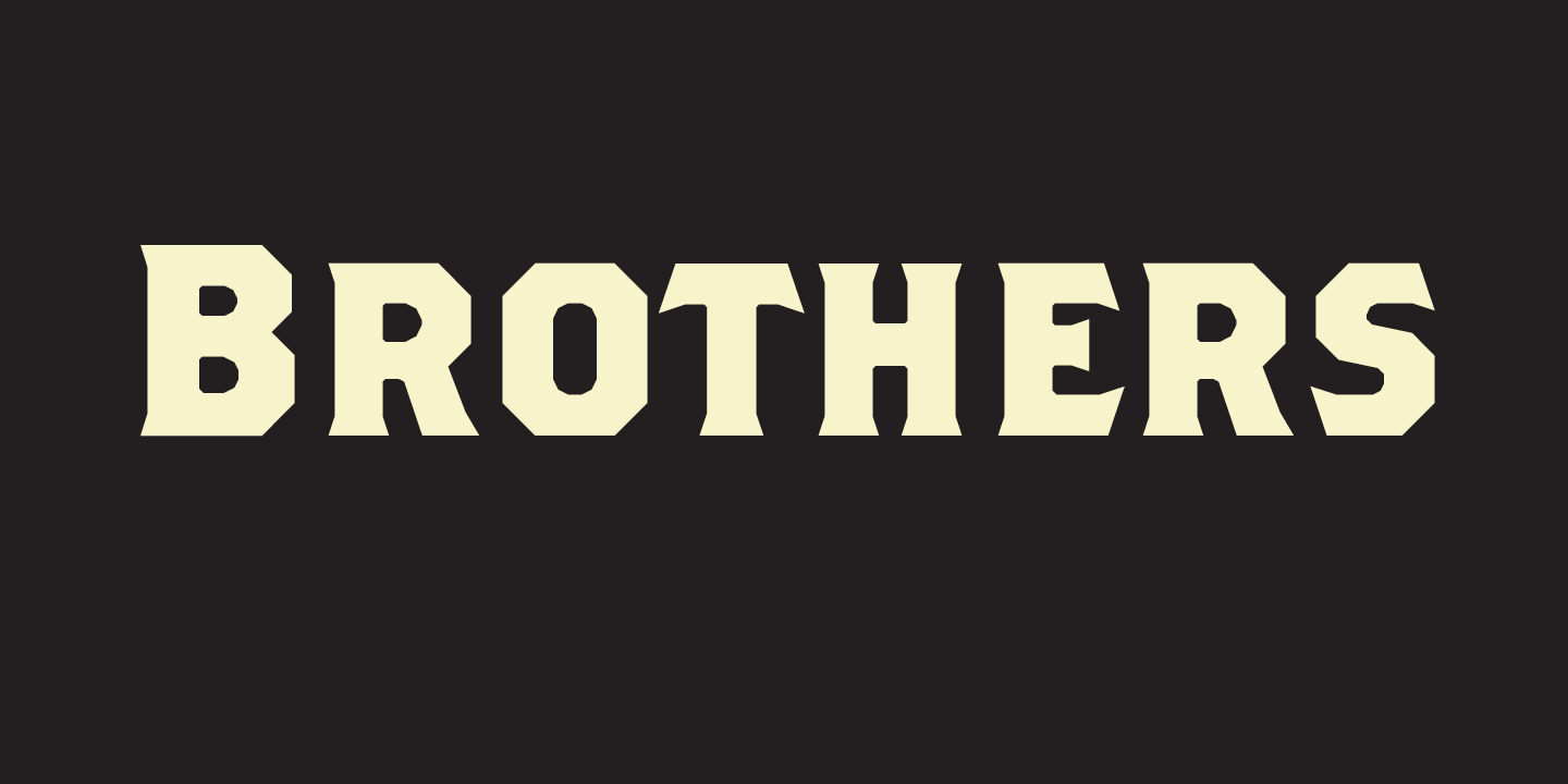
Brothers
Designed by John Downer in 1999. More...
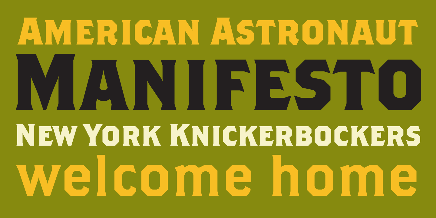
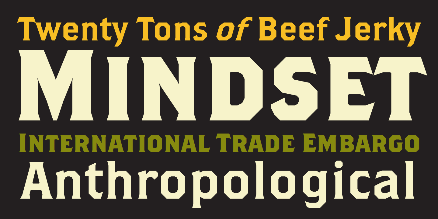
The inspiration for Brothers came from a bright chromolithographed letterhead designed around the turn of the century for the COLE BROTHERS traveling shows, an extravaganza of acrobatic and circus acts that included trained horses with bareback riders. There is a quality of boldness and daring in the letters that reflects the directness and bravado of circus performers.
The COLE BROTHERS stationery has quite a bit of variation in the letterform proportions. The letters are not very typographic, nor are they very consistent. They were drawn on a lithography stone and were “cut-in,” meaning that the lettering artist filled the panel background and left the letters showing in reverse. A notable aspect of work done in this manner is that it is relatively easy to get sharp outer edges, such as the bevels on the corners of the octagonal O, but it is difficult (often, impractical) to try for sharp corners on the counters, even where they should appear square, as on the inside of an H. Thus, many of the capitals are bracketed inside. There are some exceptions, however, where strokes join at acute angles, as in A, K, M, N, V, W, X, Y, and Z. The crotches of these letters contain “traps” that deepen the negative space for the sake of keeping the letterforms crisp. Also, because the lower case characters are expected to be used in a smaller range of sizes than the capitals, most of the bracketing has been eliminated.
As the Brothers font series grew, Downer made several alternate capitals for the Bold, then designed a Regular weight to match in style. Next came a lower case for the Regular and a set of slightly smaller (about 90%) caps to serve the full-size Bold Caps. These have the same alternate forms found in the companion font. Finally, a pseudo-italic version of the Regular was created. It is actually more an extreme oblique than it is a legitimate italic (having fewer cursive-inspired forms than normal), hence the name “Super Slant." It has alternates that match those in the Brothers Regular Alternates fonts, and a few extras as well.
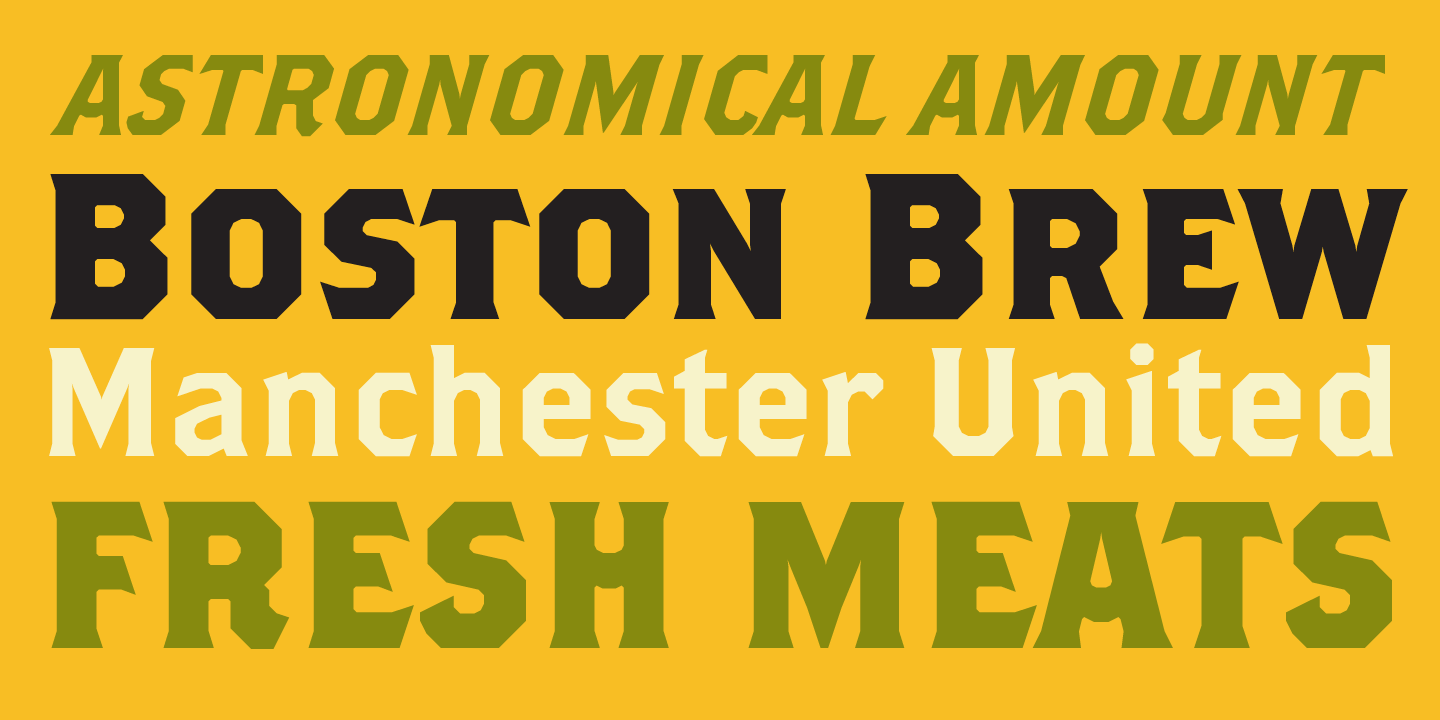
Brothers Word Logos are a hodge podge. They come in various forms and from various sources–mainly from lithography, typography, and commercial lettering. These Word Logos were not inspired by the COLE BROTHERS stationery. Rather, they have grown as a collection of devices that will add nostalgia and utility to the digital repertoire of typographers and sign makers alike.
For more information about Brothers, download the free type specimen.
