
Emigre News Archive
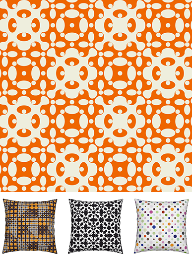
Fabrics and Pillows 06.20.2017
Zuzana Licko is applying some of her intricate pattern fonts to colorful fabric prints. Composed from Puzzler, Hypnopaedia and Tangly, these bold prints are now available as yardage and pillows.
You can choose from a variety of fabric materials, custom printed with Zuzana‘s pattern designs at spoonflower.All prints in this collection are also available as pillows, napkins, or wallpaper at roostery.
Two current exhibits in the UK feature work by Emigre.
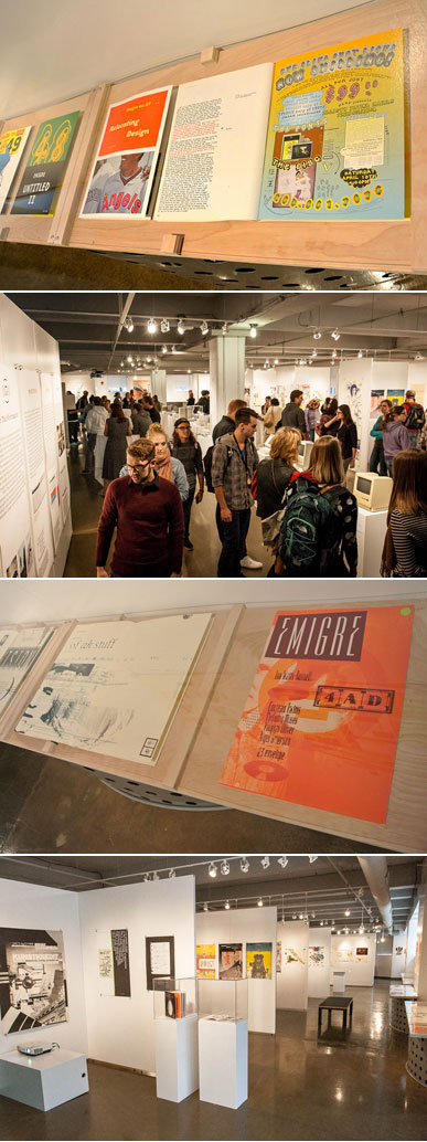
The University of Reading is staging the exhibit Emigre magazine: design, discourse and authorship. The exhibition, which will run from June 12 to July 14, has been co-curated by Francisca Monteiro and Rick Poynor.
The show is divided into sections that reflect and examine the range of Emigre's activities Rudy VanderLans as editor; The Emigre type foundry led by Zuzana Licko; VanderLans as graphic author; the Emigre Music record label; Emigre as a space for collaborative authorship for designers and writers; Emigre considered in context. A related essay by Rick Poynor on the influence of Emigre on graphic design was published in Creative Review.
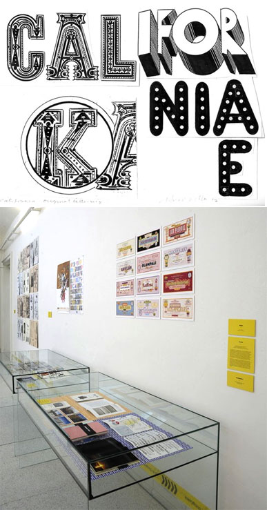
Also in the UK, a number of Emigre magazine issues are included in the wonderful exhibition California: Designing Freedom at the Design Museum in London which runs from May 24 to October 17.
The exhibit explores how the ideals of the 1960s counterculture morphed into the tech culture of Silicon Valley, and how ?Designed in California? became a global phenomenon.
Read about California designers Zuzana Licko, April Greiman, and Susan Kare and their influence on a generation of graphics in a review of the show at FastCompany.
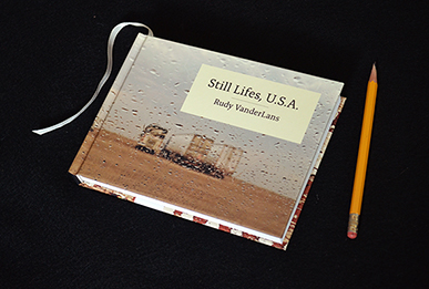
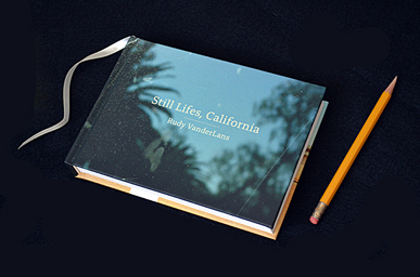
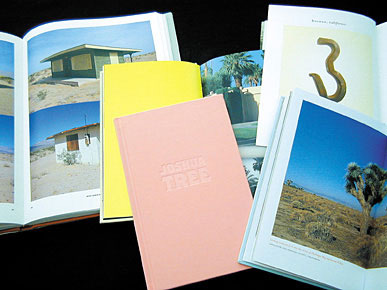
Still Lifes, U.S.A. 06.15.2017
Upon his arrival in the US some 36 years ago, Rudy VanderLans embarked on a pan-American bus trip from New York to California. Overwhelmed by the experience, he rarely took out his camera, feeling unprepared for the challenge to do justice to the visual overload of the American environment.
In 2016 he set out to retrace his route, this time with camera in hand and a determination to record the experience. If the work seems familiar at times, VanderLans is quick to name his influences: "It's through the photographs of Ruscha, Shore, Friedlander, Eggleston, and others that I learned to look at America more discerningly," he says. "I use their examples as a jumping off point to distill my own impressions."
The haunting work that resulted from his journey, titled Still Lifes, U.S.A., published exclusively in book form, creates the second entry in a trilogy of books that began with Still Lifes, California. These postcards from the road evoke both tranquility and solitude, entropy and loneliness in equal measures.
Published by Gingko Press.
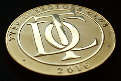
Emigre Wins TDC Medal 07.20.2016
On July 12th we traveled to New York City to receive the 29th Type Directors Club Medal. Over the past 49 years the TDC Medal has been awarded to individuals who excel in the field of typography and typographic design. We couldn't be more proud to be following in the footsteps of our personal heroes Matthew Carter, Erik Spiekermann, Herb Lubalin, Gerrit Noordzij and many other luminaries. The event was held at Cooper Union.
The video of our work, shown during the TDC Medal awards ceremony, was created by:
Creative Director – Graham Clifford
Editor – Danny Ameri (Very Nice Industries)
Music – Mystery of the Plain by Honey Barbara

Here's our acceptance speech:
32 years ago, in 1984, we printed five hundred copies of Emigre magazine #1, and we couldn't give them away, no matter how hard we tried. We had boxes full of leftover copies stashed under our bed for a long time. Fast forward to a couple of months ago, and out of the blue Carol Wahler calls us telling us we won the Type Directors Club medal. What happened in between those two events is like one big blur to us.
But there are some standout moments, and two of them include encounters with design icons from New York. I call them out because they were very important to us and our careers.
Steven Heller was the first person to ever mention Emigre in a short article that he wrote for I.D. magazine titled "Culture Tabs." He's been a huge supporter of our work ever since and opened many doors for us. He's also been a fair critic, never pulling any punches, always speaking his mind. We didn't always agree, but there's no doubt we owe a lot to Steven Heller.
The other icon is Massimo Vignelli. We never actually met him in person, but we got all tangled up when Massimo mentioned in Print magazine in 1994 that he hated our work. Actually, he didn't just dismiss it, he spent a good amount of time explaining why. That hurt our feelings at first, but in hindsight, the fact that Massimo Vignelli mentioned our work at all, made a lot of people pay attention to what we were doing. But the real import of his comments was the serious nature and passion of his critique. That passion was evidence of the heated discussions within design that existed then. And we miss those days.
So we were lucky to be working during a time when design mattered to people enough to speak their mind, and have serious discussions about design, and we feel fortunate to have been the recipient of their scrutiny. This medal notwithstanding, you learn a lot from people who take the time to criticize your work.
There are many other people who need mentioning here, since you don't get to this point all by yourself. Emigre has always been a collaborative project. Many of our typefaces were designed by outside designers. Countless contributors have worked on Emigre magazine. We often feel that too much credit is given to just the two of us. But the list is long and this evening is short.
Finally, we usually tell ourselves that awards like this don't mean much. They won't impress our clients. They won't make it easier to convince people that design matters. It doesn't justify raising our font prices. And I'm guessing that Massimo Vignelli would still be skeptical towards our work, TDC medal or not.
But when you get the call, out of the blue, informing you that you've just been nominated to receive the TDC medal, all that negative thinking evaporates and all you can think about is how amazing this is. And then you read the list of previous recipients, which includes some of the most iconic figures in design, and you're humbled, and you feel a little bit like a fraud, because how can you possibly measure up to these giants? Luckily, we're still alive and kicking, so we have time to catch up, and this medal is telling us we're on the right track.
Thank you very much Type Directors Club, thank you for this incredible honor, thank you Carol for your unending enthusiasm, thank you Graham for producing a wonderful montage of our work, and thank you all for being here.
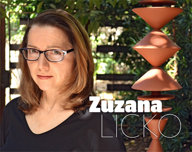
Zuzana Licko Interview 06.29.2016
MyFonts, our top reseller, just published a lengthy interview with Zuzana Licko conducted by Jan Middendorp. She answers questions about her roots, her love for ceramics, her approach to revivals, and how early digital technology inspired much of her type design output.
Emigre Donates Archive 06.20.2016
We're happy to announce that we have donated the Emigre archive to Letterform Archive in SanFrancisco. This once-in-a-lifetime decision wasn't easy to make, but was made much easier by Letterform Archive's enthusiastic support and devoted staff. Our donation includes original paste-up boards for Emigre magazine and a complete run of the publication, plus press sheets, audio tapes of interviews, merchandise, ephemera, correspondence, typeface development files, and type catalogs.
We selected Letterform Archive to house and preserve our work because of its world-class type & design collection. It's also easily accessible to the public, it actively promotes itself to the design community, and it’s run by knowledgeable and dedicated professionals. We're honored to have our work sit alongside some of the world's best-known graphic design artifacts. Letterform Archive will incorporate this donation into their programs and services, to introduce a broader audience to Emigre’s history, and to put the collection online for type lovers near and far.
You can read more about this donation and Letterform Archive's many type-related events, including workshops, lectures, exhibitions, and publications on their website

Fontstand Interview 06.15.2016
Check out the interview with Rudy VanderLans about Emigre's legacy and future on the Fontstand website. After more than three decades of activity, how does VanderLans see Emigre in 2016? And how does he feel about the aging of its body of work?
Also, read a well-considered reply by Stephen Coles on his Typographica website in response to Emigre's Fontstand interview.
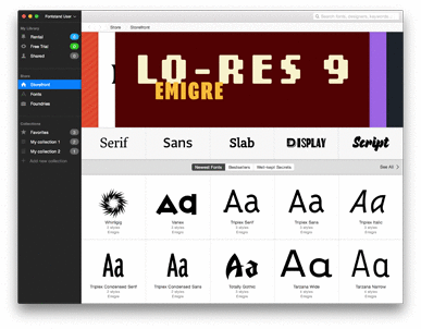
After 30 years of saying NO, we can finally say YES! to free font trials through the Fontstand service.
Fontstand is a Mac OS X app that allows you to try fonts for free or rent them by the month for desktop use for just a fraction of the regular price. Even better, if you rent the font for 12 months it’s yours to keep.
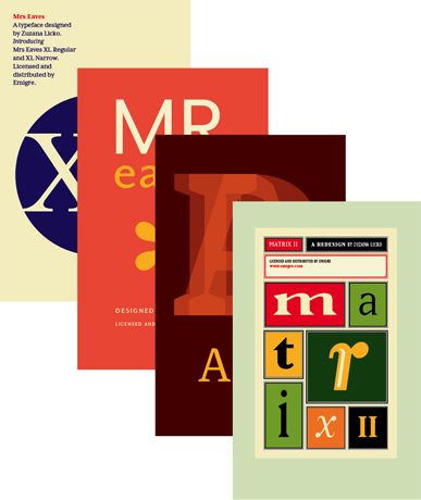
We are kicking off this new venture by making a selection of the Emigre Font library available through this service, including such long-time favorites as Mr and Mrs Eaves, Filosofia, Matrix, Fairplex and many others.
We're excited to provide this additional choice to use our fonts. Give it a try, and let us know what you think on Facebook or follow Fontstand on Twitter.
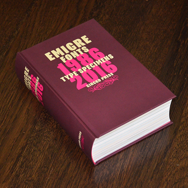
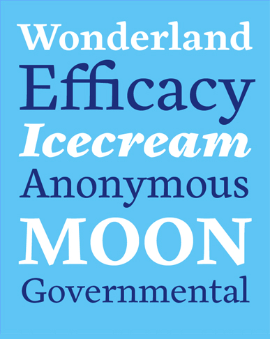
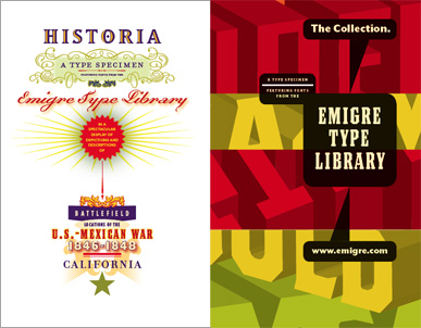
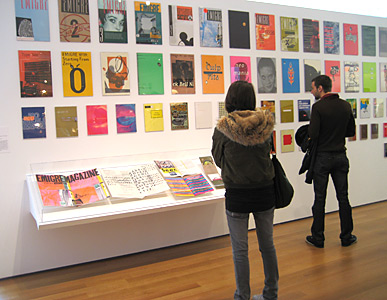
Emigre Fonts: Type Specimens 1986-2016 06.01.2016
Emigre’s latest book is a 752-page compilation celebrating the art of the type specimen. The book features reprints of Emigre's most remarkable specimen designs covering a period of 30 years. Besides displaying the virtues of the fonts and revealing the processes used to design them, these specimens go beyond their primary function as sales tools and can be enjoyed as much for the typefaces as for their esoteric content. If your collection of Emigre's popular type specimens is incomplete, or if you've missed out on these entirely, here's your opportunity to catch up.
You can read a review of the book at AIGA's Eye on Design.
Published by Gingko Press Inc. Available in cool bookstores everywhere. Or you can order copies directly from Gingko Press or Emigre.
Free Type Specimens 01.11.2016
We've added nine type specimens to our list of free downloadable PDFs!
These catalogs are from the early days of Emigre and include a slightly reconstructed version of our very first catalog of low resolution fonts titled "Digital Fonts" (1986); the original catalog design for Mrs Eaves (1996); and a reconstructed catalog for Base Monospace which was originally published as a poster (1997). The list also includes PDF versions of specimens that have long since sold out for such classic typefaces as Platelet, Keedy Sans, NotCaslon, Poppi, Dalliance, and The Apollo Program.
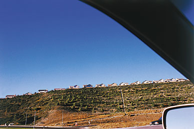
Still Lifes, California 12.03.2015
For his latest monograph, Still Lifes, California, Rudy VanderLans selected more than 100 photographs spanning a decade and thousands of miles of California highways. Along the way he’s captured vignettes that punctuate the beauty and absurdity of the California environment. Empty of people but littered with the traces of human enterprise, these often surprising and always beautifully composed images will give readers much to ponder. From Hopland to Hollywood and Modesto to the Mojave, this is California as uncovered by the ever-curious author.
Published by Gingko Press.
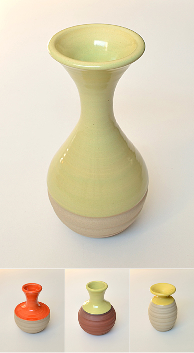
Handmade Ceramics by Zuzana Licko 11.24.2015
A new collection of handmade ceramics by Zuzana Licko is now available. These one-of-a-kind vases are offered in a variety of colorful glazes applied to various shades of stoneware. Heights range from 2.5 to 8 inches.
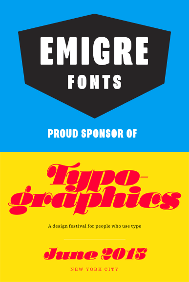
Emigre Sponsors Typographics 05.13.2015
Emigre is a proud sponsor of Typographics, a 10-day design festival devoted to contemporary typography, with talks, workshops, and tours. Featuring participants such as House Industries' Ken Barber, Pentagram's Paula Scher and Abbott Miller, Alex Trochut, Erik van Blokland, Jonathan Hoefler and many, many others. June 8-18, 2015, New York City.
Stop by our Facebook page to pick up the promo code and save $50 on the conference. While you are there, give us a “Like.”
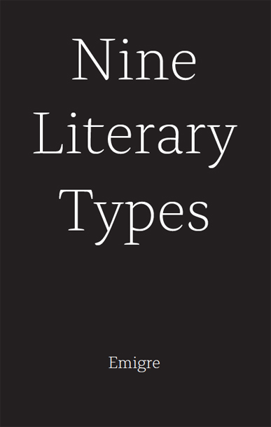
Nine Literary Types 04.26.2015
Sign up now to receive a FREE copy of the new 64-page Emigre type specimen Nine Literary Types! You can pre-order a free offset printed copy, which will be mailed to you in mid May (Within U.S. Only). Or, if you can't wait, you can download a free PDF version right now.
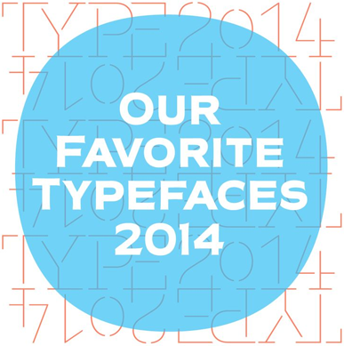
Cardea Among 2014 Favorites 03.22.2015
We are super proud to see David Cabianca's Cardea typeface among Typographica's Favorite Typefaces of 2014.
Check out the wonderful review of Cardea by Jon Coltz.
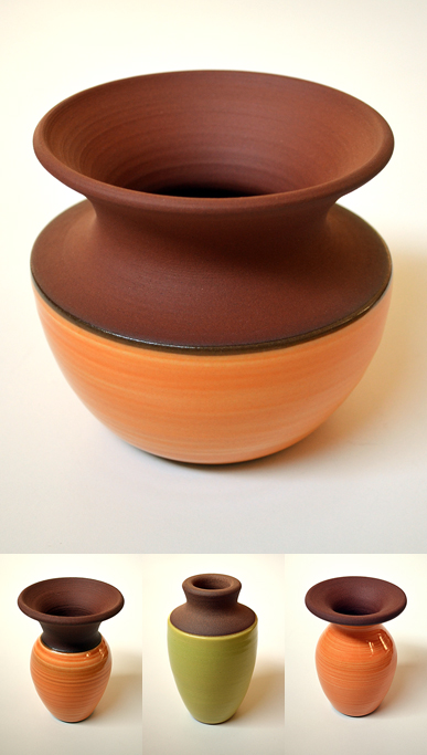
Handmade Ceramics by Zuzana Licko 02.03.2015
A new collection of handmade ceramics by Zuzana Licko is now available. These one-of-a-kind vases are offered in a variety of colorful glazes applied to various shades of stoneware. Heights range from 2.5 to 8 inches.
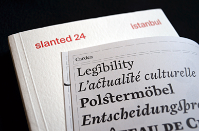
Cardea Making Waves 12.22.2014
David Cabianca's Cardea typeface is finally getting much deserved notice and is making waves. It was featured in the latest issue of the excellent German design magazine Slanted, and it was picked as one of FontShop's top 25 typefaces of 2014.

We know, we know, we're late to the party, but we finally created an Emigre Fonts Facebook page! If you're done looking around here, check it out and like us there. We're posting lots of blasts from the past and other visual treats.
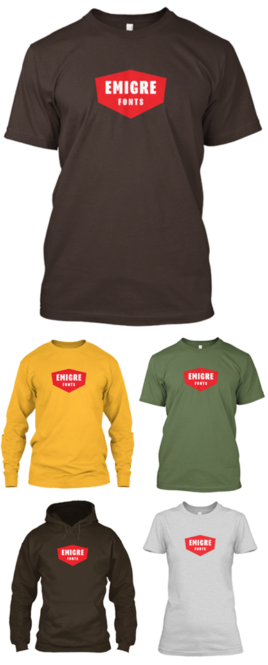
Emigre Fonts Wearables 10.27.2014
We're joining up with Teespring once again to offer a new wearable design. Show off your love for typefaces with Emigre's bold new Emigre Fonts logo shirts. Men's and women's Tees, Hoodies and Long Sleeved Shirts for every type of weather in a variety of colors. Prices range from $15 - $30. This campaign will end Wednesday, November 19th.
If you hurry, you can also still order the Design is a Good Idea shirts thru Tuesday, November 4th.
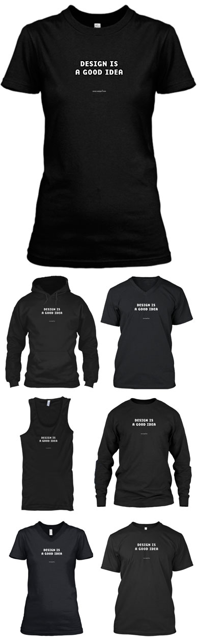
Design is a Good Idea - Premium 10.15.2014
After our first "Design is Good Idea" campaign with T-shirt manufacturer Teespring, we received many requests for additional shirt styles, so we launched this Premium campaign to include high quality women's tees, v-neck tees, tank tops, long sleeved shirts, and hoodies. Prices range from $18 - $30. This campaign will end Wednesday November 5th.
If you hurry, you can also still order the basic version of the "Design is a Good Idea" T-shirt thru October 19th. Hanes Tagless Tee $12.
Revolution/Evolution 09.28.2014
Some 30 issues of Emigre magazine are featured in the exhibit "Revolution/Evolution" at the College for Creative Studies In Detroit.
The exhibition documents the "Revolution" that started transforming design in the mid 1980s. The then new digital tools and a shift in the perceived role of design within the culture informed the designer's radically new visual solutions. Elements of theory and the use of digital as the medium decidedly changed the surface of the artifact but not the vehicle, ink on paper.
"Evolution" includes recent work by designers where the invisible, the underlying system, is as important as the visible. Equally important to a segment of the work is how user involvement allows for constantly changing, mutable solutions. The designer creates the parameters and the user creates endless variations.
Includes projects by Danny Yount, Elliott Earls, Studio Dunbar, Trapped in Suburbia, Ed Fella, April Greiman, LUST, Studio Moniker, Typotheque, and many others.
Sept. 8 to Oct. 3, 2014, Valade Gallery, Taubman Center, Detroit, MI
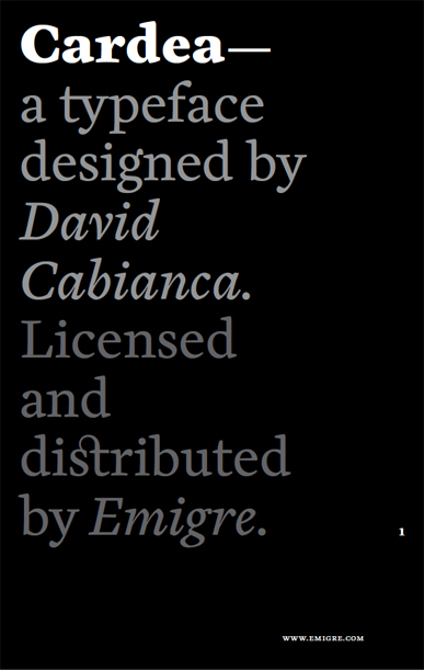
Free Cardea PDF Catalog 09.22.2014
The Cardea family of typefaces is given its first serious test drive in this 32-page type specimen catalog designed by Emigre's art director Rudy VanderLans.
Cardea is the outcome of David Cabianca‘s 2003–04 MA Typeface Design experience at the University of Reading. Cardea was designed to function as a text face. It is characterized by high contrast, subtle curves and crisp edges to create a typeface that is not shy to sparkle on the page while appeasing the reader with remarkable readability. It features three weights, each with accompanying italics, small caps, and a large variety of ligatures and numerals, making it an excellent typeface for setting lengthy texts in books, journals and annual reports.
You can download a FREE copy of the Cardea catalog.
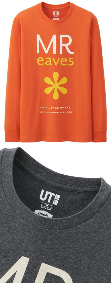
UNIQLO Loves Emigre (II) 08.27.2014
After releasing a series of tote bags and caps brandishing Emigre fonts, UNIQLO, the Japanese apparel outfit, has released a new line of long-sleeved T-shirts based on the designs of Emigre's popular type specimen covers. Check out the complete collection. They are available in UNIQLO stores worldwide or can be ordered on the UNIQLO website.
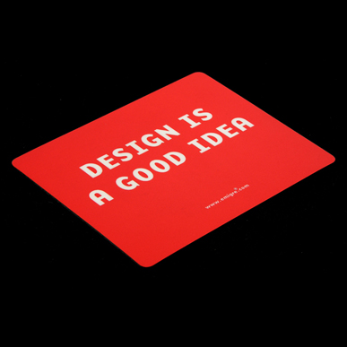
Design is a Good Idea Mousepad 07.08.2014
Requests for this popular item never ceased, even though it sold out years ago. So we decided to bring back Emigre's Design is a Good Idea mousepad.
8.5" x 7.5" x 1/8", with hard top (Lexan) surface. Only $24 (including shipping, worldwide), or FREE if you're in the U.S. and you place an order on the Emigre web site for $150 or more (While supplies last).
LACMA Acquires Emigre Posters 07.07.2014
All throughout the 80s and 90s, when we were having an absolute blast designing and publishing digital typefaces, books, a magazine, posters, music, and all kinds of graphic ephemera, we never stopped to think if the work would be of lasting value, let alone become museum worthy. We were enjoying ourselves too much to contemplate such long term thinking.
Luckily, there are institutions who dedicate themselves to thinking otherwise and who seek out exemplary work to preserve for posterity. So imagine our sense of pride and accomplishment when the Los Angeles County Museum of Art (LACMA) decided, in late 2013, to acquire the entire set of 32 Emigre promotional posters that broadcasted the activities that Emigre was involved in during the years 1984-2005.
The posters were purchased with funds provided by the Decorative Arts and Design Deaccession Fund and the Prints and Drawings Council. They have been acquired as part of the museum's new graphic design collection initiative, which is a joint project of the departments of Decorative Arts & Design and Prints & Drawings.
We will be forever thankful to LACMA. We also owe a great debt to Chuck Byrne, who was instrumental in bringing our work to the attention of the museum.
We only have a few poster sets left for purchase, although these include a subset of the complete set of 32 posters acquired by LACMA.
Also, check out Michael Dooley's article at printmag.com about LACMA's graphic design collection.
UNIQLO Loves Emigre 06.06.2014
Coming to a store near you! UNIQLO, the Japanese apparel outfit has always loved Emigre fonts. To underline their admiration, UNIQLO has recently partnered with Emigre to create a series of t-shirts, sweatshirts, caps, and totebags, using the beloved Emigre fonts. The tote bags and caps have just been released and are available in UNIQLO stores worldwide or can be ordered on the UNIQLO website.
T-shirts, based on the designs of Emigre's type specimen covers, will follow this Fall.
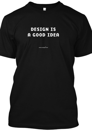
Design is a Good Idea 06.03.2014
It turns out that design is still a good idea. Due to popular demand, we are bringing back the "Design is a Good Idea" T-Shirt! This has been by far Emigre's most popular T-shirt design. It's been sold out for years, but we decided to bring it back due to continued requests from our customers. The great folks at Teespring.com will be producing and fulfilling the orders. White printing on a black Hanes Tagless Tee. Only $12.00 plus shipping. To place your order, go to Teespring.com/emigre
The Cardea family of typefaces is the outcome of David Cabianca's 2003–04 MA Typeface Design experience at the University of Reading. With Cardea Cabianca intended to mix classical and modern characteristics, and in the process he created a typeface that ”sparkles“ on the page, with high contrast, luster and crisp edges. The result is a type with a muscular or sculptural feel much like the work of artists Arne Quinze or Mark di Suvero.
Cardea was designed to function as a text face. It features three weights each with accompanying italics, small caps and a variety of ligatures.
Typeface: Filosofia
Client: Little, Brown and Company
Designer: Keith Hayes
Country: USA

Emigre Fonts Type Sampler 02.26.2014
Sign up now to receive a FREE copy of the new 64-page Emigre Type Catalog!
You can pre-order a free offset printed copy, which will be mailed to you in mid March (Within U.S. Only).
Or, if you can't wait, you can download a free PDF version right now.
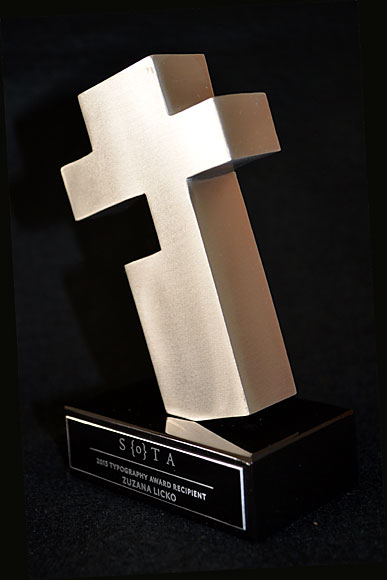
Zuzana Licko Wins SOTA Award! 08.29.2013
The Society of Typographic Aficionados (SOTA) announced that type designer Zuzana Licko has been honored with the 2013 SOTA Typography Award. The presentation took place on Saturday, August 24, 2013, at the Hilton Hotel in Portland, as part of TypeCon 2013.
The SOTA Typography Award is presented each year to an outstanding member of the type community. Past recipients include Hermann Zapf (2003), Ed Benguiat (2004), Matthew Carter (2005), Adrian Frutiger (2006), David Berlow (2007), Gerrit Noordzij (2008), Gerard Unger (2009), Doyald Young (2010), Erik Spiekermann (2011), and Mike Parker(2012).
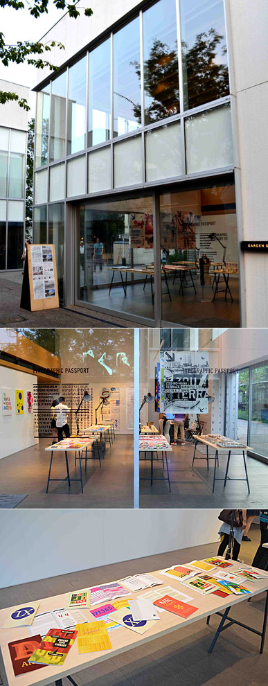
Each year the wonderful Japanese design magazine +81 organizes Tokyo Graphic Passport, a creative event based on "the Graphic Design ethos of galvanizing cross-cultural exchange and mutual understanding." This year the event was held at the Daikanyama T-SITE (Tsutaya Books) in Tokyo from August 12 - 20, 2013. Emigre was invited to be a part of the event to display its popular type specimens.
Typeface: Tarzana
Client: W.W. Norton
Design Studio:W.W. Norton
Country: USA
Have you used Emigre fonts? Send us your proudest productions. If we like what we see, we'll post them here. Please send image files to editor@emigre.com (72 dpi jpg files only).
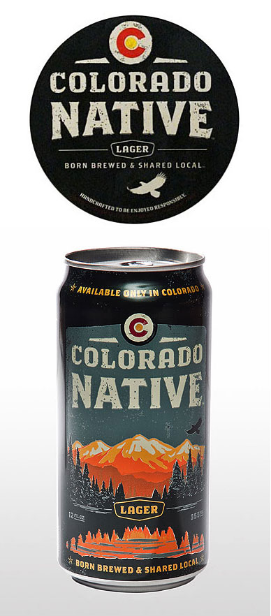
Typefaces: Brothers and Los Feliz
Client: Colorado Native
Design Studio: The Tenfold Collective
Country: USA
Have you used Emigre fonts? Send us your proudest productions. If we like what we see, we'll post them here. Please send image files to editor@emigre.com (72 dpi jpg files only).
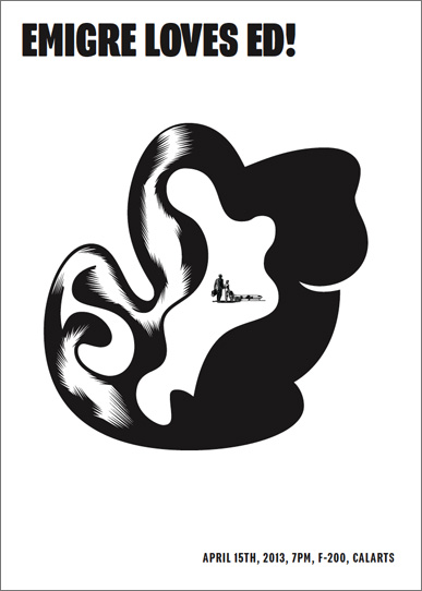
On April 15th, Ed Fella delivered his final lecture as a full-time faculty member at CalArts. To honor him, fellow professors and a handful of alums and friends of Ed designed posters to announce the lecture and celebrate his work. Above is Emigre's contribution.
Ed's been a great inspiration to Emigre over the years, and we remain proud to have released two fonts designed by him: the wonderfully idiosyncratic OutWest and FellaParts, a series of abstract doodles, one of which was used in the poster above.
Also, check out Michael Dooley's essay on Ed at Imprint.
Introducing Program 04.02.2013
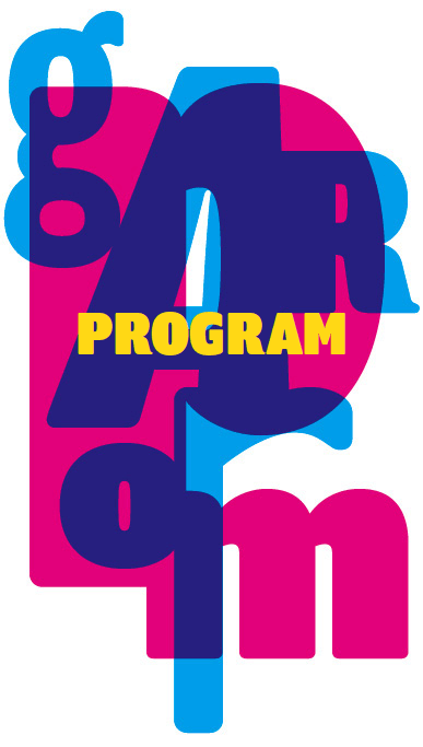
Designed by Zuzana Licko, Program is a type designer‘s typeface. It‘s about the craft of typeface design and the particular details and effects that type designers fret over when they design type. It mixes different structures, stem endings, and weight distributions not usually employed in a single family of fonts. It features both rounded edges evoking the effects of reproduction, and ink traps, the technique used to counteract that effect. The idea was to create a series of fonts with strong individualistic features, challenging the constraints of a central theme that is usually imposed on a family of fonts, while still relating to each other in terms of overall look and feel.
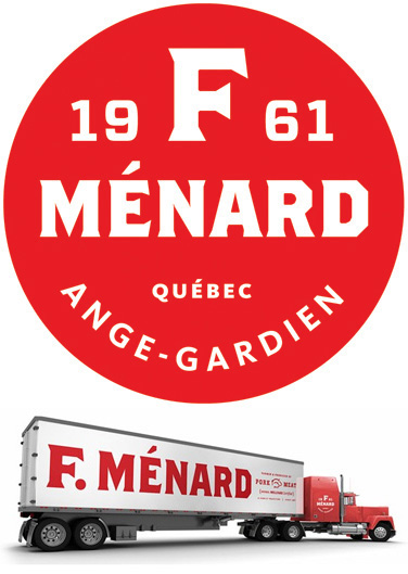
(Main) Typeface: Brothers
Client: F. Ménard
Design Studio: lg2
Country: Canada
Have you used Emigre fonts? Send us your proudest productions. If we like what we see, we'll post them here. Please send image files to editor@emigre.com (72 dpi jpg files only).
Typeface: Modula Ribbed
Client: New Directions
Design Studio: Steve Attardo
Country: U.S.A
After making and selling type for nearly 30 years, we come across our fonts in use everywhere we go. For a while we actively collected samples. Designers would send us their work showing their use of Emigre fonts, and we would buy books that we would never read but since they used our fonts we had to have them. This collection soon became impossible to manage, and somewhat expensive to upkeep, and we've since let it slide.
The use of our fonts has only increased over the years, and we are eager to catch up and share some of the best examples of Emigre fonts in use. We'll be posting a number of favorites here on our News Page in the coming days and plan to make it a recurring feature.
Have you used Emigre fonts? Send us your proudest productions. If we like what we see, we'll post them here. Please send image files to editor@emigre.com (72 dpi jpg files only).
Here's a round-up of recent mentions of Emigre in the press.
Check out Steven Heller's essay on Emigre in The Atlantic. The intro states: "Emigre Fonts, the cutting-edge type creators of the Macintosh revolution have become elder statesmen in a now-crowded field." The part about the field being crowded sure rings true to us.
Also, two of our recent type specimen catalogs struck a nerve with Eye magazine. Design critic Rick Poynor reviewed the Historia catalog, and Eye editor John Walters waxes poetic about The Collection catalog.
Cataloguing Emigre Magazine 10.17.2012
Between 2001-2006, the Goldstein Museum of Design at the University of Minnesota added a full set of Emigre magazines to its collection, which provided a significant anchor for GMD‘s graphic design collection. This acquisition, guided by Professor Steven McCarthy, was made possible by the Anne Brey Fund. In total, Emigre published 69 issues between 1984 and 2005. Subversive and sophisticated, its founders Rudy VanderLans and Zuzana Licko – together with numerous designers, writers and artists – assisted in elevating typography and graphic design to a serious and respected field of study.
In 2011, GMD awarded its annual Joss Internship to MFA graduate student Jessica Barness (currently Assistant Professor at Kent State University), who devised a project that meticulously mined the contents of Emigre. By creating an online interface, others are allowed to see the impressive breadth of contributions over the publication‘s 22 year existence. This interactive index focuses on connections between issues, people and the original typefaces used throughout the magazine.
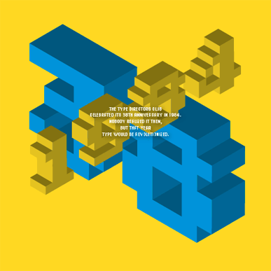
To celebrate its sixty-fifth anniversary and its sponsorship of typographic excellence, the Type Directors Club has published Celebrate 65, a portfolio of inspirational work by prominent type designers, graphic designers, letterers, calligraphers, and artists. The sixty-five contributors were invited to submit a design for one number between one and sixty-five.
The featured designers come from more than twenty-five countries and include such celebrated names as Marian Bantjes, Neville Brody, Sonya Dyakova, Louise Fili, Ruben Fontana, Milton Glaser, Henrik Kubel, Niklaus Troxler, Underware, Sharon Werner, and Bai Zhiqei.
Emigre was honored to collaborate on this project and was assigned to design a page using the number 38. While looking for a design angle, it suddenly occurred to us that the TDC was founded in 1946 and that they celebrated their 38th anniversary in 1984. What a coincidence! Nobody realized it then, but that year type would be revolutionized, and we started Emigre.
Congratulations TDC!

Back to School Special 08.22.2012
Attention design teachers! Free Type Specimen Catalogs for Design Schools and Type Design Programs. (U.S. only, while supplies last.)
If you teach typography or type design and you have an interest in giving your students sample type specimens, we are happy to send you copies of our catalogs free of charge.
Emigre's award winning type specimen catalogs are a great resource to learn about type design. Our specimens explain the process behind the design of fonts, featuring an abundance of preliminary sketches, illustrations and how the fonts can be used.
Just send an email to editor@emigre.com with your name, school affiliation, address to ship, phone number, and number of students in your class, and we will ship out the catalogs free of charge anywhere within the continental U.S.
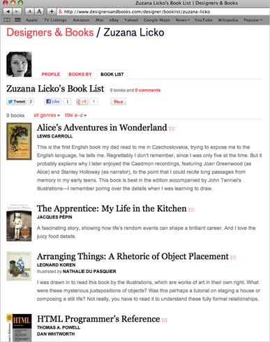
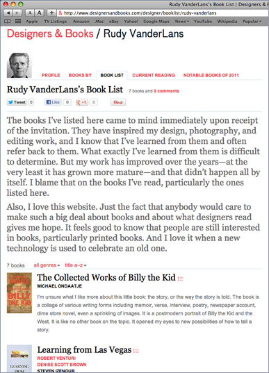
Designers & Books is devoted to posting lists of books that esteemed members of the design community have identified as personally important, meaningful, and formative. From Vitruvius to William Morris to Frank Lloyd Wright to Edith Wharton to Le Corbusier to Paul Rand, there has always been a particularly special and robust relationship between designers and books: reading them, writing them, designing them, collecting them, learning from them, and being inspired by them. Designers & Books celebrates that relationship.
Check out the list recently submitted by Emigre's Type Director Zuzana Licko.
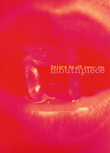
From time to time we receive requests to post specific essays from Emigre magazine on our website. One such essay that has received multiple requests is "To go about noisily: Clutter, writing and design" by Steve Baker. It was first published in Emigre #35 in 1995. Since that issue was produced before electronic page layouts became the norm (the layouts were pasted on boards, no electronic version exists), we've been tardy in our response to post it on line. Yet the enthusiasm for the essay never subsided. Tired of waiting for us to act, two big fans of the essay, design instructor John McVey and design critic Rick Poynor, combined efforts to finally make the essay available, with Poynor taking it a step further and providing his own take on the topic of clutter in an essay published on Design Observer titled "The Never-ending Struggle against Clutter." Check out the Poynor article and link to a PDF version of the original Clutter essay on the DO site.
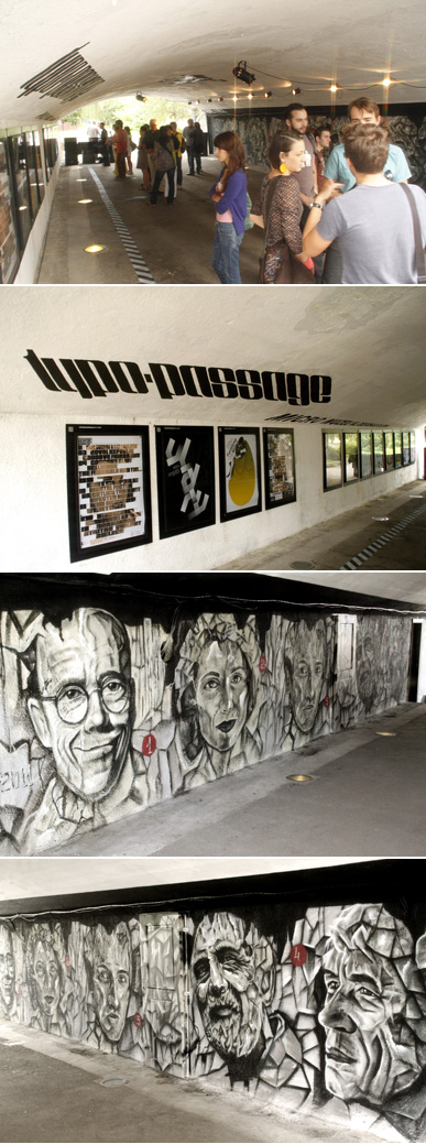
Typopassage Timisoara 08.10.2012
A few days after we posted the "TypeFace" graffiti mural in the Romanian city of Timisoara, we received a very nice and enthusiastic email from Ovidiu Hrin, one of the designers behind this effort, who gave us the following background information on this visual homage to type designers.
"Typopassage Timisoara is a micro museum located in a public space, dedicated to graphic design and the art of shaping letters. It's the first international extension of Typopassage Vienna initiated by the genius Ovidiu Hrin and Bauer Konzept & design. One of the walls is hosting the actual exhibition and the other one is the Typowall where each year the organizers invite a graffiti artist to depict the faces of some of the most significant type designers. TPTM launched the Typ'O'wall in 2011. It is a 28 square meters graffiti covering the entire wall of the passage, with the concept of the artwork related to typography. Last year's subject 'TypeFace,' was brought to life by the artist Jones."
We were actually incorrect about one of the portraits in the photo. The typeface designers featured were 1. Erik Spiekermann, 2. Zuzana Licko, 3. Peter Bilak, 4. Herb Lubalin, and 5.Wim Crouwel.
Above are some additional photos to get a better sense of this unique event.
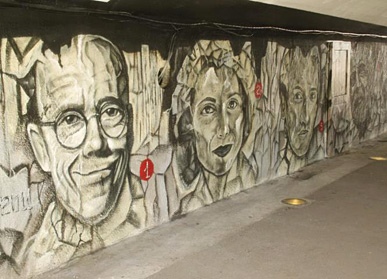
We've come to accept the fact that as type designers we spend our life wallowing in obscurity and rarely receive public recognition for the work we do. So imagine our surprise when we received this photograph from our good friend and fellow type designer Peter Bilak, who stumbled across this graffiti mural in the Romanian city of Timisoara. Featuring Erik Spiekermann, Zuzana Licko, Peter Bilak, and we believe Herman Zapf. Viva La Type Revolution!
As part of the 25th International Biennial of Graphic Design in Brno 2012, designer Jon Sueda was invited to organize an exhibit featuring the work of California designers. Instead of creating a region-based exhibition aimed to capture significant work from The Golden State, "Work from California" focusses on "exceptional works that directly interpret or reflect upon California as subject matter. 'Work from California' offers a”¯portrait of America’s 31st state through the lens of graphic design. It examines the fascination that graphic designers have with California culture, as well as revealing something of the context, attitudes, and people involved, and the history of the place where the work was made."
We're proud to have our work featured along that of many of our California friends and colleagues such as Bob Aufuldish, Ed Fella (See graphic above), Green Dragon Office, Mr. Keedy, Geoff McFetridge, McSweeney’s, Mike Mills, Gail Swanlund, Martin Venezky, and Volume Inc.
The show runs through October 28, 2012, at the Moravska Gallery, Brno.
Designers & Books is devoted to posting lists of books that esteemed members of the design community have identified as personally important, meaningful, and formative. From Vitruvius to William Morris to Frank Lloyd Wright to Edith Wharton to Le Corbusier to Paul Rand, there has always been a particularly special and robust relationship between designers and books: reading them, writing them, designing them, collecting them, learning from them, and being inspired by them. Designers & Books celebrates that relationship.
Check out the list recently submitted by Emigre's Art Director Rudy VanderLans
.
Alda Designer Berton Hasebe Receives Print Magazine Honors 05.22.2012
We're proud to announce that Berton Hasebe, the designer of the Alda type family was selected as one of the "20 under 30" 2012 New Visual Artists by Print magazine. The invitation-only competition introduces and profiles 20 of the most promising rising talents in graphic design, advertising, illustration, digital media, photography, and animation all under the age of 30. Choices are drawn from nominations made by industry professionals.
You can download a free copy of the Alda type specimen as a PDF file.
Emigre Sponsors TYPO San Francisco 2012 04.30.2012
TYPO SF was one of the best design conferences we've attended in a long while. And Emigre was smart enough to be a sponsor. It was worth the price just to see our logo, blown-up to gigantic proportions, floating around on the big screen in between presentations (see above).
If you missed the conference, you can check out some of the presentations on the TypoTalks website. And if you missed the new Emigre Type Catalog that was included in the conference's goodie bag, here's your chance to get one for free.
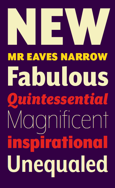
Mr & Mrs Eaves Completed 03.27.2012
Mr Eaves XL Sans & Modern Narrow are the final installments to complete the Mr & Mrs Eaves family of fonts
Mr Eaves XL Sans Narrow is 20% narrower than the regular Mr Eaves XL Sans with overall tighter spacing. Mr Eaves XL Sans Narrow allows for a wide variety of uses and is perfectly suitable for lengthy text settings. The larger x-height also maintains superior readability at smaller point sizes.
The matching Modern Narrow family, also 20% narrower, provides an overall less humanistic look, with simpler and more geometric-looking shapes, most noticeably in the squared-off terminals and symmetric lower case counters. This family has moved furthest from its roots, yet still contains some of Mrs Eaves' DNA. The Modern Italic is free of tails, and overall the Modern exhibits more repetition of forms, projecting a cleaner look.
Mr Eaves XL Sans Narrow and XL Modern Narrow feature seven weights each with accompanying italics, small caps and alternate characters.
Emigre at Museum of Modern and Contemp. Art in Bolzano, Italy 11.18.2011
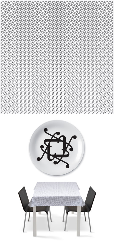
Applications of Emigre's Hypnopaedia patterns, designed by Zuzana Licko, were included in the exhibition Typographic Tables at the Museum of Modern and Contemporary Art in Bolzano, Italy. The exhibit featured works by 30 international highly-regarded Graphic Designers, and explored the role of the word, its meaning, its form, and its context in our everyday life. The 30 designers were asked to design a typographic table cloth and dinner plate to create a space to sit around, to eat, and to discuss with your table neighbor.
Designers included such luminaries as Ed Fella, Erik Spiekermann, Irma Boom, Büro Destruct, Philippe Apeloig, Helmut Schmid and many others.
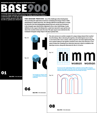
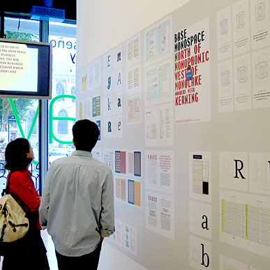
Base 900 PDF Catalog 11.15.2011
To celebrate the inclusion of Base 900 in the Walker Art Center exhibit Graphic Design: Now In Production we have added the Base 900 Type Specimen to our list of free downloadable PDF catalogs.
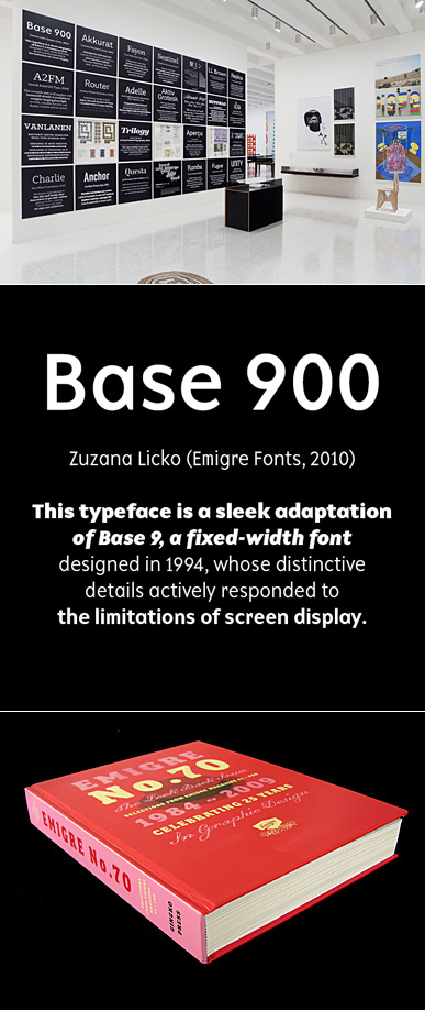
Emigre at the Walker Art Center, Minneapolis 11.11.2011
The Emigre typeface Base 900 and the book Emigre No. 70: The Look Back Issue were selected to be featured in the exhibit Graphic Design: Now in Production at the Walker Art Center in Minneapolis. This major international exhibition explores how graphic design has broadened its reach dramatically over the past decade, expanding from a specialized profession to a widely deployed tool. Graphic Design: Now in Production is the largest museum exhibition on the subject since the Walker's seminal 1989 exhibition Graphic Design in America: A Visual Language History in which Emigre's work was also represented.
Emigre at Victoria & Albert Museum, London 10.12.2011
Emigre magazine issues #10 and #11 are included in the exhibition Postmodernism: Style and Subversion 1970-1990 at the Victoria & Albert Museum in London. This exhibit, which features work by the likes of Peter Saville, Frank Gehry, Philippe Starck, Robert Venturi, and Ettore Sottsass, sets out to answer the questions "What does postmodernism mean, and where did it come from?" And while some of its participants have tried to distance themselves from postmodernism, Emigre is proud to have been an active participant in this controversial movement which continues to defy definition.
Read Rick Poynor's review of the the exhibition here.
Emigre at Contemporary Art Museum, Raleigh, NC 10.10.2011
All 13 typographic labels designed for the Historia type specimen are included in the exhibit Deep Surface: Contemporary Ornament and Pattern at the Contemporary Art Museum in Raleigh, NC. Curated by Denise Gonzales-Crisp and Susan Yelavich the exhibition is comprised of works from 42 international designers and artists and speaks to the pervasiveness and relevance of pattern and ornament in graphic design, industrial design, fashion, furnishings, architecture and digital media.
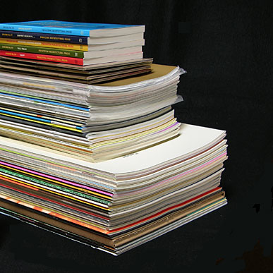
Emigre Fonts PDF Catalogs 09.13.2011
Emigre's award winning type specimen catalogs are now available for free as downloadable PDF files. Many have been long out of print and some have reached collector item status. So if you haven't received these in the past, or have lost your copy, here is your opportunity to receive these beautifully designed type catalogs delivered directly to your computer for immediate typographic perusal.
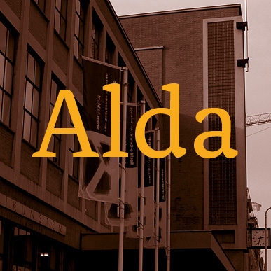
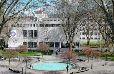
Rudy VanderLans couldn't be more proud of the latest Emigre typeface release. Alda, designed by Berton Hasebe, was conceived and developed at VanderLans' Alma Mater, The Royal Academy of Art (KABK) in The Hague. "This typeface wears its local heritage on its sleeve," said VanderLans. "It exudes Dutch type design to such a degree, it makes me feel homesick. It has that beautiful combination of being both robust and elegant. It's a great text typeface. I can't wait to use it in some of my own designs." See if you can beat VanderLans to it by purchasing your own copy of Alda right now.
A short interview with Hasebe about his experiences at KABK is posted in our essays and interviews section. (Photo of KABK building, The Hague, by Hyo Kwon.)
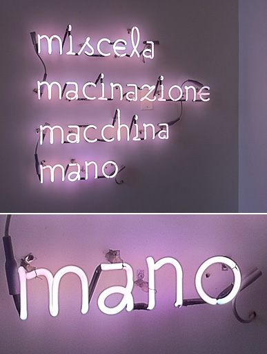
Jonathan Hoefler sent us this wonderful example of Suburban at a coffee house around the corner from their office called La Colombe. We never imagined neon as a viable application for Suburban when we designed it, but it works remarkably well. Our hats off to whoever produced that sign.
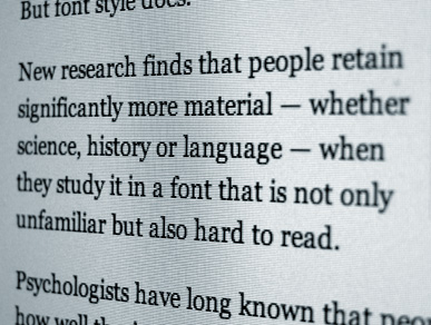
The Legibility Wars are Over and the Winner is... 05.22.2011
Twenty years after we first published our thoughts on legibility in Emigre magazine, the rest of the world is finally catching up. We raised a lot of eyebrows in those days. Our less than neutral layouts and jarring typeface designs were criticized and dismissed as self indulgent and were deemed to interfere with the readers' ability to read texts and comprehend messages. The opposition to our experiments was so vehement that the ensuing battle was referred to by many as "The Legibility Wars."
Well, it turns out that researchers have found what we suspected all along: that slowing the reader down actually helps them concentrate harder and retain more information. Disfluency, as the researchers call it, improves retention. Or as The New York Times put it: "...people retain significantly more material when they study it in a font that is not only unfamiliar but also hard to read."
Of course we're not absolutists on this issue, and we're highly skeptical of findings by researchers who have little knowledge of the complexities of type and design. But it was always obvious to us that there's more to effective typography than simply making things legible.
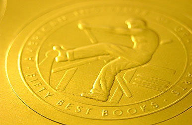
Books of Excellence 05.21.2011
When the AIGA decided to discontinue their annual design competition, "50 Books/50 Covers," in early 2011, members and non-members alike reacted en masse. Designers and publishers love the printed book, and a public petition to save "50/50" resulted in over a thousand signatures in only a few days convincing the AIGA to reinstate the popular competition.
It's inspiring to see this passionate interest in the art of traditional book making. And we're proud to be a part of this long running event, as Emigre and its publisher Gingko Press have been on the receiving end of two "50/50" Certificates of Excellence. In 2010 we received one for Emigre No. 70: The Look Back Issue. And in 2001 the award was bestowed on Supermarket.
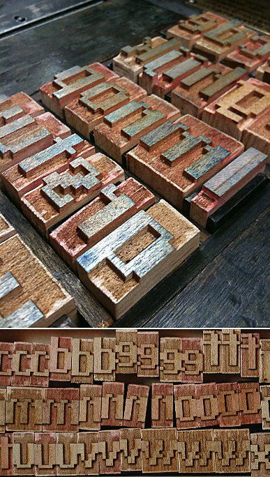
It is more than 20 years ago since Zuzana Licko, in reply to a skeptical question about the viability of her bitmapped typefaces in print applications, said: "why did letter press type start to look a certain way, and why was that eventually accepted? Not because people were reading the type off the bed of the letterpress. They were still reading it off the printed page. That didn't have anything more to do with casting lead than it does with computer chips today, but that's where it comes from, and that's what we've gotten used to."
Not to further complicate the issue, but if you're so inclined you can now read Licko's trademark bitmapped screen type off the bed of a letterpress as well.
These wonderful wood letters of Oakland (renamed Lo-Res in 2001) were created by Evan Christie, a student at Juliet Shen's Level 1 Typography class at the School of Visual Concepts in Seattle, WA. "Typefaces of the past, many of which are now staples of modern graphic design, took physical form as moveable type," said Evan. "I wanted to use a typeface that was never meant to take physical form, and Oakland was the perfect typeface to use because it embodies the birth of the digital era where nothing is tangible." Christie milled the maple down to type height and etched the letters in long strips using an epilog laser engraver. They were then cut off the strip into individual blocks.
It doesn't resolve any legibility issues, but it resulted in some beautiful prints and brought a smile to Zuzana's face. Thanks Evan!
(A flurry of attention has resurrected Oakland as of recently, as it is also one of 23 digital typefaces recently acquired by The Museum of Modern Art in New York.)
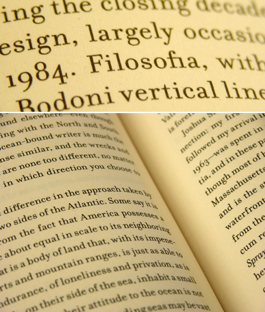
The traditional practice of crediting fonts is a lost art today. Type designers are largely resigned to the notion of toiling in obscurity. So imagine our delight when the best-selling British author Simon Winchester himself contacted us to verify the accuracy of his colophon "A Note on the Type" to be published at the end of the text in his latest book Atlantic published by Harper Collins. The text of the book was set in Filosofia. And we couldn't be more grateful for the thoughtful acknowledgement.
Here's what Winchester wrote: "The typeface employed throughout this book is a modern interpretation of the classic eighteenth century Bodoni face, and known as Filosofia. This was created in 1996 by the Bratislava-born type designer Zuzana Licko, who with her Dutch-born partner Rudy Vanderlans astonished the typographic world during the closing decades of the 20th century with a whirlwind of type design, largely occasioned by the invention of the Macintosh computer in 1984. Filosofia, with its slightly bulging serifs and lighter-than-classical-Bodoni vertical lines, clearly owes much to one of the most beloved of all Italian faces, but is more amiable and less wearing to the eyes when ranged over texts as lengthy and complex as that of Atlantic. I am proud that this book's designer felt able to employ this wonderful new typeface, and applaud with gratitude its most gifted creator. - SW"
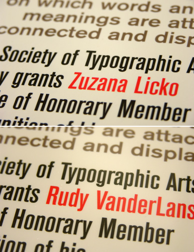
Last October, Emigre founders Zuzana Licko and Rudy VanderLans were inducted as Honorary Members of the Society of Typographic Arts in Chicago.
"We feel quite fortunate to be doing what we love doing" said VanderLans, "and we always thought that was reward enough. So when the STA contacted us last year, and told us about the wonderful honor that they were planning to bestow upon Emigre, we were simply stunned."
Since its inception in Chicago in 1927, the STA has been a vital participant in the Chicago design community, sponsoring seminars and conferences, and developing publications. Honorary members include such luminaries of design as Saul Bass, Lester Beal, Mildred Friedman, Fredrick W. Goudy, Beatrice Ward, Herb Lubalin and Jan Tschichold to name but a few.
"This award is a great vote of confidence," said Licko, "and it inspires us to keep working even harder so that we may actually earn our stay among these giants of design. Thank you STA!"

Emigre Typefaces Enter MoMA Design Collection 02.20.2011
The Museum of Modern Art in New York has acquired 23 digital typefaces for their design and architecture collection. Included are five Emigre font families: Jeffery Keedy's Keedy Sans, Jonathan Barnbrook's Mason Serif, Barry Deck's Template Gothic, Zuzana Licko's Oakland (renamed Lo-Res in 2001), and P. Scott Makela's Dead History.
This acquisition marks the beginning of MoMA's effort to built a collection of typefaces documenting milestone designs covering the twentieth century. Working backwards they have started with the digital era.
MoMA based its selection on criteria ranging from aesthetics to historical relevancy, from functionality to social significance, from technological ingenuity to economy. "Several of the fonts we chose visually reflect very closely the time and place in which they were made," writes Senior Curator Paola Antonelli, "they represent a specific era in the digital revolution--the early 1990s, when digital typography was coming into its own. They were chosen based upon their importance to cultural history as well as their experimental aesthetics."
We're proud to be a part of this exciting new museum collection, and we're honored to find ourselves in the company of type designers we much admire such as Matthew Carter, Jonathan Hoefler, and Erik Spiekermann.
The typefaces will be on display at MoMA New York as part of the exhibit Standard Deviations which will open March 2, 2011.
Council Holding Court in New Orleans 01.20.2011
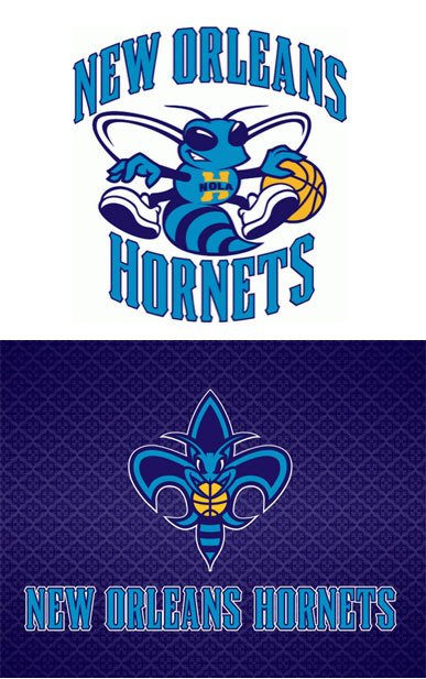
The professional basketball team New Orleans Hornets unveiled an updated logo design last Fall (see above) created by Logo Design Next in collaboration with the Hornets, the NBA and the sporting good company Adidas. We're happy to see yet another professional sporting team picking an Emigre typeface for their identity. The main typeface used by the Hornets is Council designed by John Downer.
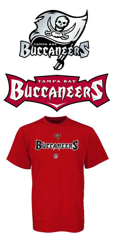
There's nothing like watching sports and seeing your own typefaces in action (literally). Below are three other professional sports teams donning Emigre fonts.
From top to bottom:
the Tampa Bay Buckaneers football team (Totally Gothic);
the Arizona Diamondbacks baseball team (Matrix); and
the Baltimore Ravens football team (Matrix Display).


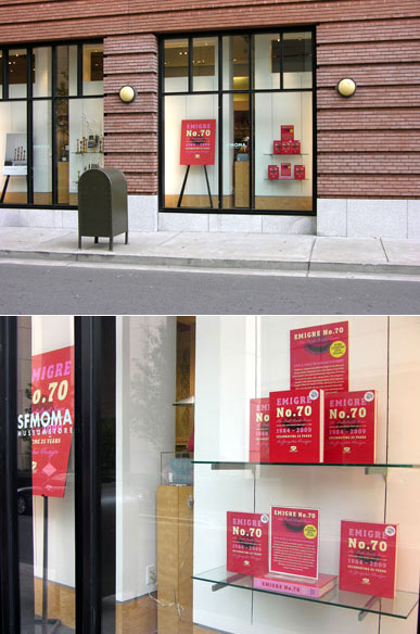
Emigre Book at SFMoMA Museum Store 01.13.2011
Signed copies of the Emigre book are still for sale at the SFMoMA Museum Store in San Francisco.
Emigre Magazine Preserved in Zurich 12.20.2010
Last month the Museum fur Gestaltung in Zurich acquired a set of Emigre magazine issues for its permanent design collection. Emigre couldn't be more proud to be a part of this esteemed bastion of design. Founded in 1878 as part of the Kunstgewerbeschule, the Museum fur Gestaltung Zurich considers itself to be Switzerland's premier design and visual communication museum, covering fields including design, furniture, fashion, graphics, photography and architecture. A complete list of institutions that hold sets of Emigre magazine in their collections can be seen here.
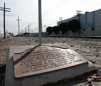
Lost Battlefield Marker Found 08.19.2010
This photo was sent to us by Scott Fajack, a very astute and observant reader of our recent Historia Type Specimen, in which Rudy VanderLans reports a missing historical marker designating the La Mesa Battlefield location in Vernon, CA. Thanks Scott!
Emigre Featured on Fast Company Website 08.18.2010
Check out Alissa Walker's interview with Emigre's Rudy VanderLans on FastCompany's Design website.
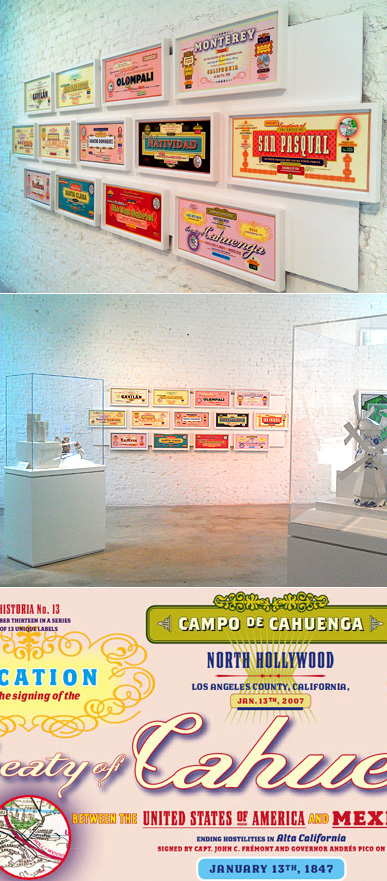
Emigre Publishes New Type Specimen 06.07.2010
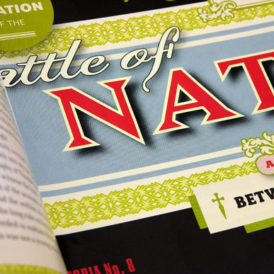
Two years in the making, the 64-page Historia Type Specimen, has finally been published. Featuring type from the Emigre Fonts Library mixed and paired in a multitude of creative combinations, set in a spectacular display of depictions and descriptions of the U.S. Mexican War of 1846-1848 in California. Download a copy here.
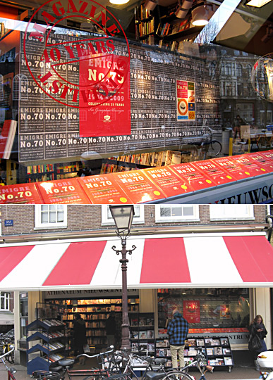
Emigre Book at Athenaeum Bookstore in Amsterdam 01.16.2010
We're super excited to see our Emigre No.70 book take up an entire window at Athenaeum bookstore in Amsterdam. Perhaps the best bookstore in all of Europe, Athenaeum was also the first store in Holland to sell Emigre magazine. Thank you Athenaeum!
Go check them out at Spui 14-16, Amsterdam.
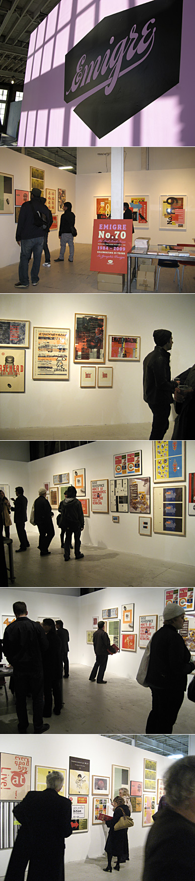
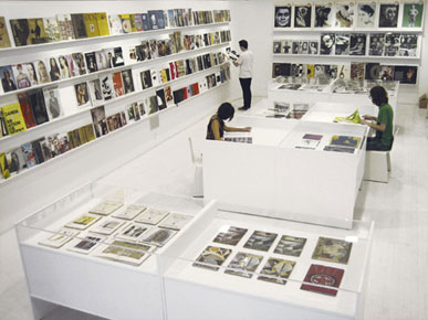
Emigre at Gallery 16 12.19.2009
The design work of Emigre is currently on display at San Francisco's Gallery 16 from December 18, 2009 through January 30, 2010.
The exhibit, which coincides with the recent publication of Emigre No. 70: The Look Back Issue, features a selection of work spanning the entire Emigre enterprise, including a collection of press sheets of Emigre magazine covers, promotional posters for Emigre Music and Emigre Fonts, as well as books, prints, photographs, and much more. A series of six specially designed large-sized digital prints to celebrate Emigre's longstanding relationship with Gallery 16 are also be on view.
Gallery 16, 501 Third Street, San Francisco, CA.
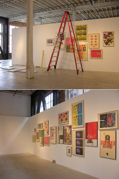
Emigre at Gallery 16 Installation 12.14.2009
Gallery installation in progress. Show opens December 18th, 2009.
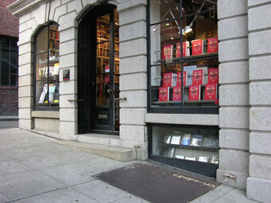
Emigre Book at William Stout 09.12.2009
The newly published Emigre book for sale and on display at William Stout Architectural Books in San Francisco.
Emigre Magazine at Berardo Museum in Lisbon, Portugal 01.12.2009
Surrounded by Josef Muller Brockman posters and the artist books of Edward Ruscha, Emigre magazine issues #10 through #24 were on display at "Quick, Quick, Slow." This exhibition, an "alternative history of graphic design," was curated by Emily King as part of the Experimentadesign Lisboa 2009 at the Berardo Museum in Lisbon, Portugal. On view through December 31, 2009.
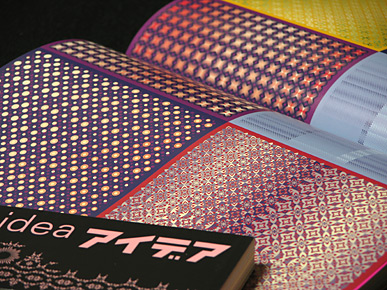
Emigre Featured in IDEA Magazine 01.12.2008
Zuzana Licko's pattern fonts and designs are prominently featured in the current issue of the Japanese design magazine IDEA. The issue (No. 325) is a visual survey of the "Natural History of Printers' Flowers." Copies of the magazine can be purchased directly from IDEA magazine.
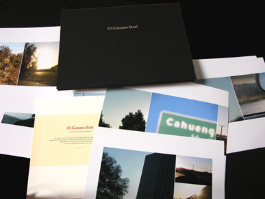
Emigre Photo Portfolio Presented at The Photography Show 2007 04.12.2007
Richard Moore Photographs will exhibit El Camino Real, a portfolio of new photographs by Rudy VanderLans. Organized by the Association of International Photography Art Dealers, The Photography Show 2007 will feature more than eighty of the finest dealers in fine art photography. The show runs from April 12 trough April 15, 2007.
The Park Avenue Armory, 67th Street & Park Avenue, New York City, NY
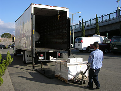
Brand New Emigre Catalog Arrives at Emeryville Warehouse 04.11.2007
You can order a copy or sign up to receive the next Emigre Catalog for free here.
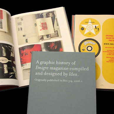
A Graphic History of Emigre Magazine by Idea 04.06.2007
The Japanse design magazine Idea presented a 132-page editorial on the history of Emigre magazine in their January issue (#314, 2006). To celebrate the occasion, Emigre produced a limited edition case bound version of the feature. For those of you who missed it (all 50 copies sold within one hour of going on sale) you may be able to order a copy of the regular version directly from Idea magazine.
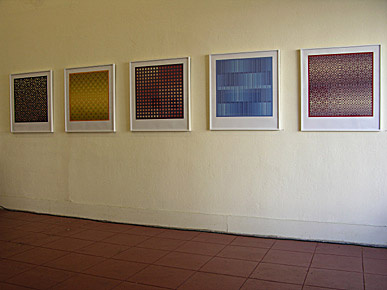
Emigre Puzzler Prints at North Berkeley Frame & Gallery 04.01.2007
Twelve limited edition C-prints created by Zuzana Licko are on exhibit at North Berkeley Frame & Gallery.
These elaborate color prints were composed by Licko using her Puzzler font. They were printed with the Durst Lamda digital imager, each in a limited edition of 50. The show opened on March 13 and will run through May 11, 2007. Gallery Hours: Tuesday-Friday 10-5:30 Saturday 10-4:30
North Berkeley Frame & Gallery, 1744 Shattuck Avenue, Berkeley, CA
Emigre at the Museum of Modern Art, New York 03.29.2007
A complete set of Emigre magazine is on display at MoMA. Emigre Magazine, issues 1-69, 1984-2005 is part of the reinstallation of the Architecture & Design Galleries, entitled, Digitally Mastered. The galleries officially opened on November 22, 2006.
The Museum of Modern Art, 11 West 53 Street, New York.
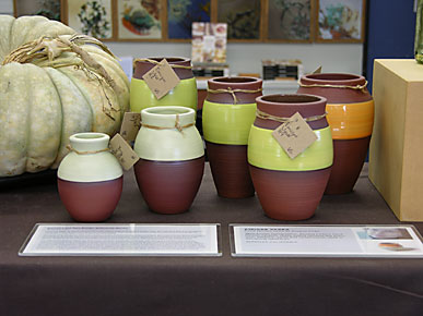
Emigre Vases at Heath Ceramics 03.20.2007
A selection of Zuzana Licko's ceramic vases are currently on display and for sale at the Heath Ceramics Factory Store in Sausalito. If you're in the Bay Area, stop by and check them out. Hours are Sunday through Wednesday, 10 - 5, Thursday through Saturday 10 - 6. Heath Ceramics, 400 Gate 5 Road in Sausalito, California.
Emigre Photo at San Jose Museum of Art 02.04.2007
A large-sized C-print by Rudy VanderLans is featured in the group show Suburban Escape: The Art of California Sprawl at the San Jose Museum of Art. The show, which includes works by Edward Ruscha, Joel Sternfield, Larry Sultan and Lewis Baltz, embodies the changing attitudes and questions that have been - and continue to be - asked about suburban development in California. Through March 4, 2007. San Jose Museum of Art, 110 S. Market Street, San Jose, CA 95113
Emigre Magazine at Visionaire Gallery 12.01.2006
Five issues of Emigre magazine are on display at the show Megazines at the Visionaire Gallery in Manhattan. The exhibition brings together a collection of rare and innovative magazines from the beginning of the 20th Century to the present. Through December 31, 2006. Visionaire Gallery, 11 Mercer Street, New York.
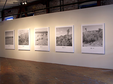
Emigre and Gallery 16 Present: 13 Big Western Landscapes by Rudy Vand 01.16.2006
For this, his third solo exhibition, VanderLans further explores the form of landscape photography through a series of large size pigment prints on canvas.
Through January 16, 2006. Gallery 16, 501 Third Street, San Francisco, CA.
Emigre at the Centre Pompidou, Paris 10.17.2005
Emigre's work is on display at the Centre Pompidou in Paris as part of the exhibition D-Day, one of its prestigious mega-surveys covering the breadth of international contemporary design practice. Through October 17th, 2005. Centre Pompidou, Place Georges Pompidou, Paris.
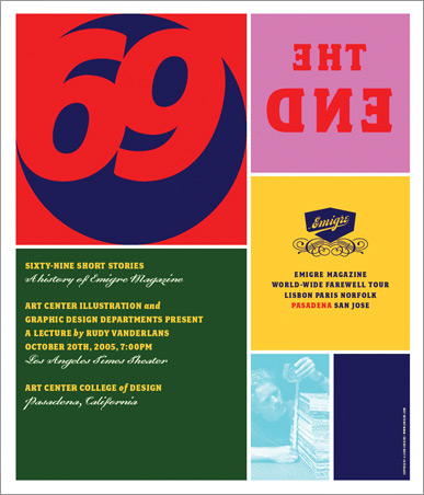
World Wide Farewell Tour 10.10.2005
Emigre magazine's editor/designer Rudy VanderLans concluded the last lecture of his World Wide Farewell Tour celebrating the publication of the final issue of Emigre. Lecture stops included Paris's Centre Pompidou, Lisbon's Design Bienale, Old Dominion University in Norfolk, Virginia, Pasadena College of Art, and San Jose State University.
Fish Eye; A Talk for the Screen 04.21.2005
Originally conceived as a lecture, this essay by Rob Giampietro about the work of Rudy VanderLans focuses on the photography of Emigre magazine's editor/designer.
