Mason
Designed by Jonathan Barnbrook in 1992. More...
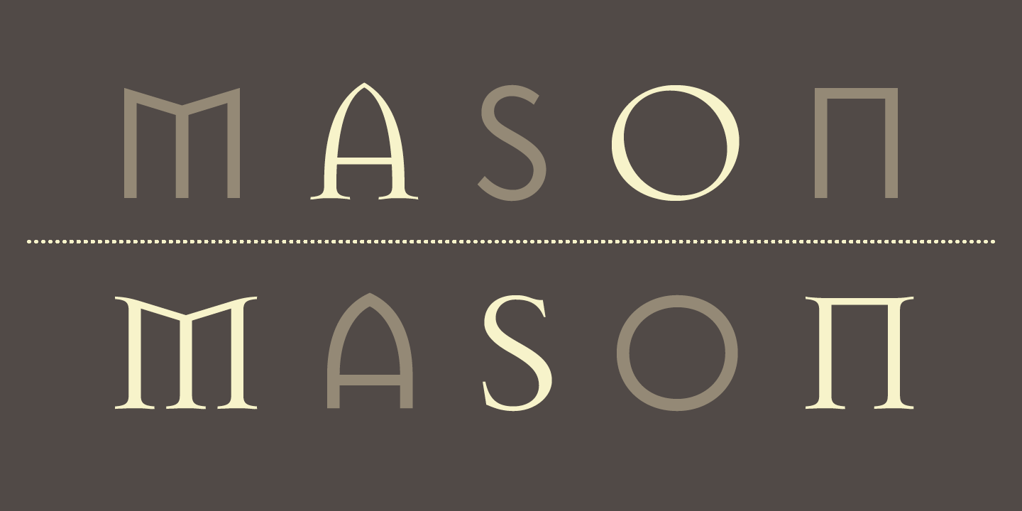
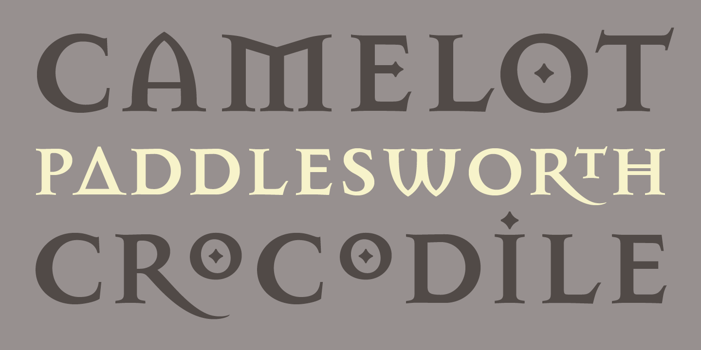
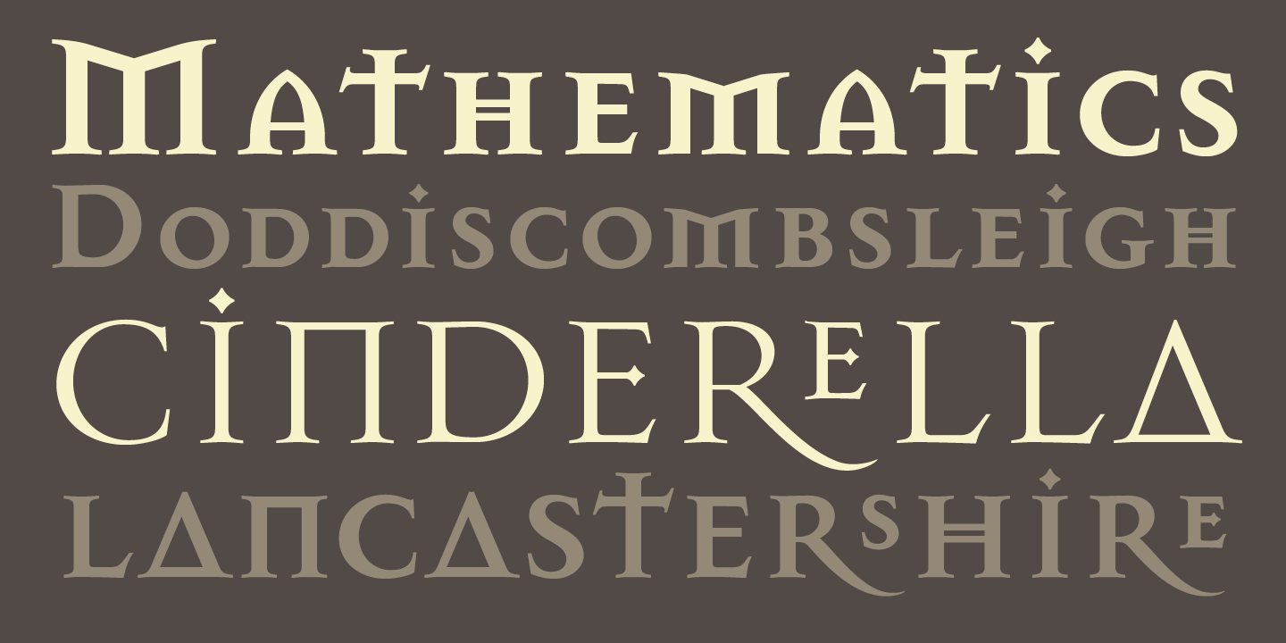
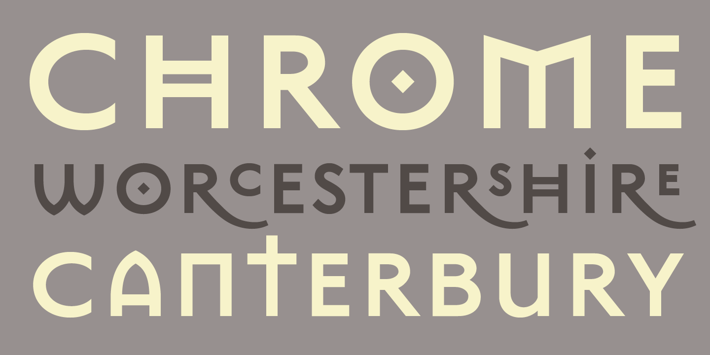
Mason comes in both a serif and sans serif version, and each package comes with three variants: Regular, Alternate, and Super, each in two weights. Together, these fonts contain several variants for each alphabetic character, each in a capital, small cap, and super script cap version.
In its design, Barnbrook was influenced by nineteenth-century Russian letter forms, Greek architecture, and Renaissance Bibles. The font also displays many references to popular culture, politics, and typographic history. Mason’s postmodern attitude is undeniable and, like Jeffery Keedy’s Keedy Sans, Mason emerged during the explosion of digital typefaces in the early 1990s, both products of the technological and cultural influences of the time.
Barnbrook originally called this typeface Manson (after American serial killer Charles Manson) “to express extreme opposite emotions of love and hate, beauty and ugliness.” After releasing the font, Emigre came under heavy scrutiny for glorifying a murderer, and decided to change the name to Mason, as the letter forms also evoke stonecutters’ work, Freemasons’ symbology, and pagan iconography.
In 2011 Mason Sans was one of 23 digital typefaces included in the permanent architecture and design collection of the Museum of Modern Art in New York.

