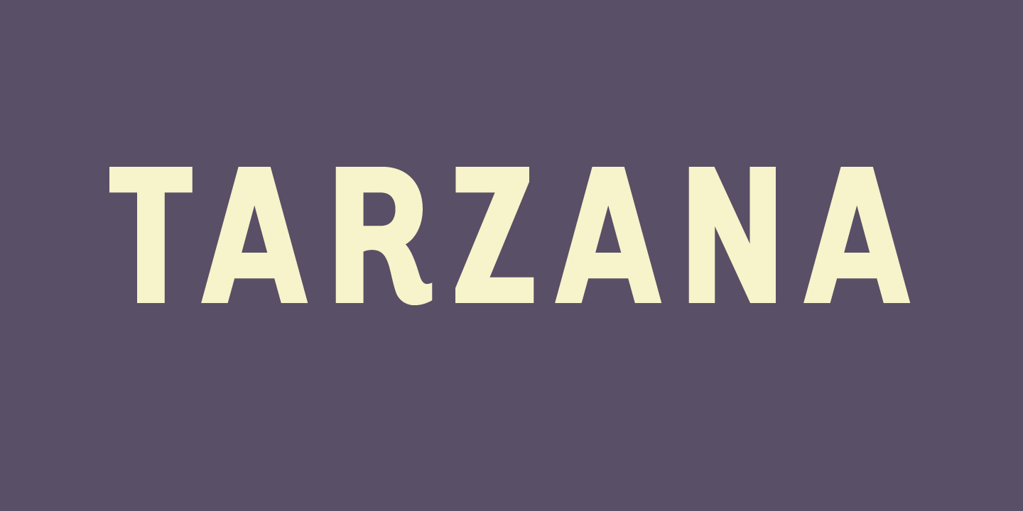
Tarzana
Designed by Zuzana Licko in 1998. More...
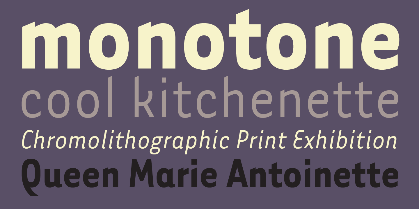
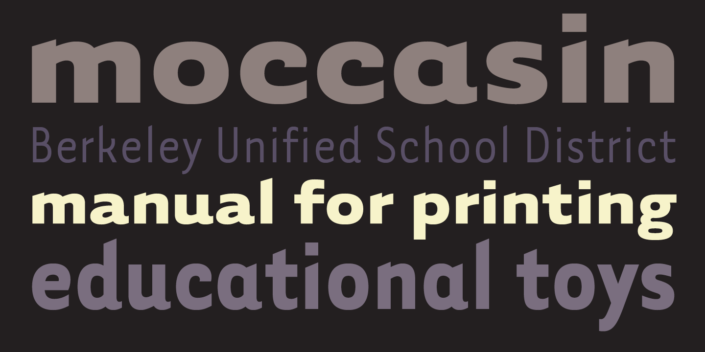
These two families of sans-serif text faces were developed purely along formal lines. The goal was to balance the neutrality required for a text face with just enough idiosyncrasies to create a slightly unfamiliar design in order to provide new interest.
Of course, both of these extremes are necessary, but seldom is either extreme desirable. If everything was neutral, we wouldn't be able to tell things apart due to their sameness. Alternately, if everything was purely expressive, we wouldn't be able to make sense of the visual world around us.
The definition of what is neutral (traditional or familiar) versus that which is idiosyncratic (expressive or unusual), is continually changing, as new typeface designs are added. Over time, what may once have seemed unusual becomes familiar through repeated usage. This shifting continually provides new contexts for new designs which in turn alter these definitions yet again, thus completing the cycle.
Tarzana’s design process was one of visual editing by discarding overly familiar ideas, while assimilating new ones without compromising legibility. Often, a particular decision would conjure up more questions than it answered, and changing one character often lead to the reworking of an entire range of related characters, as the various stages and permutations of letterforms shown here illustrate.
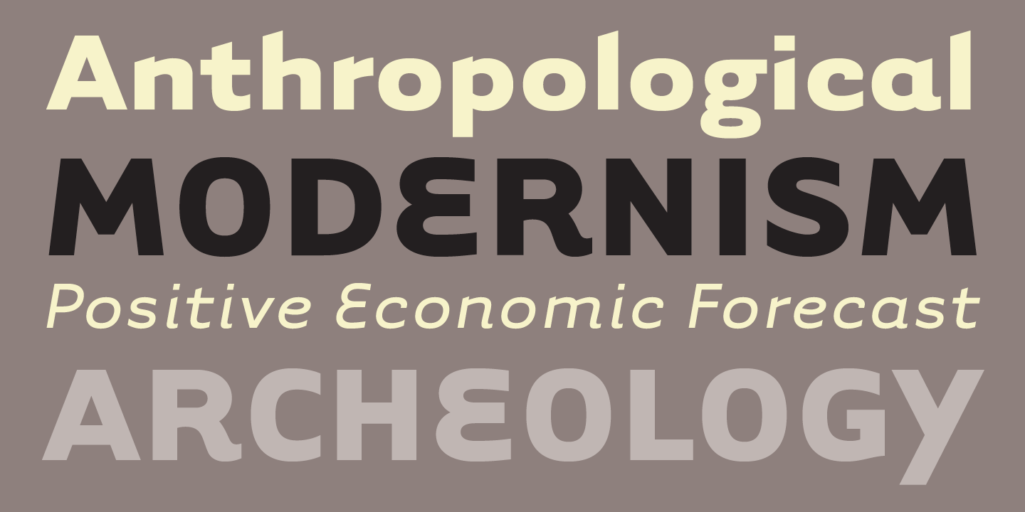
The roman (upright) and italic versions were designed simultaneously, with the purpose of cross-pollination. In some instances, roman character designs were developed on the basis of the italics, resulting in such features as the curved arm on the lower case “k,” the asymmetric capital “Y,” and the rounded capital “E,” yielding an informal feel to the entire family.

