

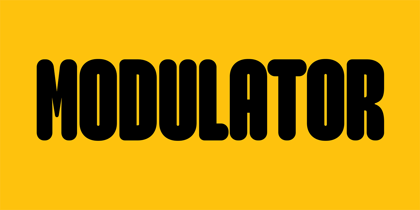


Modulator
Designed by Zuzana Licko in 2026. More...
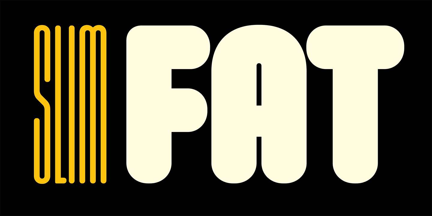
Modulator is a spin-off inspired by two different designs born in different eras: Modula Round Black, designed in 1995, and Lo-Res Monospaced Solid, designed in 2023. Modula Round was the starting point for Modulator 100 medium, whereas the square proportions of Lo-Res Monospaced Solid became Modulator 350 heavy. The idea started when designer Zuzana Licko imagined how her Lo-Res Monospaced Solid might look with rounded edges. The modularity and slim counters of this new design echoed some of the features of Modula Round Black, and she realized how, with some modifications, those two designs could work together in this new family which she ended up calling “Modulator.” To make these two designs compatible in the new font, she made Modula a unicase font, and tightened the counters in Lo-Res. Using interpolation, she then created three intermediate versions between these two initial extremes. Not satisfied with the range, Licko added two additional accentuating weights at the extremes, expanding the family to a total of nine fonts. While the stem weights vary, all nine styles share the same counter width. This repetition of shape and space creates a unifying rhythm.
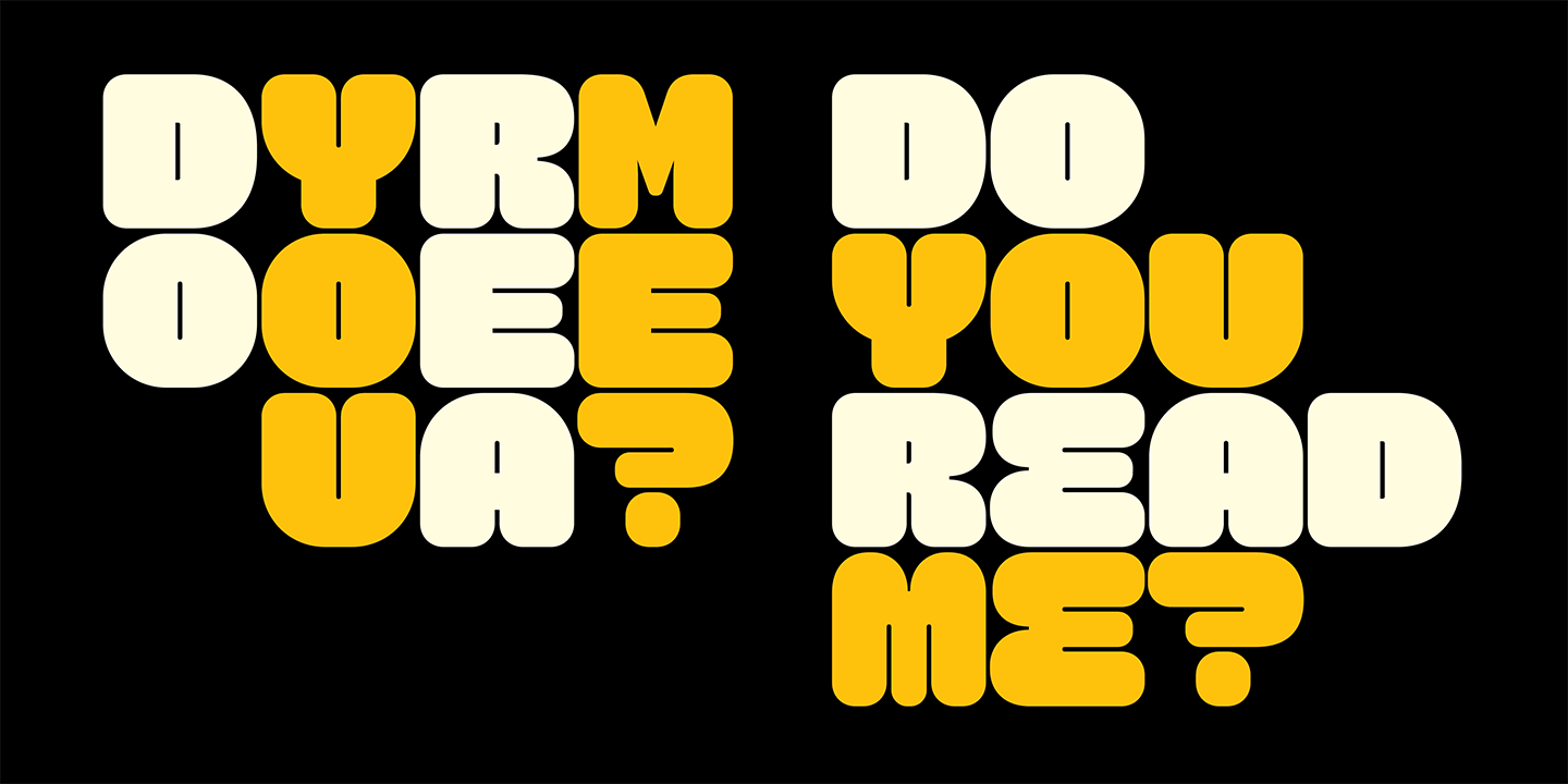
Another design characteristic of Modulator is the transformation from vertical strokes to horizontal strokes, which happens between the bold and heavy, seen in glyphs like the letter s or number 3. The shapes required for this morphing lead to some surprising forms.
Although Modulator is an all-caps design, the letters e, m, and n were given alternative glyphs in the lower case to provide some variety and flexibility when customizing headlines.
The variable version of Modulator contains a continuous range of style variations, allowing designers to use a slider to pick any point between extremes, rather than being limited to preset styles in separate files, which allows for precise fitting and saves data.
A secondary variable font, Modulator Text, provides a range of widths that are a bit more suitable for small sizes and text applications. This "text" version increases the stem weight and counter width, up to six times that of the extreme narrow width, starting with the 25 stem version, with a 22 counter space, and stretching out to the 150 stem version with a 132 counter space.
Next came the development of Modulator Monospaced, which began by adapting Modulator 350 Heavy, utilizing its square proportion. Serifs were added to the numeral 1, and letters i and l, in order to fill out the space of the mono width. Creating narrower monospaced versions proved more difficult. It required adjusting the stem weights in order to fit these characters into their predetermined mono width, while preserving the uniform counter width. This caused them to appear either too light or too bold within their width group. But these irregular results sparked the idea for Modulator Mix, a version with mixed width glyphs within one font. Modulator Mix alternates among four different monospaced widths. As text is typed, the contextual alternates opentype feature drives the automatic mixing of the widths. Each width is a multiple of the narrowest, so text lines up vertically in sporadic increments. Many thanks to Tal Leming for his brilliant feature script that make the mix font acrobatics possible.
For more information about Modulator, download the free type specimen.
