
Email List
Add yourself to our emailing list.

Modulator Creative Cloud
July 7, 2026
p>For all you Adobe Creative Cloud subscribers, we have just added our latest typeface release, Modulator Variable, to the Adobe Fonts library. So you now have free access to Modulator for all your creative projects.Released as a variable font, Modulator allows continuous navigation across its design space for precise fitting and efficient data use. A companion variable font, Modulator Text Variable, is optimized for smaller sizes, expanding the stem and counter dimensions to improve legibility.
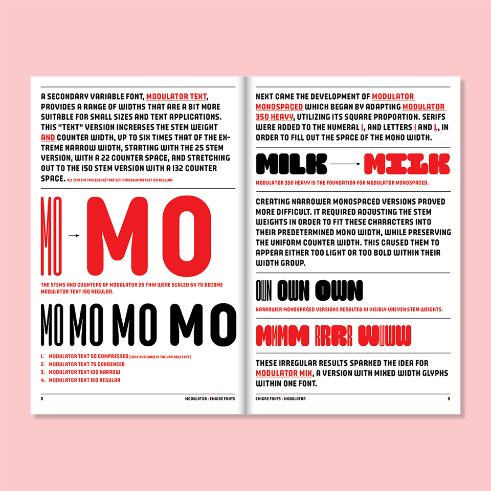
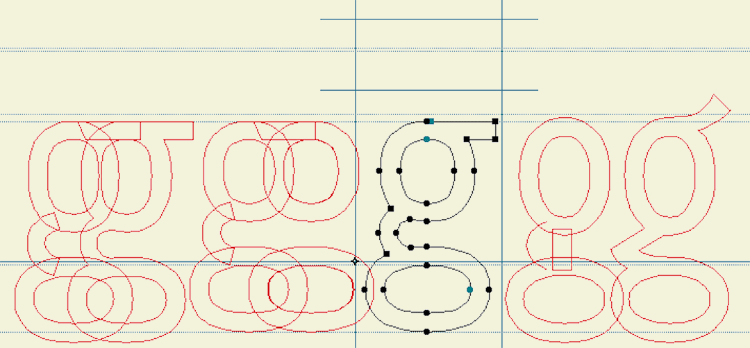
Modulator was conceived as a dialogue between two designs separated by nearly three decades: Modula Round Black (1995) and Lo-Res Monospaced Solid (2023). The project began when Zuzana Licko explored how the pixel-derived rigidity of Lo-Res Monospaced Solid might behave if softened with rounded edges, an experiment that revealed affinities with the modular structure and narrow counters of Modula Round Black. These shared traits suggested the two could function as endpoints of a single system. Modula Round informed Modulator 100 Medium, while the square proportions of Lo-Res Monospaced Solid became the basis for Modulator 350 Heavy. The numbers refer to the stem weights, which vary, while all styles share the same counter width.
You can download a free PDF version or purchase a printed copy of the Modulator type specimen from the Emigre website.
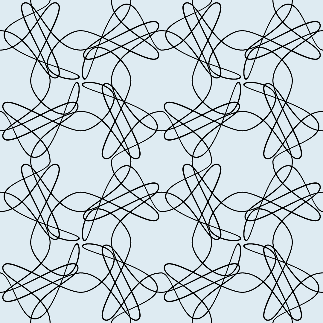
Modulator
February 3, 2026
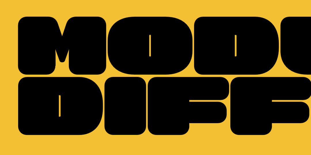
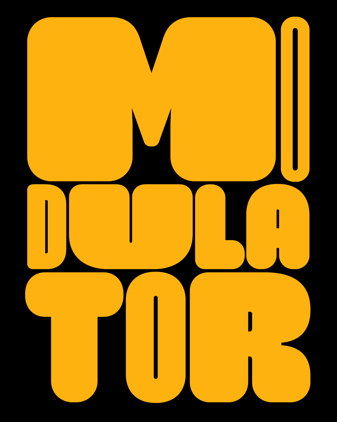
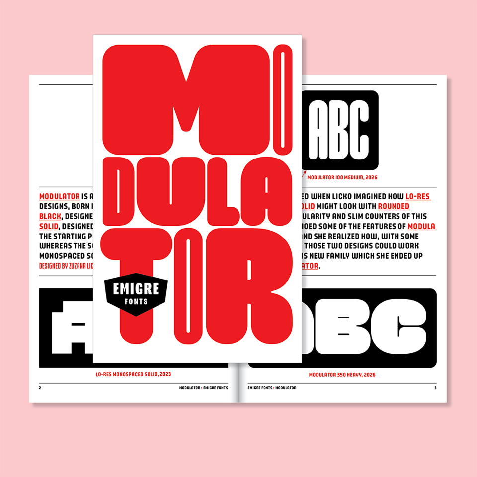
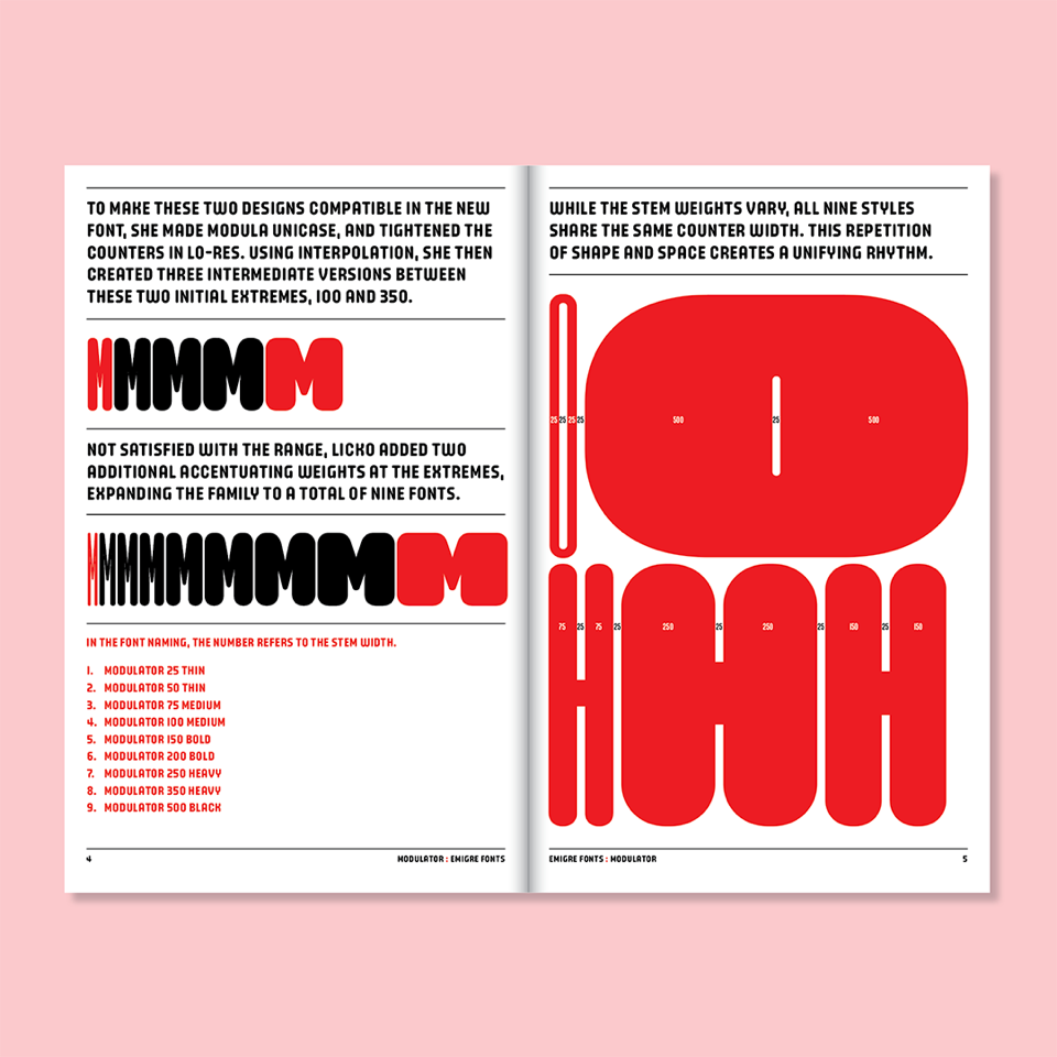
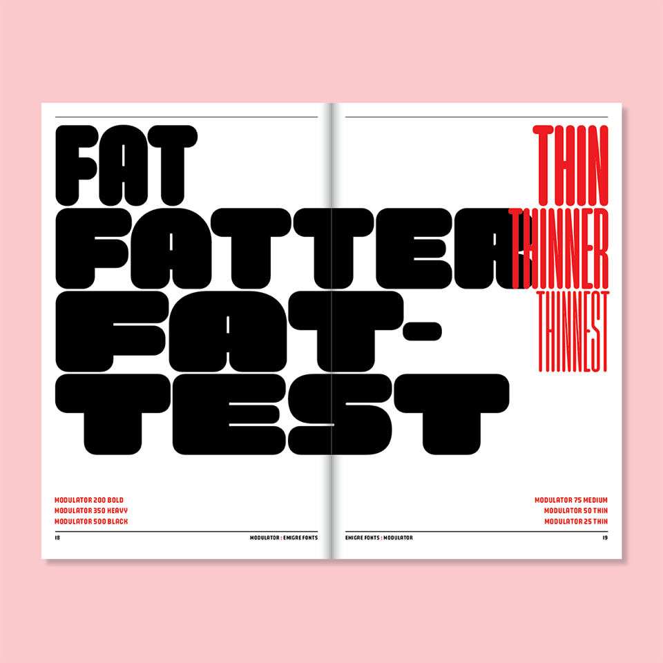
Modulator is a type family conceived as a dialogue between two designs separated by nearly three decades: Modula Round Black (1995) and Lo-Res Monospaced Solid (2023). The project began when Zuzana Licko explored how the pixel-derived rigidity of Lo-Res Monospaced Solid might behave if softened with rounded edges, an experiment that revealed affinities with the modular structure and narrow counters of Modula Round Black. These shared traits suggested the two could function as endpoints of a single system. Modula Round informed Modulator 100 Medium, while the square proportions of Lo-Res Monospaced Solid became the basis for Modulator 350 Heavy. The numbers refer to the stem weights, which vary, while all styles share the same counter width.
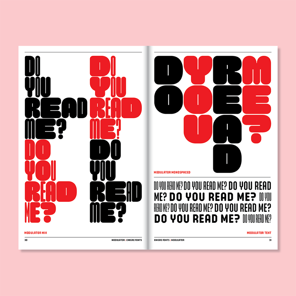
Released as a variable font, Modulator allows continuous navigation across its design space for precise fitting and efficient data use. A companion variable font, Modulator Text, is optimized for smaller sizes, expanding the stem and counter dimensions to improve legibility. The family later evolved into Modulator Monospaced, derived from the heavy weight’s square proportions, and ultimately Modulator Mix, which alternates among four monospaced widths within a single font using contextual OpenType features, creating vertically aligned yet rhythmically varied text.
You can download a free PDF version or purchase a printed copy of the Modulator type specimen from the Emigre website.

Merchapalooza!
December 4, 2025
Between the typographic blankets and stylish ceramics of Zuzana Licko, and the photo books of sun-kissed California by Rudy VanderLans, the Emigre mercantile shop is filled to the brim with the perfect gift for you or your designer friend. Come check it all out. We’re open 24/7.
Order before December 15th, and we will include a one-of-a-kind bonus booklet created by hand from make-ready print sheets.

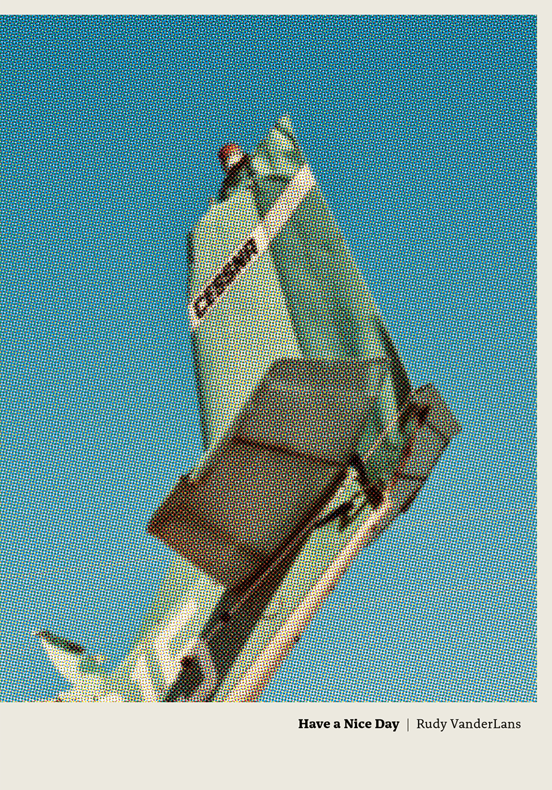
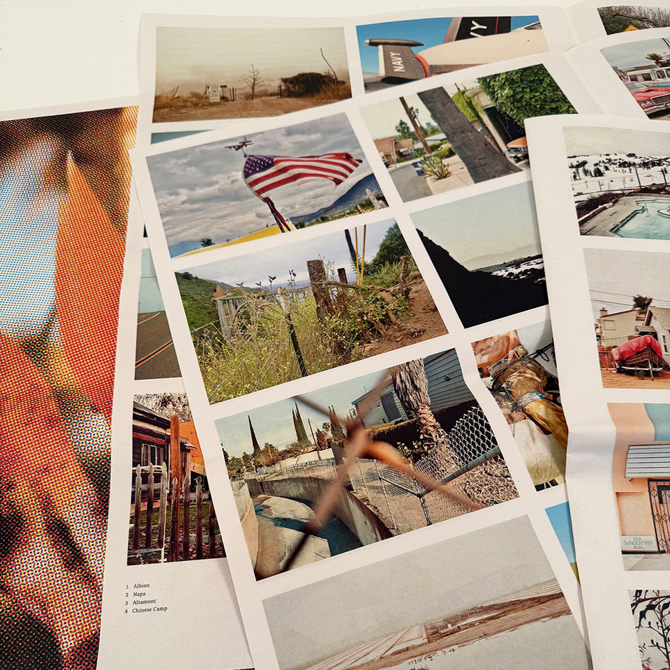
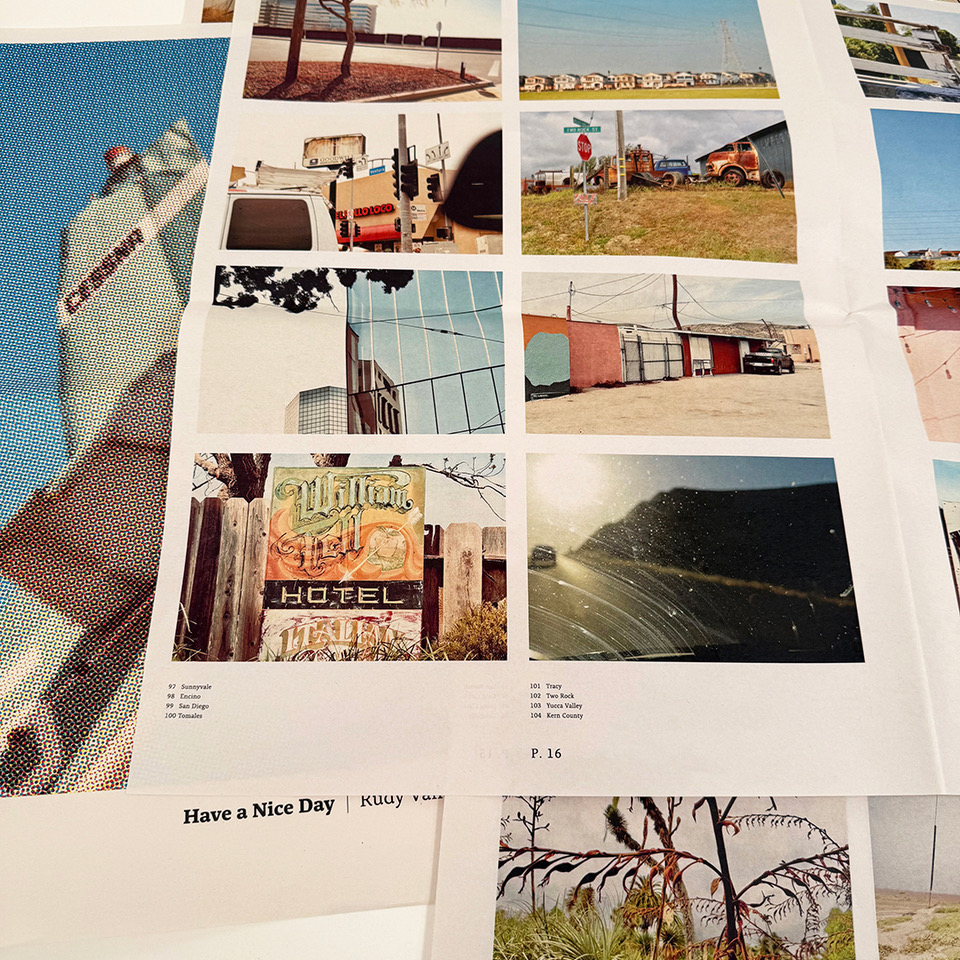
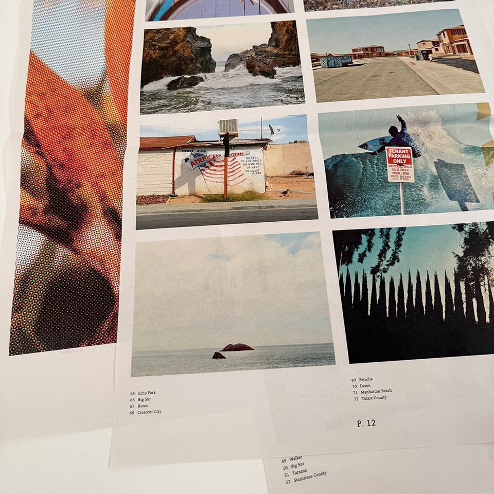
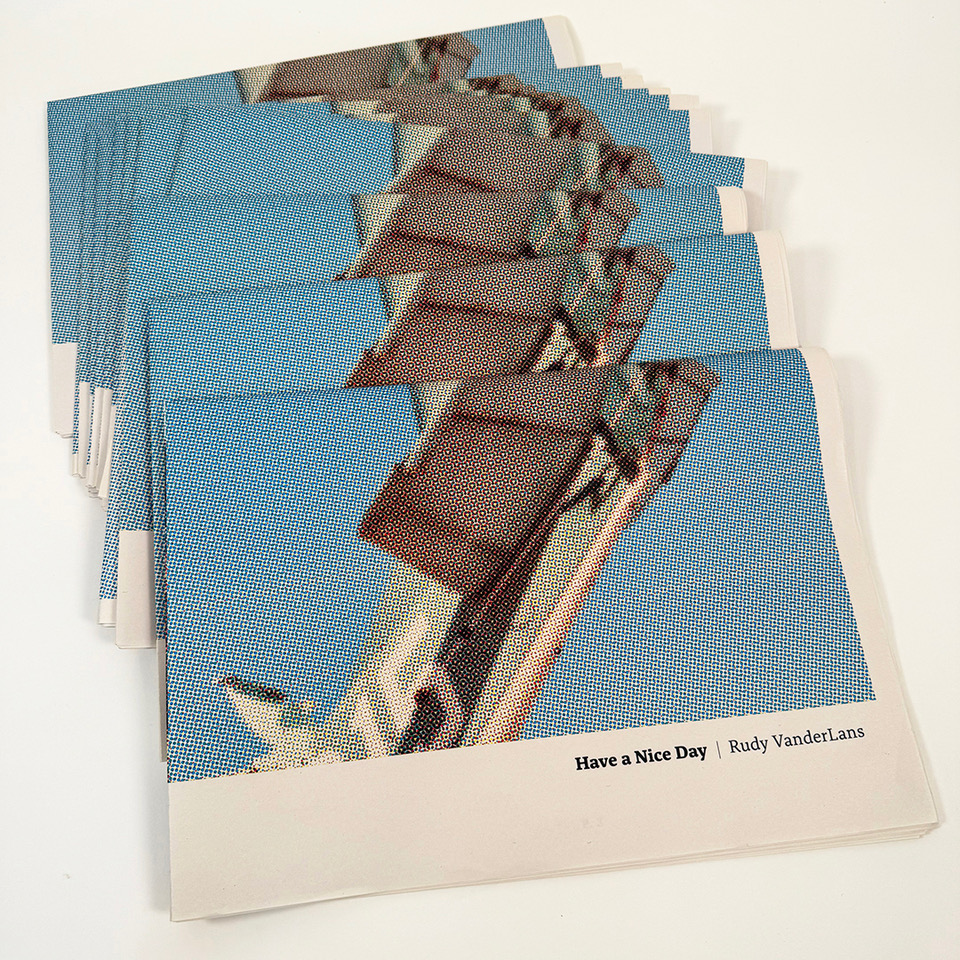
Have a Nice Day
July 1, 2025
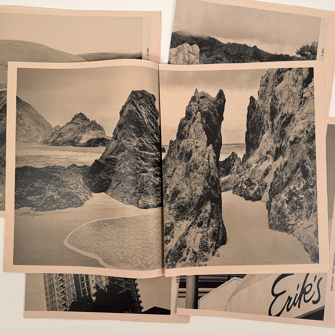
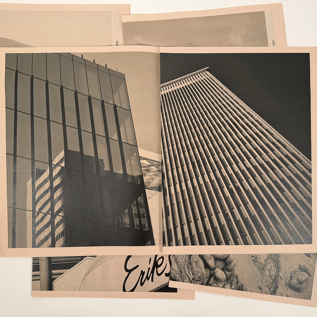
Have a Nice Day is a new book of photographs by Rudy VanderLans, printed as a newspaper. It’s not exactly fine art printing, but that suits VanderLans and his postcard pictures just fine. Featured are 144 new photos, representing 124 different places in the Golden State, which brings him closer to his ultimate quest of photographing nearly 3,000 California locales.
Inspired by artists like Edward Curtis and Charles Schulz, who devoted their lives to a single objective, VanderLans continues his pursuit to create a consistent body of work of postcard-size images, rendering a comprehensive portrait of California in the early part of the 21st century.
Without theorizing, or searching for subjects, he allows himself to be receptive to the world around him and discovers beauty in the most ordinary locales. Stylistically diverse, and meticulously composed, his pictures are as sundry in nature as California itself, while the captured vignettes punctuate the beauty and absurdity of the California environment. Empty of people but littered with the traces of human enterprise these often surprising and always beautifully composed images will give readers much to ponder.
Digitally printed on 55 gsm newsprint, 24 pages, loose-leafed, 13.75 x 19.625 inches.
“[VanderLans] consolidates his position as one of the most notable designer-photographers of recent decades.” – Rick Poynor
“His images are at once still and vibrant experiences that are also meditative and sensational.” – Steven Heller
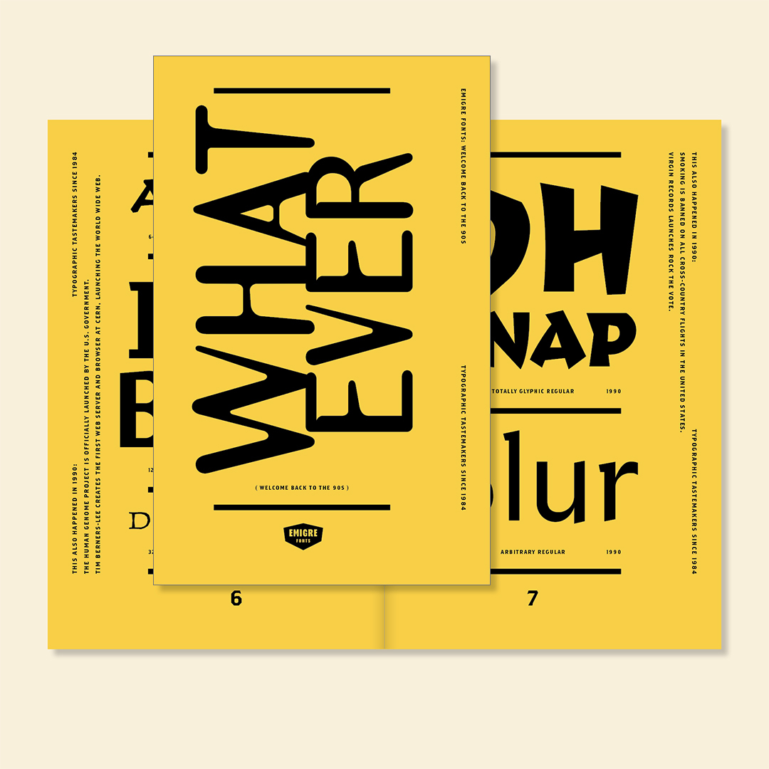
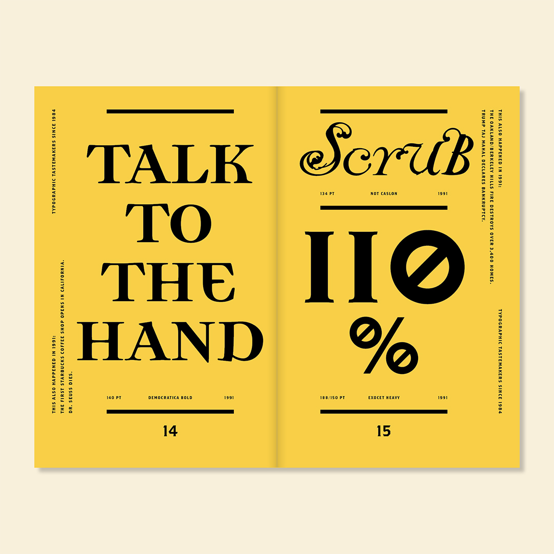
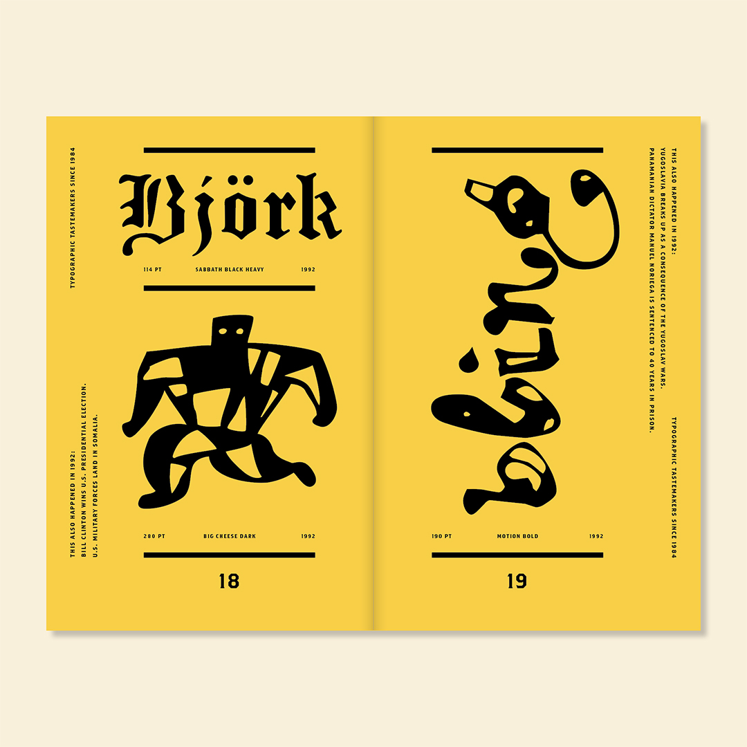
Welcome back to the 90s
April 10, 2025
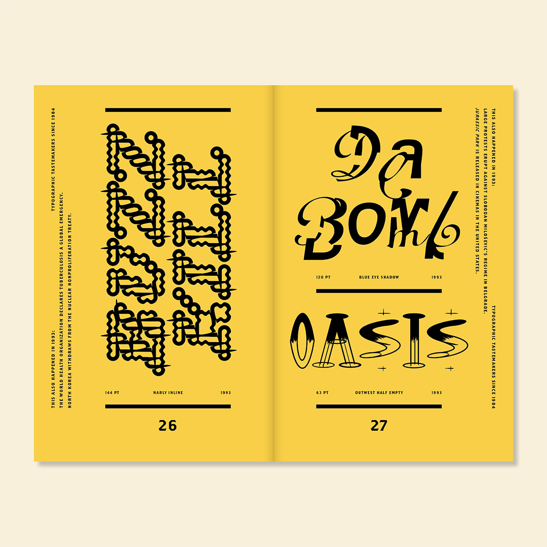
To us, the nineties are a blur. What we do remember is that we produced a lot of work. Besides publishing a quarterly magazine, we released 37 font families for a total of 157 individual fonts, plus all the promotional material to properly support those fonts. In 1990 we also launched Emigre Music, and throughout the 90s published a number of artist books, posters, T-shirts, and even pajamas. In 1994, with the internet in its infancy, we built one of the first electronic font distribution systems. It was set up as a bulletin board, or BBS, using First Class software. This propelled font sales, placing these freshly minted typefaces in the hands of designers around the world. Before too long, Emigre fonts started popping up on billboards, magazine pages, TV screens, compact disc inserts and book covers everywhere. Fonts like Template Gothic became iconic, while others such as Mrs Eaves and Brothers became so popular they provoked recurring blog discussions of overuse.
This catalog features bits and pieces of all 37 font families released in the 90s, using slang phrases and names of pop culture phenoms that defined the era. Running alongside the font displays are random world events that happened while we were hunkered down in our studio pushing boundaries and challenging conventions, creating and participating in a cultural moment that is now frozen in time. Or whatever.
You can download a free PDF version or purchase a printed copy of the Whatever type specimen from the Emigre website.
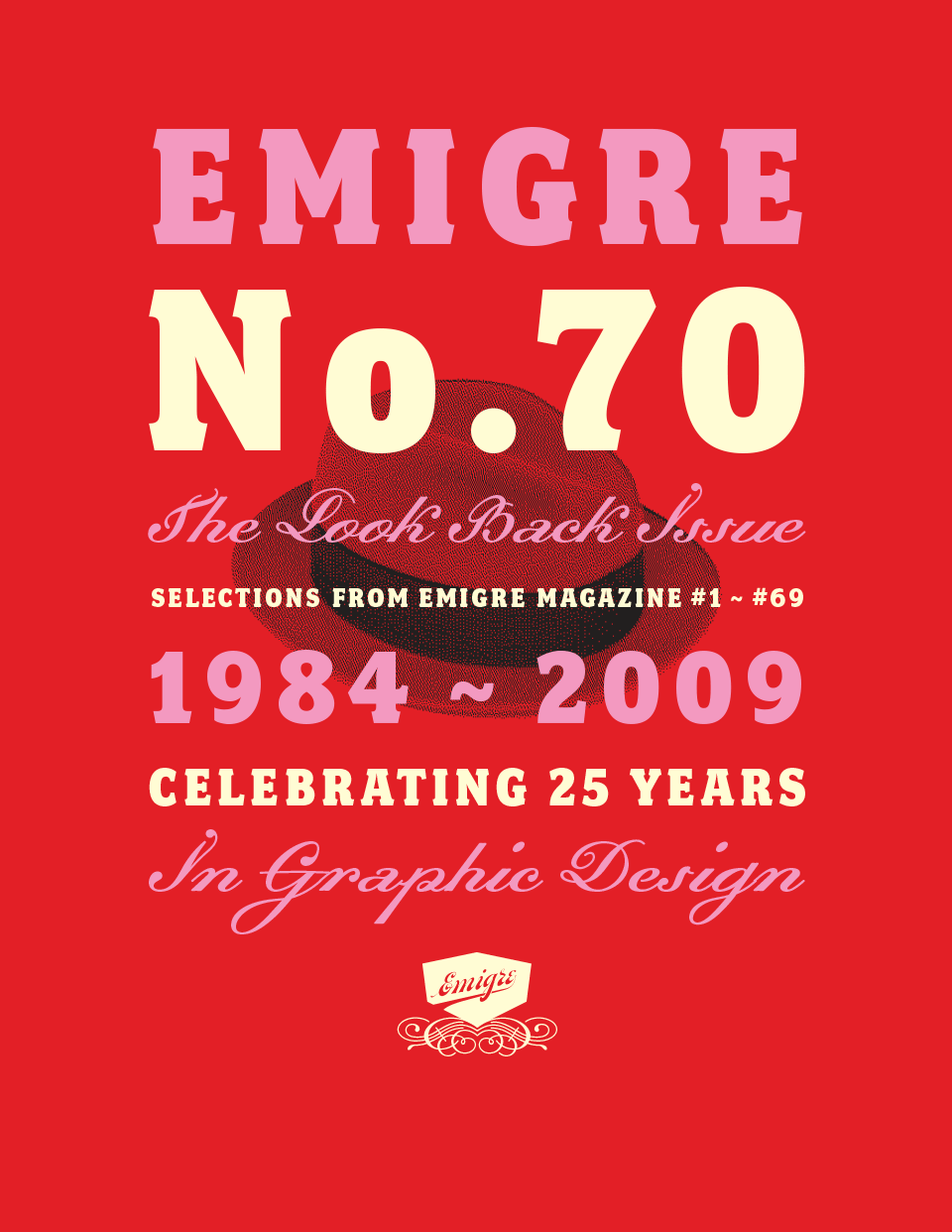
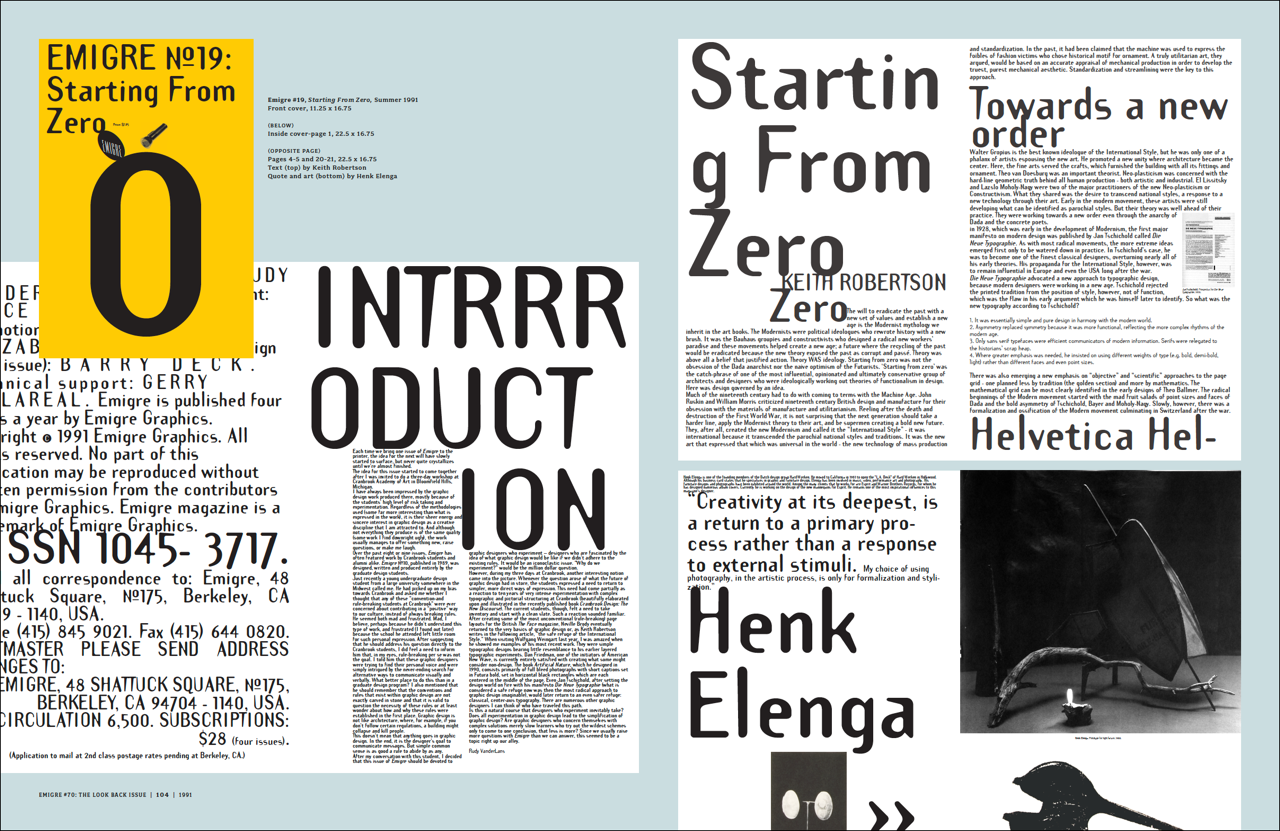
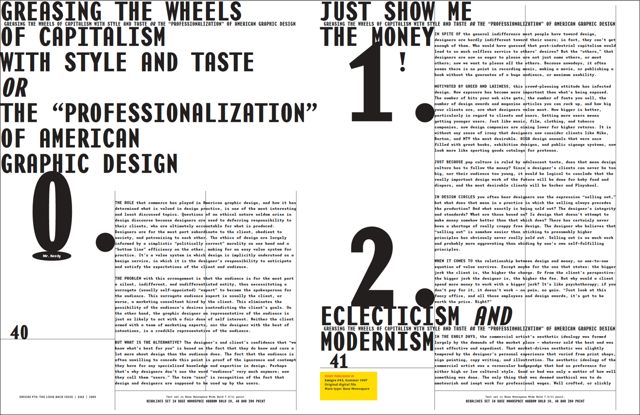
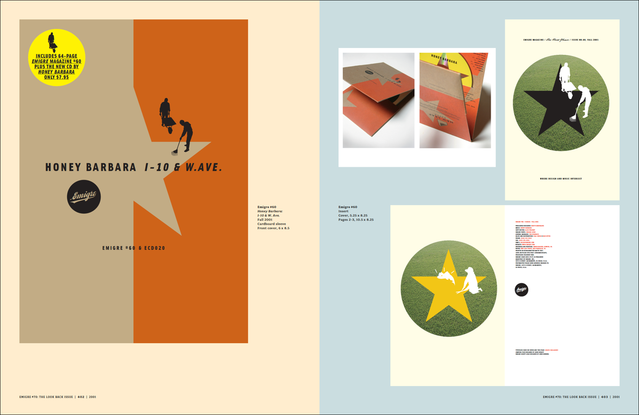
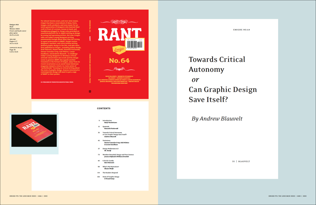
Emigre No. 70: Ready for Download
February 27, 2025
Now available in PDF format, this book covers the typographic experiments and discourse that epitomize the graphic design scene of the 1980s and 90s. If you missed out on the printed version, which sold out a few years ago, now is your chance to catch up. All 512 pages, plus a 32-page digest containing the Letters to the Editor section, are ready for immediate download.
During the late 1980s and throughout the 1990s, graphic design was experiencing one of its most exciting and transformative periods. The Apple Macintosh computer had been introduced, design schools were exploring postmodernism, the vernacular had become a serious source of study and inspiration, the design and manufacture of typefaces was suddenly opened up to everyone with a desktop computer, and for the first time in the United States, New York City was no longer the place to look for the latest developments in graphic design. And in Berkeley, California, across the bay from Silicon Valley, Emigre magazine, like no other, recognized the significance of the events, and became both a leading participant and a keen observer of this innovative international design scene, generating a body of work and ideas that still resonate today.
This PDF version of the original book, designed and edited by Emigre co-founder and designer Rudy VanderLans in 2009, is a selection of reprints tracing Emigre's development from its early bitmap design days in the late 1980s through to the experimental layouts that defined the so called "Legibility Wars" of the late 1990s, to the critical design writing of the early 2000s.
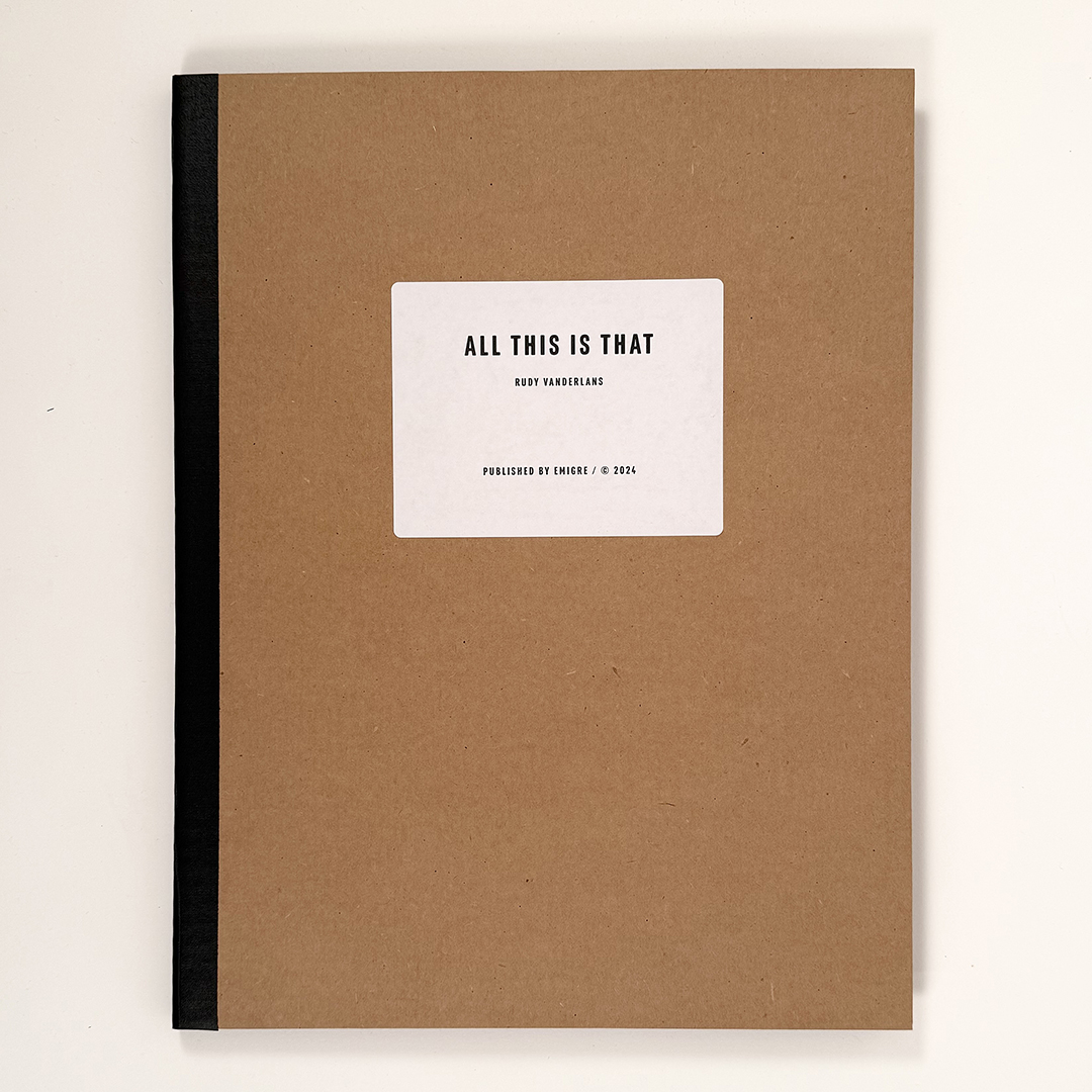
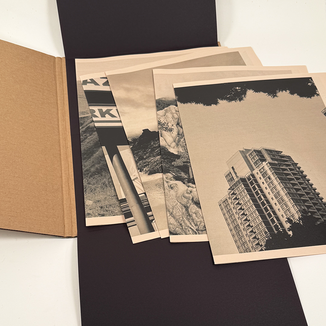
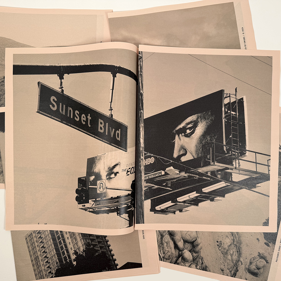
All This is That
February 11, 2025
All This is That, by Rudy VanderLans, bundles five newspaper editions into a single portfolio for a total of 30 photographs of various locations in California. These folded and collated sheets can be enjoyed sequentially and can be rearranged creating surprising juxtapositions or, when pulled apart as stand-alone posters, can be framed or pinned on your wall.
5 separate newspaper sections, 12 pages each, 11.5 x 14.5 inches. Printed on 45 gms salmon-colored newsprint. Hand-assembled portfolio made of corrugated cardboard.
Available only through Emigre.
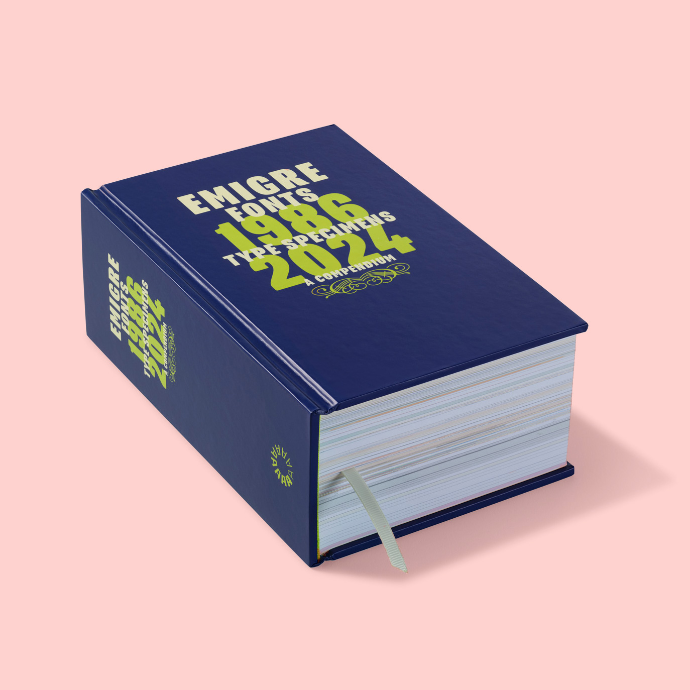
Type Specimens, 1986-2024 Restocked
January 28, 2025
After quickly selling through their limited copies for 2024 delivery, our publisher Letterform Archive is now fully stocked! You can place your order for this book online, or pick up a copy at your local bookstore.
This reissue of our first volume (published in 2016) nearly doubles its already impressive extent to 1,264 pages, containing reprints of 40 type specimens and spanning 38 years. Besides displaying the virtues of the fonts and revealing the processes used to design them, these specimens go beyond their primary function as sales tools and can be enjoyed as much for the typefaces as for their esoteric content. If your collection of Emigre’s popular type specimens is incomplete, or if you’ve missed out on these entirely, here's your opportunity to catch up.
We also added new texts by Letterform Archive associate curator Stephen Coles and longtime Emigre collaborator Jeffery Keedy. In addition to specimens not included in the first volume, Licko and VanderLans revisited their type design process files to create a special behind-the-scenes section, offering readers a look at their photos, sketches, and hand-written correspondence.
100% of Emigre’s proceeds from this book will be donated to Letterform Archive. Help us support Letterform Archive by becoming a member, and receive 10% off the book’s cover price of $75.
Hardcover, 1,264 pages, 5.25 × 8.25 inches, 4 colors throughout and 2 spot colors on the case. Designed and edited by Rudy VanderLans.
Available from Letterform Archive.
Emigre Fonts: Type Specimens, 1986-2024
November 26, 2024
We are happy to partner with San Francisco-based Letterform Archive on a reissue of our first volume of type specimens, an ample tome first published in 2016. But this time, we nearly doubled its already impressive extent to more than 1,200 pages containing 40 type specimens and spanning 38 years. We also added new texts by Letterform Archive associate curator Stephen Coles and longtime Emigre collaborator Jeffery Keedy. In addition to specimens not included in the first volume, we also revisited our type design process files to create a special behind-the-scenes section, offering readers a look at photos, sketches, and hand-written correspondence.
Hardcover, 1,264 pages, 5.25 × 8.25 inches, 4 colors throughout and 2 spot colors on the case. Designed and edited by Rudy VanderLans.
Available from Letterform Archive
Digital Font Sketches
July 30, 2024
When Emigre donated its comprehensive archive to Letterform Archive in San Francisco in 2016, one of the issues that came up was how to best preserve Zuzana Licko’s type design process. This was a challenge, because during her career as a type designer, Zuzana rarely made sketches for her fonts. Within the world of type design this is unusual as most designers conceptualize and jot down ideas usually using pencil and paper. That doesn’t mean her typeface designs arrived out of the blue fully formed. Growing up with the computer all her exploratory work was done almost exclusively on the computer.
She explains: "This was a natural outcome from the technology, which started with bitmap type in 1984. Creating letter shapes with the bitmap font editing program, on the new 128k Mac, was much faster than sketching bitmaps on grid paper. It provided live preview while trying out various pixel configurations of a letter, as well as simultaneously viewing letter combinations in a line of sample text.
Then, as the font technology advanced into outline format, the first preview tools were quite crude, so it remained easier for me to work on screen and run printouts only as confirmation of form, which is the reverse of the skecth/scan/import/trace method preferred by many typeface designers.
Because of this workflow, my printouts served as a way of visualizing details, recording the work progress, marking the changes to be made, and for proofing body copy texture in texts of various sizes.
So, the very first ideas, or alternate forms, often existed only in digital format, and I saved these in the background layer of the font editing program, which at the time was Fontographer. There was only one background layer available then. So, for clarity, and to avoid the distraction of too many outlines in the background, I would periodically delete some of this work. Regrettably, none of this material survived the most recent transfer of my master font files, which was necessary to bring the fonts to the current font making technology. I was able to save my old Fontographer files, but they became increasingly difficult to access as the operating system advanced.”
Now, thanks to the expertise and ingenuity of fellow type designer and font developer Frank Grießhammer, many of these early background layers have been reconstituted, and preserved in PDF format. Using a variety of tools, including DrawBot, Frank figured out how to distill and convert these surviving outlines, recreate the drawing plane environment, and export elegant PDF files. The only detail missing is the coarse screen display, which was much more pixelated in the old Fontographer preview than the infinitely smooth outlines in these PDF files.
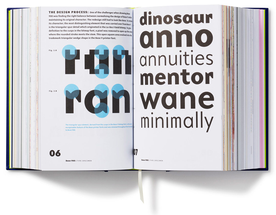
Get a peek behind the scenes of the early stages of iconic digital typefaces such as Mrs Eaves, Filosofia, Matrix, Base 900 and others. Click on any of the font names in the column on the left and download hundreds of digital font sketches resurrected from Zuzana Licko’s early computer files.
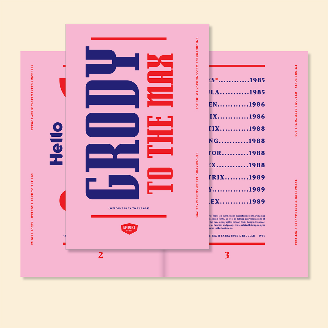
Grody to the Max
February 27, 2024
Welcome to our latest type specimen catalog, where digital type design meets the cultural zeitgeist of the 1980s. In this catalog we invite you on a journey through a collection of iconic Emigre typefaces produced between 1985 and 1989. Screens were tiny, processing speed was slow, memory was limited, and screen resolution was coarse. But we used these restrictions as inspiration to create typefaces that evoked the raw energy and creativity of a generation unafraid to break boundaries and challenge conventions.
The 1980s was a decade marked by dynamic cultural shifts, from the rise of underground subcultures to the explosion of street art and music scenes. As you explore the pages of this catalog, you'll encounter a rich tapestry of Emigre fonts paired with iconic slang phrases from the 1980s capturing the essence of an era that continues to inspire and influence contemporary design and culture.
You can download a free PDF version of the Grody to the Max type specimen from the Emigre website.
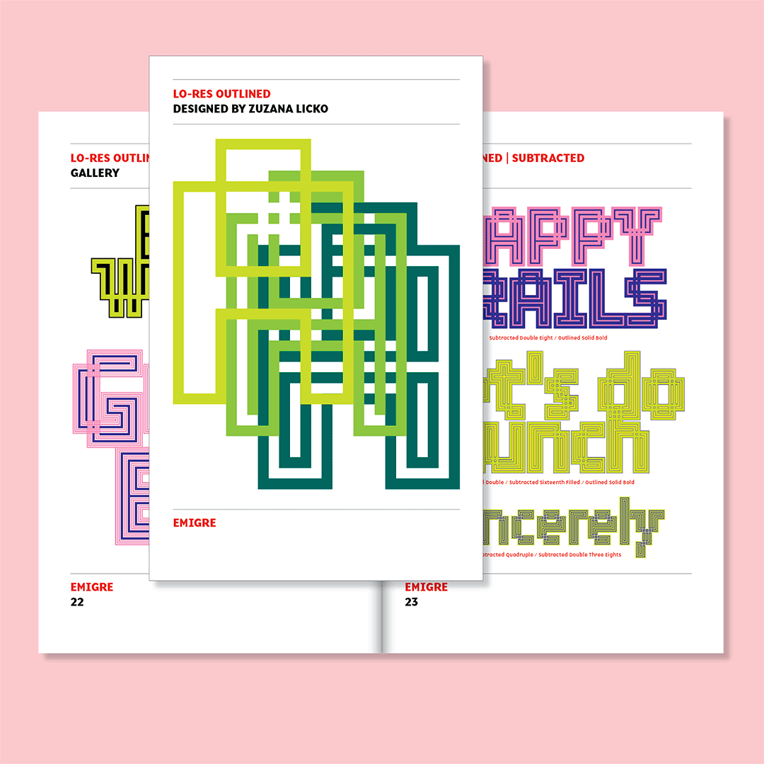
Lo-Res Outlined
September 19, 2023
The idea behind this series of fantasy bitmaps began simply enough. Starting with the structure of Lo-Res Nine, a typeface that goes back to the very start of Zuzana Licko's type design career in 1984, she applied a series of outlines of varying weights and styles in order to transcend the impermeability of the solid square bitmap. This experiment created armatures with properties and characteristics of their own, appearing solid, perforated, or overlapping.
Starting out with a thin outline, equal in weight to one sixteenth of the pixel, the outline was then doubled in weight in subsequent permutations, until reaching half of the pixel size. The outlining measurement lends the style name to each font permutation.
Applying a similar logic, but with multiple outlines of equal weight, the next iteration started with a double outline, which made each line equal to one quarter of the pixel size. Then, doubling the number of outlines with each permutation, Quadruple was made from four outlines of one eight of the pixel size, and Octuple from eight outlines of one sixteenth of the pixel size.
By reimagining the outlined variants as woven structures, and by removing pixels to create the illusion of overlapping, the effect of weaving was conjured. This effect was applied to a selection of the Outlined fonts.
Since all variants are build on the same grid with the same internal structure, these letters can be overlayed to fill and complement each other in multiple combinations and variations.
You can download a free PDF version of the Lo-Res Outlined type specimen from the Emigre website.
5 days left: Zuzana Licko at Gallery 16
July 18, 2023
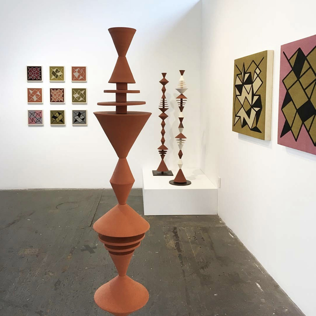
There are just 5 days left to catch Zuzana Licko’s exhibit at Gallery 16.
Following is an excerpt of her gallery talk on June 24th, about the interplay of fonts, ceramics, and weavings that inspired the work:
“People often ask me about my ceramic cone sculptures, and how they relate to my work with fonts. I approached the sculptures as I would a typeface. Which is to create a system of elements that can be combined and repeated in various configurations. With an alphabetic font, these combinations create words, but if the elements are abstract, they can form patterns.
The process starts with setting up rules, because defining limits creates guidance to the thought process. As you implement those rules, you soon realize if they need to be adjusted and expanded. For this reason, I like to start with very simple rules, so I began with a single straight line, drawn at specific angles.
The next step was to translate these ideas into ceramic form. Working on a potter's wheel, as it spins around, a diagonal line turns into a cone. And a horizontal line turns into a disk. I arrived at 3 cone shapes: small, medium and large. The angle on the medium one is 45 degrees, so the height is half the width. The small one is the same height, but narrower. And the large one is the same width, but taller.
When I made the ceramic pieces, I intuitively exaggerated the size differences, so the measurements are not exact to my plans. But I did want the shapes to repeat exactly, so I made molds. I made slump molds that I fill with clay slabs, and compress on the wheel, similar to jiggering, but done manually.
These elements are stacked onto a metal stand, with a central pole, so it’s like stringing beads. I added small ceramic spacers between the disks, which allows them to float. This creates voids that imply shapes, and I love that these spaces allow you to look through the form, to see it's depth.
As I played with arranging the ceramic pieces on the stands, I risked damaging them with the repeated handling. So I went back to the computer to visualize their arrangement. For this, I created a font, so each element could be typed as a letter, then repeated and edited as a line of text. Since typing happens in a horizontal line, the cone shapes are turned 90 degrees in the font, so they are stacked horizontally.
When Gallery 16 invited me to show alongside Rex Ray, I created 3 new sculptures to accompany his vibrant collages. I added pops of color and some fluid shapes. These shapes are wheel thrown, and are essentially deconstructed flower vases. These vase shapes embrace the flower elements in the collages.
Also, making the font for the sculptures gave me the idea for a system of connected lines. Each element is square, so it works with any other element, in both horizontal and vertical directions, unlike the cones font. And the basic rule is, each element has a diagonal line at each corner, making it connect to any other element in the font. (This font is named Crackly, and you can test drive it here.) I was amazed at the patterns that emerged. I was seeing all sorts of perspectives, with shifting planes, and I wanted to capture these as wall artworks. Weaving is perfectly suited for these constructions. The lines convert well to bitmaps, and weavings are essentially physical bitmaps.
Once I determine the size of a weaving, I prepare a bitmap image file and send it to a special weaver in North Carolina, that has computer driven looms, called jacquard looms. Through their software, each pixel in my bitmap file sends a specific set of instructions to the loom. A range of colors can be created by interweaving just 4 colors of yarn, similar to the blending of colors that happens in 4 color printing, or the 3 led colors on a computer screen. This blending is a “trick if the eye” which happens in our human perception.
I love how these weavings relate to my early bitmap font work, which initiated my journey into typefaces in the first place.”
Gallery 16
501 3rd St, San Francisco
June 2 - July 22, 2023
Contact Gallery 16 for pricing.
Zuzana Licko and Rex Ray at Gallery 16
May 25, 2023
Gallery 16 presents an exhibition of two Bay Area pioneers who worked in both the design and fine art fields.
This exhibition
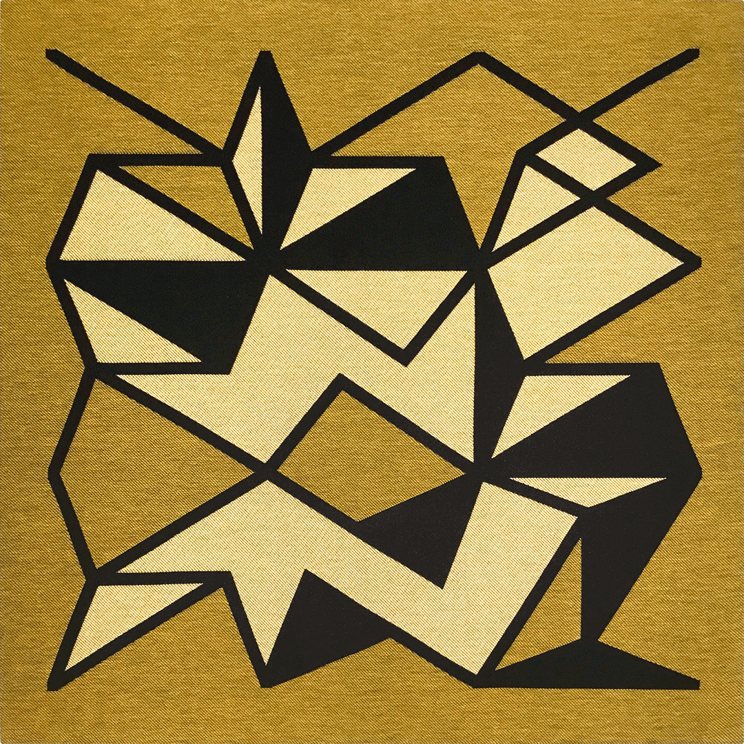
features Zuzana Licko's ceramic sculptures and weavings alongside works spanning twenty years of Rex Ray's prolific career.Drawing on her experience as a typeface designer and graphic artist, Licko has long been exploring the relationships of abstract forms, and developing them into structural systems which she has applied in both her ceramics and weavings.
Her journey into ceramics began as a counterbalance to her digital design work. "I've always enjoyed creating ceramic objects, and I need this to balance out the ephemeral nature of digital work. I find that my current work on modular ceramic sculptures and textiles is actually an extension of type design. I'm using font software to create sketches for my ceramic sculptures, which consist of repeating elements. Each sculpture has a variety of shapes that can be combined to make different sculptures. The font software helps me go through the possible variations. The elements for the textile designs are also created as fonts, which I configure into various patterns. Perhaps my focusing on a physical medium is a reaction against everything being consumed digitally these days."
Based on the digital pattern fonts she created for Emigre, the geometric compositions featured in her weavings play with repetition in unpredictable ways, creating imaginary perspectives and optical illusions that welcome interpretation. Licko’s jacquard textiles are woven by a computer driven loom. She creates the master image file as a coarse resolution bitmap, specifying the particular thread configuration for each bit with color coding. These weavings are essentially bitmaps, built from thread, which echoes her early digital bitmap font work.
Rex Ray, like Licko and many who toil before a computer screen, began to covet the analog in the mid 90s. Fatigued with the digital and feeling a sense of rebellion against his design success, Ray created an outpouring of artwork using the simplest of tools: scissors and glue. His complex canvases and collages were a reaction to the hours spent on his computer. "As my graphic design business grew, my clients got bigger and the money they offered rose in direct proportion to the decline in creativity they required. The collage was my rebellion against that. I began by turning off the computers, unplugging the phones, sitting down and making collage. I'd do them to silence that internal critic we all have — the inner voice that judges, raves, and berates us. I wanted to get back to that magic of making something out of nothing."
Gallery 16
501 3rd St, San Francisco
Opening reception: June 2nd, 6-9pm
Exhibition: June 2 - July 22, 2023
Image: Zuzana Licko, Intersecting Figure #32, 30 x 30 inches, jacquard woven fabric on wood panel.
Inquire for preview price list.
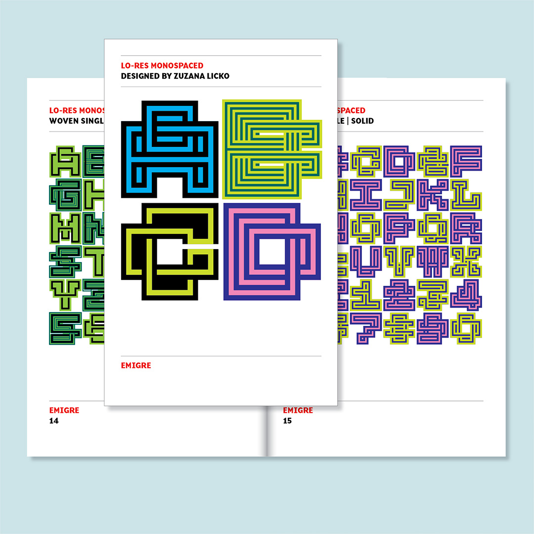
Lo-Res Monospaced
March 29, 2023
Designing a typeface is a process of staying on the straight and narrow. Each glyph in the alphabet wants to be unique, yet needs to fit in a larger system of hundreds of glyphs with similar characteristics in order to make a comprehensive font. However, the process of drawing, redrawing, editing and searching for solutions easily leads one to stray. Ideas for glyphs are sometimes stretched to a point where they no longer fit the original scheme, but may show potential for an entirely new direction. Most of these distractions lead to dead ends, but others, on rare occasions, can turn into ideas for new fonts.
Lo-Res Monospaced is such a typeface. While working on a much larger family of fonts named Lo-Res Outlined, which are years in the making, Zuzana Licko stumbled upon the idea of making a mono spaced version. The idea was so energizing, she decided to shift focus and finish it before returning to her original designs. The result is close-knit family of six modular fonts.
This mono spaced design takes its playfulness into the world of patterns with its abstracted, woven letterforms. The characters fill up an M-square entirely, thereby allowing the letters, when set without line spacing, to create dense patterns filling a square grid. It should be obvious that this design is intentionally sacrificing legibility for being highly expressive. And we expect that users will apply the font accordingly.
Lo-Res Monospaced was an idea born from happenstance, and from being receptive to the alternatives that present themselves during the design process. In the accompanying type specimen we show you examples of how to combine and layer the six versions of this typeface. You might enjoy the creative challenge to further define its utility and expand upon its possibilities.
You can download a free PDF version of the Lo-Res Monospaced type specimen from the Emigre website at:
https://www.emigre.com/TypeSpecimens/LoResMonospaced
And you can purchase a printed version for $3.00 ($10 International), or receive one for free with any font purchase from the Emigre website.
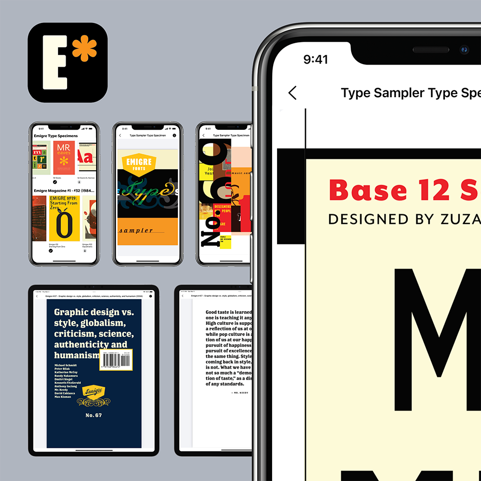
Emigre Fonts App
Check out the Emigre Fonts App. View and read all pages of the entire collection of Emigre Fonts type specimens, and all issues of Emigre magazine, in this easy-to-use app made for graphic designers and type aficionados alike. Download for free from the Apple Store.
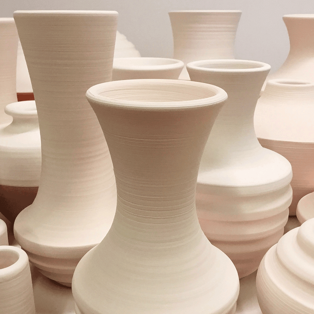
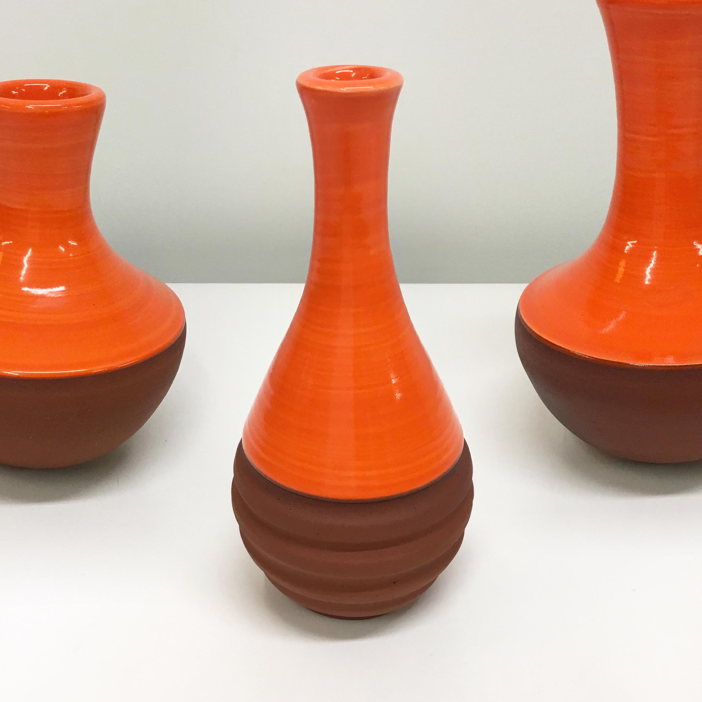
New Ceramic Vases by Zuzana Licko
December 1, 2022
This collection of bisque-fired ceramic vases are awaiting Zuzana Licko’s custom-made glazes. Visit the Emigre website and see how they turned out.
A few times a year, Licko produces small sets of hand-thrown ceramic vases. With their bright red, orange and green glazes, or muted black and white tones on various shades of stoneware, these simple yet elegant vases will fit any decor. You can fill them with flowers, or simply display them as they are.
While best known for her elegant and innovative type design, which is generated entirely on the computer, Licko has been working in ceramics to balance the screen-based aspects of typeface design. And while the two practices may seem worlds apart, Licko sees a natural connection between the two. "Both deal with the duality of inside and outside form," she says, “and both require resolving transitions of curves. When throwing a piece on the potter’s wheel, the conceptualization of the shape can be reduced to a single line of curve transitions, which represents one half of the symmetrical cross section. These curve transitions and balance of form have much in common with constructing curves in letter forms."
Check out this new collection at Emigre Decor: https://www.emigre.com/Decor
Emigre Fonts App
Check out the Emigre Fonts App. View and read all pages of the entire collection of Emigre Fonts type specimens, and all issues of Emigre magazine, in this easy-to-use app made for graphic designers and type aficionados alike. Download for free from the Apple Store.
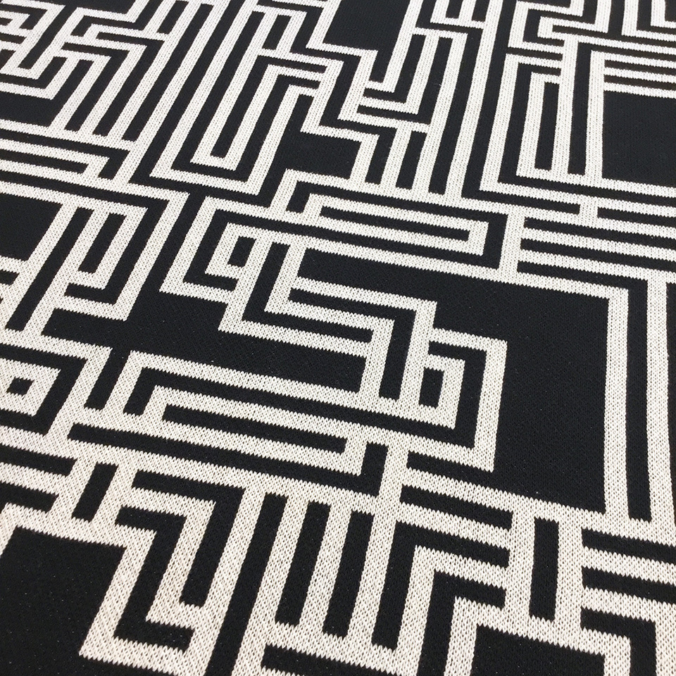
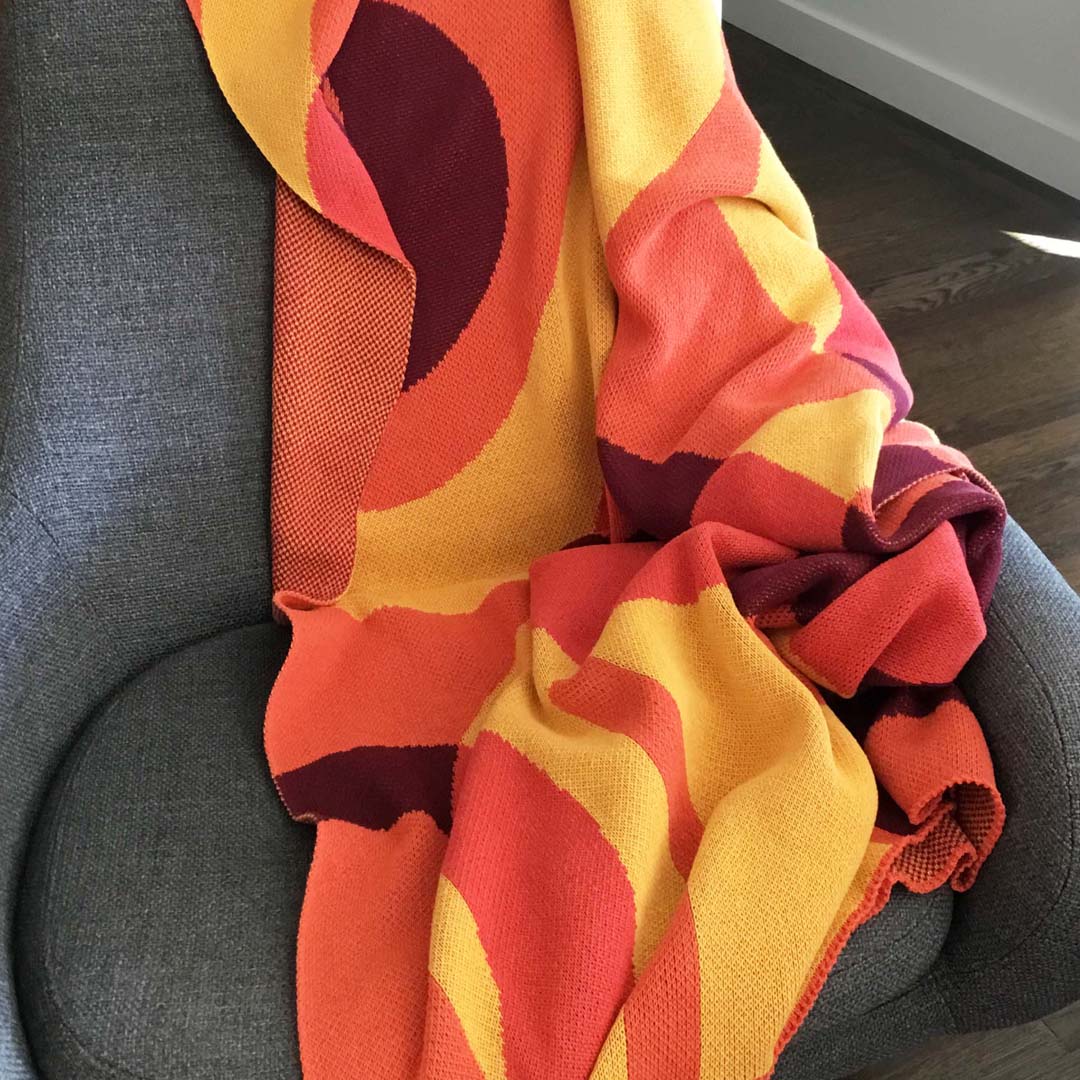
Alphabet Throw Blanket
October 25, 2022
The Emigre shop has added a brand new item to spruce up your decor and keep you warm at the same time.
This super comfy and stylish knitted throw blanket features a woven bitmap design based on an upcoming font by Zuzana Licko. The letters A to Z are composed from lines and outlines that intertwine. The black and white linear design appears on the front, with a stippled herringbone pattern on back.
50 x 50 inches. Manufactured in the USA. 50% recycled cotton and 50% recycled poly blend.
Check out this blanket, plus throw pillows and ceramics, at Emigre decor: https://www.emigre.com/Decor
Emigre Fonts App
Check out the Emigre Fonts App. View and read all pages of the entire collection of Emigre Fonts type specimens, and all issues of Emigre magazine, in this easy-to-use app made for graphic designers and type aficionados alike. Download for free from the Apple Store.
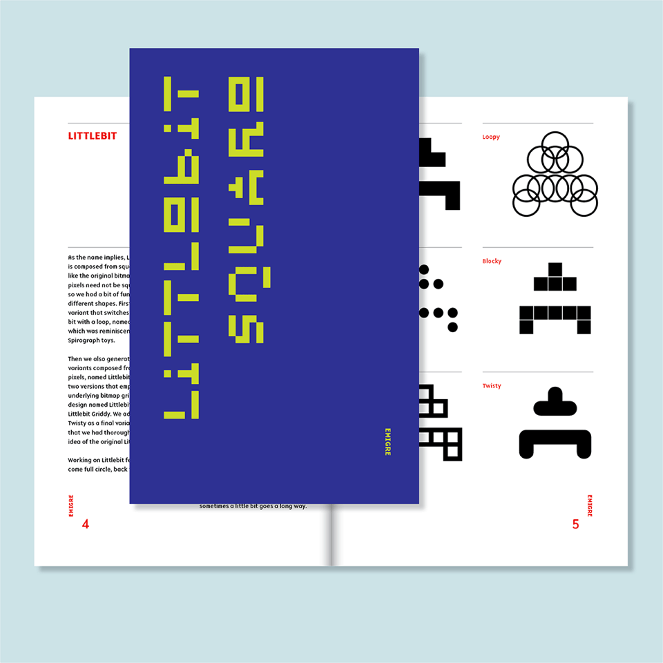
Littlebit
September 6, 2022
Sometimes we come across work that we created way in the past and it brings a smile to our faces. Littlebit is a typeface that was originally created by Rudy VanderLans in 1985, although it wasn’t called Littlebit back then. Actually it didn’t have a name, because it didn’t exist as an actual font. It was created as a series of letters using MacPaint, one of the first drawing programs that came standard with the Apple Mac 128K. To set words, VanderLans would simply “cut and paste” the letters together in MacPaint.
Those letters were first used in Emigre #3 (1985) and Emigre #4 (1986) to create a headline that read “Boundaries Ignored.” Then we never used it again. We’re not sure why. Probably it was pushed aside or forgotten by an onslaught of new type designs we were working on in those days.
So after 37 years we removed the cobwebs, blew off the dust, took a close look at it, and realized it would be worthwhile to complete the character set and turn it into a usable typeface. Of course, since we are designers, who can’t leave well enough alone, we made a few changes, mostly to the proportions and to some of the character shapes, and then also added 19 variations based on the same basic model.
Working on Littlebit felt like we’ve come full circle, back to where we started when we were using bitmaps as our building blocks to make letters. And while the tools to produce fonts are now extremely sophisticated, allowing for unlimited formal expression, it’s still creatively satisfying, sometimes, to set restrictions and reduce choice to generate simplified yet readable letter forms.
You can download a free PDF version of the 32-page Littlebit type specimen from the Emigre website. https://www.emigre.com/TypeSpecimens/Littlebit
And if you're on the Emigre mailing list, you'll receive a printed version within the next month or so. https://www.emigre.com/TypeSpecimens
Emigre Fonts App
Check out the Emigre Fonts App. View and read all pages of the entire collection of Emigre Fonts type specimens, and all issues of Emigre magazine, in this easy-to-use app made for graphic designers and type aficionados alike. Download for free from the Apple Store.
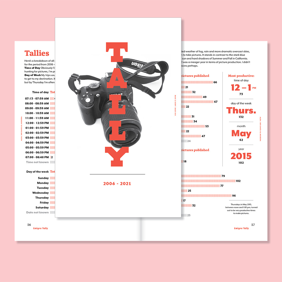
Tally
April 5, 2022
Tally is another Emigre Fonts type specimen in disguise. This one presents the indexing data derived from the hundreds of pictures of California published by Rudy VanderLans between 2006 and 2021.
VanderLans had a lot of spare time on his hands these last two years since he didn’t travel nor socialize much. So he decided to take inventory of his California photographs. It should be obvious by now that he loves taking pictures of California. This started innocently enough, but has grown into a full-blown obsession with the ultimate goal to cover the entire Golden State. The effort so far has resulted in 479 pictures published in three books and an ongoing series of small magazines. To measure where he’s currently at in his impossible pursuit, VanderLans compiled as much data about these pictures as he could assemble, and displayed the info in this engaging typographic catalog using a wide selection of typefaces from the Emigre Fonts library.
You can download a free PDF version from the Emigre website.
https://www.emigre.com/TypeSpecimens/Tally
And if you're on the Emigre mailing list, you'll receive a printed version within the next month or so.
https://www.emigre.com/TypeSpecimens
Bonus: Emigre fonts are available as part of your Adobe Creative Cloud subscription. https://fonts.adobe.com/foundries/emigre
Emigre Fonts App
Check out the brand new Emigre Fonts App. View and read all pages of the entire collection of Emigre Fonts type specimens, and all issues of Emigre magazine, in this easy-to-use app made for graphic designers and type aficionados alike. Download for free from the Apple Store.
Emigre Fonts App
March 21, 2022
View and read all pages of the entire collection of Emigre Fonts type specimens, and all issues of Emigre magazine, in this easy-to-use app made for graphic designers and type aficionados alike. Download for free from the Apple Store.
- Browse all Emigre type specimens and magazines published since 1984.
- See how Emigre ignited the digital revolution in type design.
- Zoom in on every typographic detail.
- Peruse every Emigre magazine essay and interview in their original layouts.
- Read up on the dialogues that circulated around graphic design in the 1990s.
- View the layouts that made Emigre both revered and reviled.
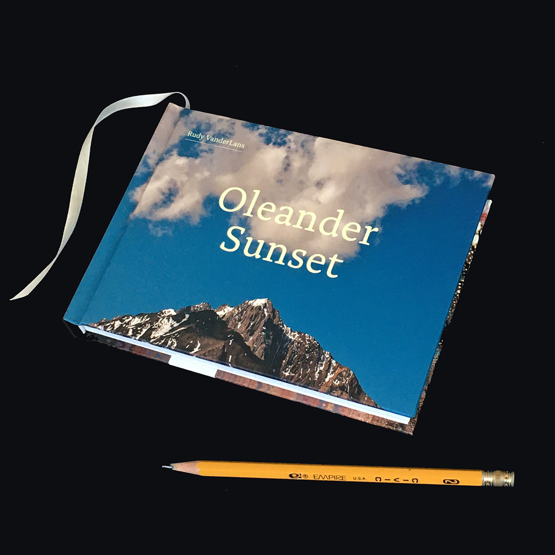
Oleander Sunset
August 10, 2021
Inspired by artists like Edward Curtis and Charles Schulz, who devoted their lives to a single objective, Rudy VanderLans continues his pursuit to create a consistent body of work of postcard-size images, rendering a comprehensive portrait of California in the early part of the 21st century.
VanderLans, who is often drawn to places with fantastical names — like Oleander Sunset — wanders about California’s back roads with eyes wide open. Without theorizing, or searching for subjects, he allows himself to be receptive to the world around him and discovers beauty in the most ordinary locales. Like the men who named the cities and towns he visits, VanderLans makes the mundane seem less so, and in the process shows us what’s been overlooked.
Oleander Sunset juxtaposes single images on opposing pages, setting up dynamic formal and contextual interactions through contrasting, complementing and reiteration. The book is interspersed with a number of fold-out panoramas, placing the viewer smack in the middle of the author’s habitual stamping ground.
Available from your local bookstore, or through gingkopress.com
Order a copy directly from Emigre before August 31st, and we’ll send along a free copy of the Joshua Tree book, plus a few other surprises.
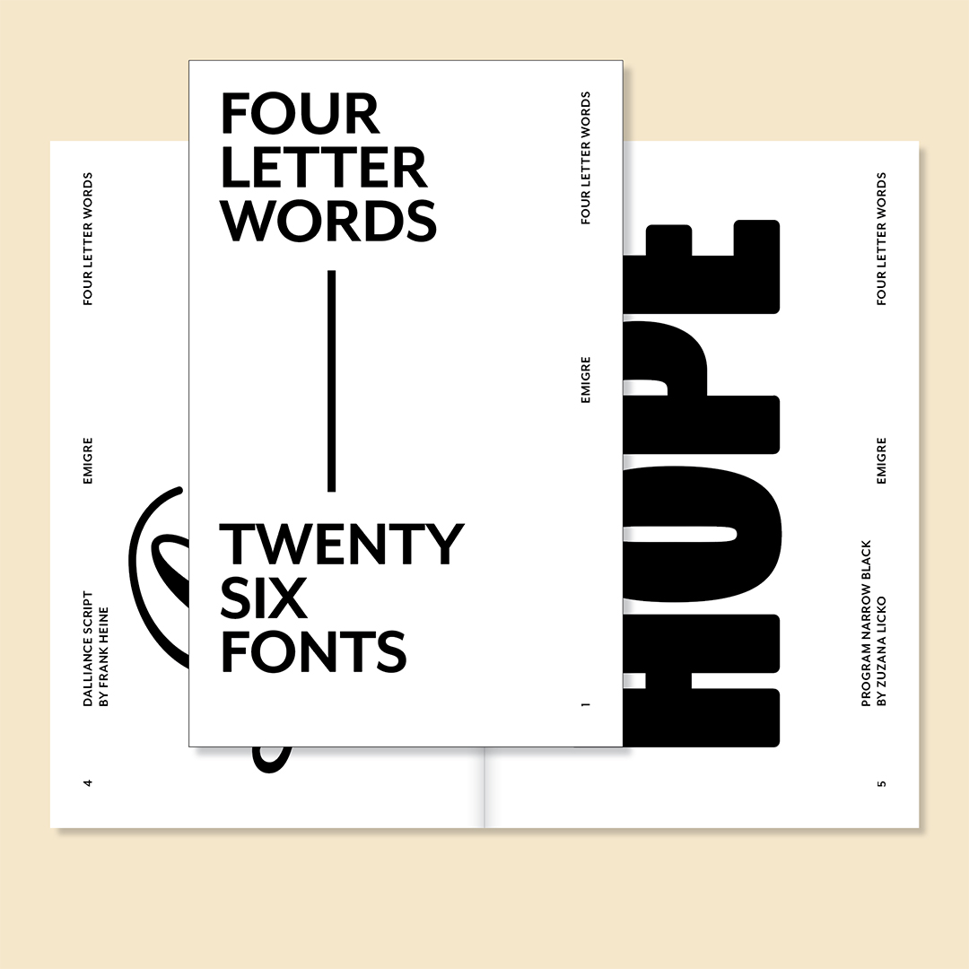
Four Letter Words
February 23, 2021
"Make it bigger" is an often heard client suggestion that can drive graphic designers mad. But sometimes things actually do look better when big. We picked twenty-six fonts from the Emigre Library that we think look really good when used at a large size and gave them ample real estate to display their distinguishing details.
Designed by Rudy VanderLans, this thirty-two-page type specimen features typefaces by Mr. Keedy, Jonathan Barnbrook, Zuzana Licko, Elliott Earls, Sibylle Hagmann and many others. Each typeface is used to spell out a four letter word suitable for print.
You can download a free PDF version from the Emigre website.
https://www.emigre.com/TypeSpecimens/FourLetterWords
And if you're on the Emigre mailing list, you’ll receive a printed version within the next month or so.
https://www.emigre.com/TypeSpecimens
Bonus: Emigre fonts are available as part of your Adobe Creative Cloud subscription.
https://fonts.adobe.com/foundries/emigre
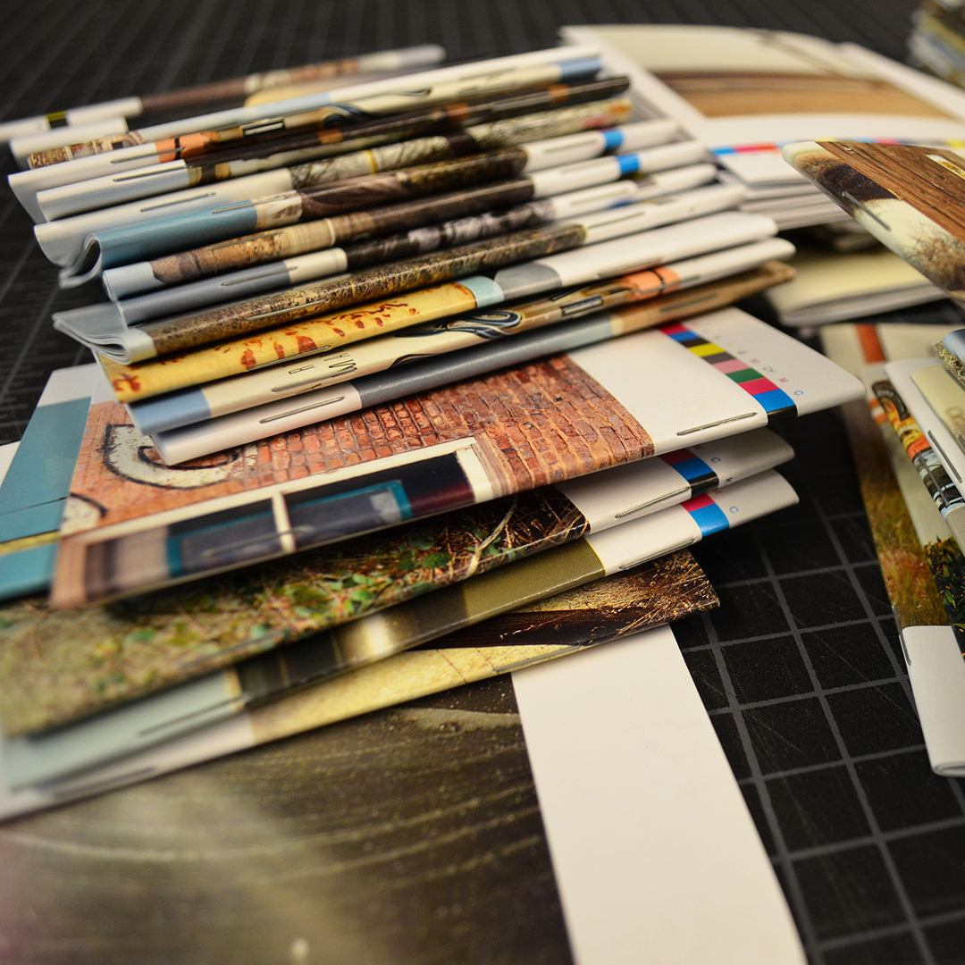
Printed Type Specimens for Sale
September 21, 2020
You can download most of Emigre’s type specimens for free as PDF files. But if you’re like us, and believe that nothing beats print, now is your opportunity to add to your library of printed type specimen catalogs.
For the first time in years we are making our back catalog of printed Emigre font catalogs available for sale. These are vintage type specimens of some of our most popular fonts such as Mrs Eaves, Program, Puzzler, Alda, Cardea and Vista.
Designed by Rudy VanderLans, these catalogs go beyond their primary function as sales tools. By creating specific contexts, the booklets were produced to be enjoyed as much for the design of the typefaces as for the engaging content.
If you missed out on any of these, or want to replace an old copy, now is your chance to enhance your collection. Limited availability.
Days of Discourse Past
August 4, 2020
The final six issues of Emigre magazine, co-published with Princeton Architectural Press from 2003-2005, are now available as free PDF downloads from the Emigre website.
These six pocket-book sized volumes were a final effort by Emigre to highlight and encourage critical writing within graphic design. We believed that design, as a cultural force, was worthy of an evaluative look, so we turned an inquisitive eye on our profession.
All six issues have sold out years ago. We’re now making them available for free to anybody who’d like to revisit or who missed the excitement of the often heated debates that were circulating within graphic design during the early years of the 21st century.
Featuring essays by Mr. Keedy, Kenneth FitzGerald, Lorraine Wild, Andrew Blauvelt, David Cabianca, Rudy VanderLans, Katherine McCoy, David Barringer, Gerard Unger, and interviews with Experimental Jetset, Peter Bilak, Louise Sandhaus, Ian Anderson, and many others.
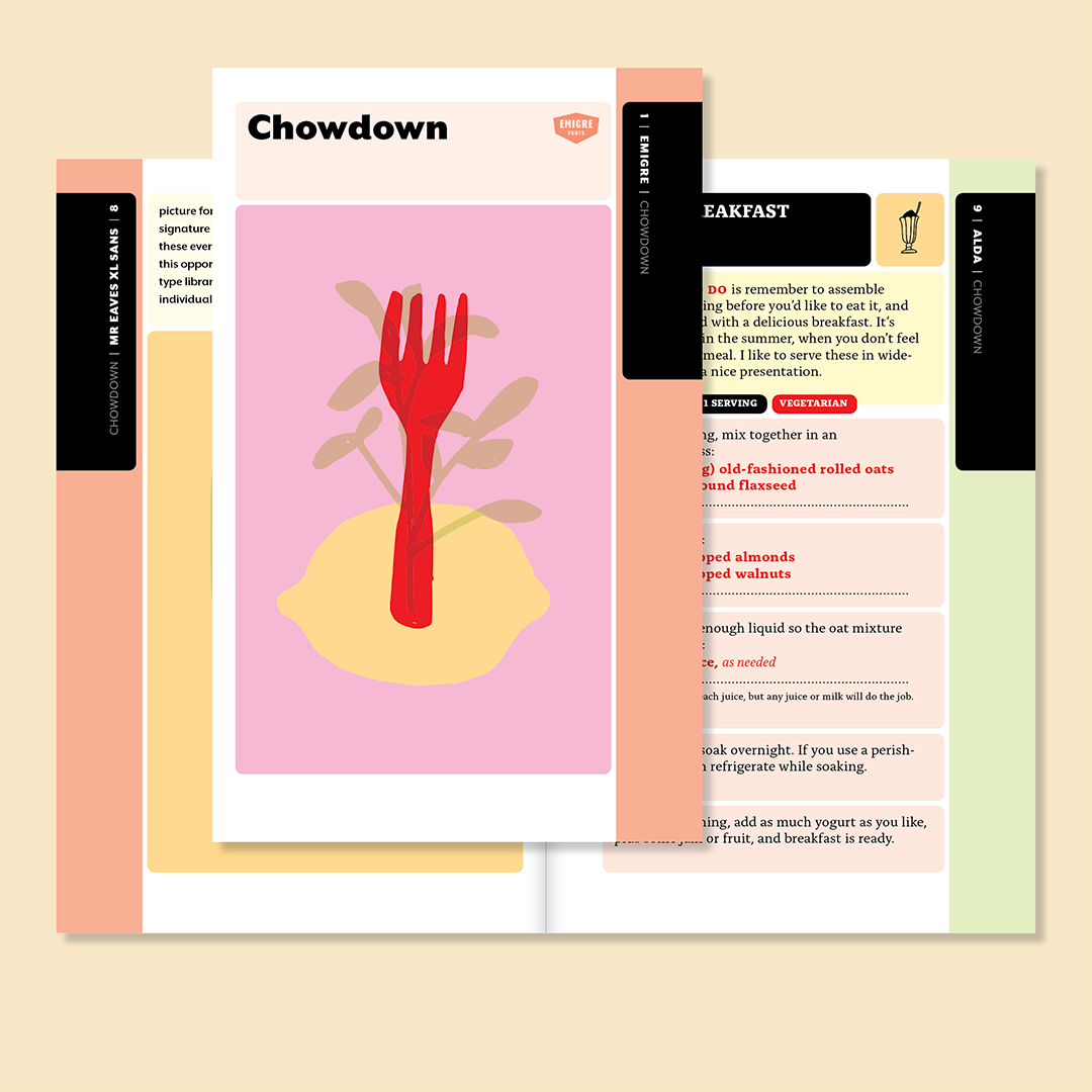
Chowdown
May 26, 2020
The next Emigre Fonts catalog is here! Chowdown, is a type specimen in disguise, featuring 21 recipes cooked-up by Zuzana Licko. Compiled from a loose collection of scribbled comments on sticky notes and index cards filled with recipes that Licko and her husband Rudy VanderLans have been enjoying over the years, they are now sharing some of their favorites with you in this collection. Each recipe is paired with a delectable font freshly handpicked from the Emigre fonts library.
This scrumptious 64-pager was edited by Maria Zizka, author of The Newlywed Table cookbook, and garnished with a brand new picture font named Chowdown by Bay Area artist Tucker Nichols.
You can download a free PDF version of the Chowdown cookbooklet from the Emigre website.
https://www.emigre.com/Fonts/Chowdown
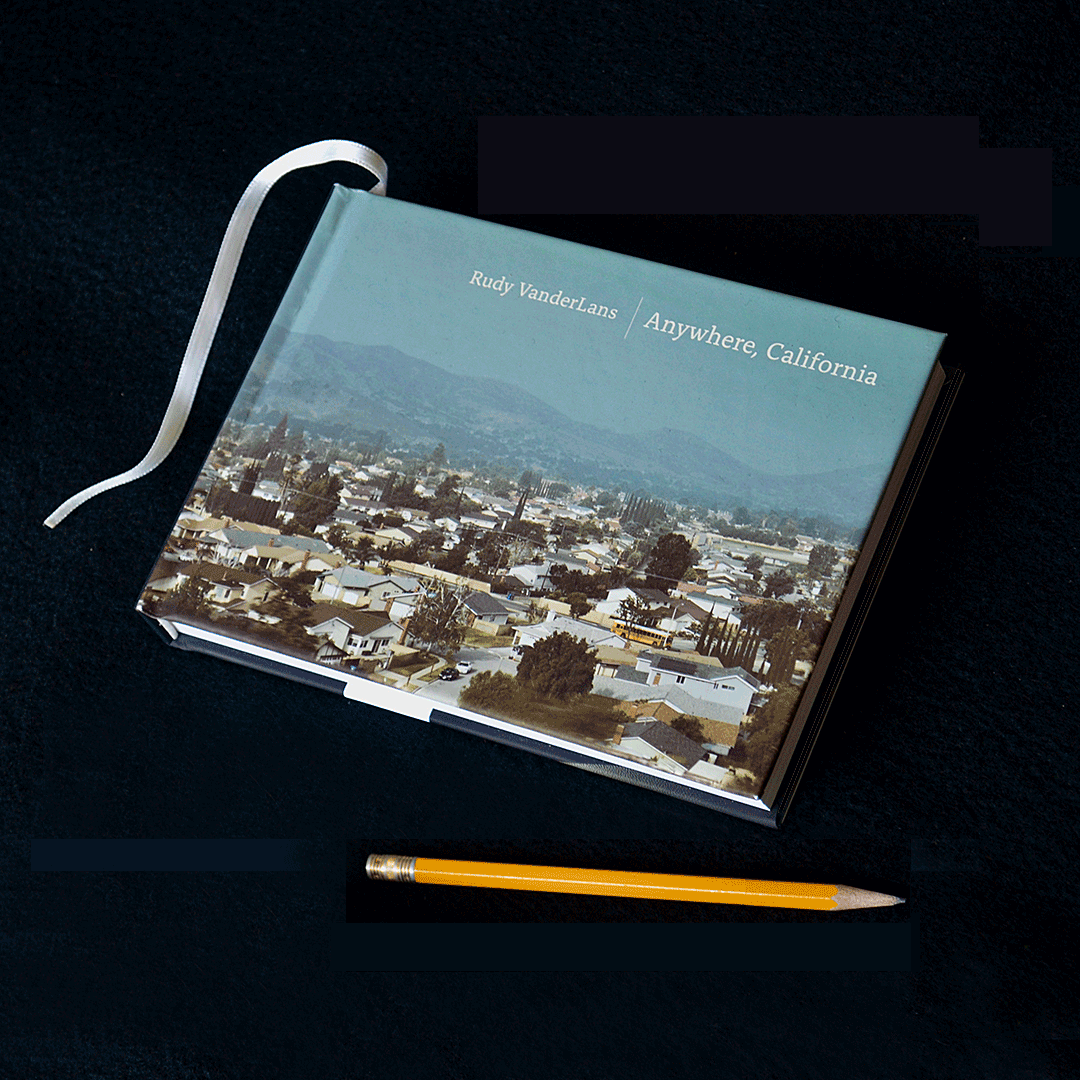
Anywhere, California
May 12, 2020
“Anywhere, California” is another close look by Rudy VanderLans into the cultural landscape of his favorite subject, the Golden State. Whether it’s the garage where Apple started in Los Altos, or the former location where the Manson Family lived in Chatsworth, or an anonymous abandoned storefront in Calexico, VanderLans finds beauty in the unlikeliest of locations. Yet he rarely divulges the why or what of his photographs. Instead he stresses that things aren’t always what they appear to be, leaving much to the imagination of the reader.
Stylistically diverse, and meticulously composed, his pictures are as sundry in nature as California itself. Presented in unencumbered page layouts, with well-considered sequencing, this publication is another testament to VanderLans’ dual mastery of design and photography. It continues his preference for the book format as his primary vehicle to exhibit his photography, making this limited first edition another instant collectible.
Available from your local bookstore, or through gingkopress.com and emigre.com.

Emigre at the Online Archive
April 21, 2020
The much anticipated online version of the San Francisco-based Letterform Archive is now public! Enjoy unprecedented virtual access to nearly 1,500 objects and 9,000 hi-fi images (and counting!) from their collection, free of charge. For all the students and designers taking shelter at home, we hope this will bring a little inspiration to the world.
Besides some of design's most iconic artifacts, this treasure trove includes the full run of all 69 issues of Emigre magazine, to be accessed, read and explored, from cover to cover, in super high resolution. With extensive cataloguing data accompanying each entry, this is the ultimate source for researchers, educators and graphic design aficionados alike.
Please go and explore this wonderful archive! We know this is a trying time for many people, but if you’re able to support the Letterform Archive and the work they’re doing, consider doing so by making a gift to their new home or a one-time donation of an amount of your choosing, ensuring that their archive will be freely available to everyone forever.

Emigre Fonts on Creative Cloud
January 12, 2020
Did you know? The Emigre Fonts Library (nearly 500 fonts) is available through the Adobe Creative Cloud service! This is a great worry-free solution for most of your desktop and web font needs. And it’s included in your Creative Cloud subscription, at no extra cost to you. You have all the Emigre fonts right at your fingertips, just click the "Activate font" toggle switch and the font is instantly available to all your desktop applications. This simple license to use Emigre fonts is valid for as long as you subscribe to Creative Cloud.
If you prefer to have a perpetual license and/or want to self-host web fonts, you can order directly from Emigre or our resellers. We can also help you with specialty licenses for servers, games and other dynamic content applications, or any other license not covered by the Adobe Fonts license.
If you have licensing questions, email us at sales@emigre.com
Bonus: when you order a font direct from Emigre, we’ll mail you a selection of Emigre’s award winning type specimens.
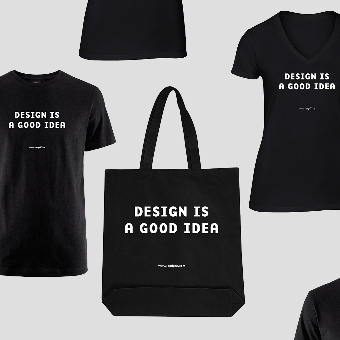
Merch & More
December 3, 2019
Once again, by popular demand, we have brought back the “Design is a Good Idea” T-shirt. This time we also added a canvas Tote Bag and a Notepad with letterpress printed cover. Beware: these items are printed in limited editions.
While you’re visiting our online store, check out our Merch & More section for artist books by Rudy VanderLans, Emigre music releases, and Zuzana Licko’s most recent one-of-a-kind ceramics and pictorial weavings.
Crackly
August 14, 2019
Crackly is a pattern font that follows in the footsteps of Licko’s previous release, Tangly. Instead of curved lines, Crackly is composed from straight lines that intersect at various angles.
The idea for Crackly came from Licko’s ceramic sculptures. She was composing stacked totems from modular cones and disks of various sizes and angles, and to help visualize these shapes in different combinations, she made herself a font so she could type out various sculpture compositions before assembling them.
Recognizing that the font itself had potential, Licko worked on adapting the elements into square proportions that could be rotated and connected. Many of the resulting patterns create illusions of depth with incongruous perspectives, reminiscent of Cubism and M.C. Esher’s work.
As Licko was experimenting with the Crackly patterns, it occurred to her that the compositions would make excellent graphics for coloring, so we decided to make a coloring book disguised as a type specimen. Or vice versa?
What Crackly adds to the coloring book phenomenon, though, is that you can use these pattern fonts to make compositions, print them out on your laser printer, and generate your own coloring pages. We imagine that kids and adults alike can enjoy the experience of getting lost in the moment of experimentation and coloring. Or you can use Crackly for any other pattern applications, such as endpapers or backgrounds. The options are limitless.
You can download a free PDF version of the Emigre Coloring Book from the Emigre website. https://www.emigre.com/Fonts/Crackly
And if you're on the Emigre mailing list, you’ll receive a printed version within the next month or so. https://www.emigre.com/TypeSpecimens
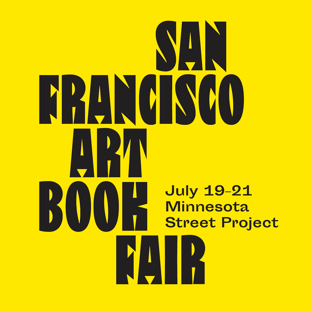
San Francisco Art Book Fair
July 19, 2019
Come check out the Emigre booth at the San Francisco Art Book Fair this weekend. We’ll have a selection of our latest releases and old favorites for sale, including photo books, Emigre magazine back issues, type specimens, music, vintage T-shirts, tote bags, caps, and lots of giveaways.
Emigre, Booth M22, Minnesota Street Project
1275 Minnesota Street, San Francisco
Hours:
Friday, July 19, 6 – 10pm
Saturday, July 20, 11am – 6pm
Sunday, July 21, 11am – 5pm
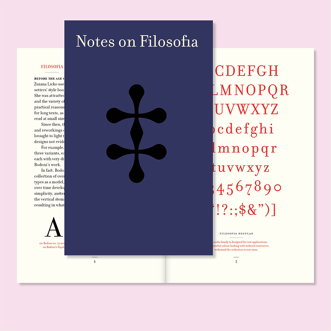
Notes on Filosofia
May 21, 2019
Notes on Filosofia is an overview of the design and general history of one of Emigre’s most popular fonts. Filosofia was designed in 1996 by Zuzana Licko and is based on Bodoni’s cut of Filosofia 3 Siena. Licko designed Filosofia largely from memory. After closely studying a copy of Giambattista Bodoni’s “Manuale Tipografico” (1818) at the Bancroft Library in Berkeley, California, she started her first sketches by drawing directly on the computer using Fontographer. The resulting design shows Licko’s personal preference for a geometric Bodoni, while incorporating such features as the slightly bulging round serif endings which often appeared in printed samples of Bodoni’s work and reflect Bodoni’s origins in letterpress technology. This brand new type specimen, designed by Rudy VanderLans, recalls those early events, as well as other highlights in the life of this wonderful typeface.
You can download a free PDF version from the Emigre website.
https://www.emigre.com/Fonts/Filosofia
And if you're on the Emigre mailing list, you’ll receive a printed version within the next month or so.
https://www.emigre.com/TypeSpecimens
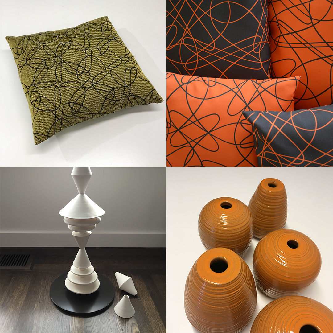
Pillows & Ceramics
December 5, 2018
Cozy up this winter with Tangly pillows and handmade ceramics by Zuzana Licko.
During the design process of Tangly, her most recent pattern font design, Licko experimented by applying these intricate motifs onto different fabrics, including jacquard weaves, to see how these Tangly patterns could be utilized. She then sewed many of these fabric samples into different sized pillows, enjoying the results, which lead to her decision to make them available commercially. Many of her patterns can now be ordered on a variety of fabrics and sewn to order into pillows and other housewares.
A few times a year Licko also produces small sets of hand thrown ceramic vases. With their bright red, orange and green glazes, or muted black and white tones on various shades of stoneware, these simple yet elegant vases will fit any decor.
In addition, Zuzana has recently expanded her ceramic range into producing garden sculptures. Composed from modular handmade pieces, with a nod to mid-century modern, the geometric forms repeat playfully, complementing both plants and architecture. The unglazed stoneware echoes the color palette of terra-cotta planters, and they can be installed both indoor or outdoor.
Throw pillows with Tangly patterns
12" x12" printed and jacquard woven pillows are available at Etsy.
18” x 18" made to order pillows are available at Roostery.
Handmade ceramics
Ceramic Vases at Emigre.
Ceramic Planters and Vases at Etsy.
Garden Cones
Ceramic sculptures, at home indoors and out.
White Garden Cones.
Terra Cotta Garden Cones.
In stores
If you are in the San Francisco bay area, Zuzana’s ceramics are available at:
Abrams Claghorn Gallery: 1251 Solano Avenue, Albany, California
Celery Space: 1714 San Pablo Avenue, Berkeley, California
Follow on Instagram
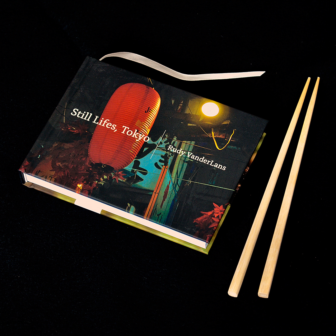
Still Lifes, Tokyo
November 27, 2018
Comprising more than two hundred photos taken over the course of three weeks, the third book in the Still Lifes series leaves the United States for the busy streets of Tokyo, resulting in a volume that is both of a piece with and dramatically different from Still Lifes, California and Still Lifes, USA. The roughly translated advertising blurb for the Tokyo hotel where Rudy VanderLans booked his stay promised “a world of stillness and motion,” and VanderLans used this as his creative prompt. Over the course of his stay, VanderLans walked over a hundred miles, camera in hand, capturing an extensive document of Tokyo’s lived-in details. Just as much care has been taken in the arrangement of the photos, with adjacent images often mirroring one another despite their wildly different subjects. Conspicuously devoid of human figures for such a populous city, these photos capture a Tokyo beneath the surface of the crowd, presenting a version of the city rarely seen in media of any kind.
Available in selected bookstores, or at emigre.com.
Tangly Lines and Tangly Splines
September 18, 2018
With Tangly, designer Zuzana Licko set out to explore how a font could be used for composing patterns that would appear as looping and connecting lines. Each character on the keyboard would be an element, and the elements would connect at specific points, as they would in a connecting script font, except they would connect at all four edges, top and bottom, as well as left and right. She started with one looped line, then rotated that line so the composed element would connect with itself and all other elements. The result is a pair of font families “Tangly Lines” and “Tangly Splines.” Each group has symmetric, mirrored and asymmetric variants.
Licko began the design process in 2014, and returned to it sporadically over the next four years. During this time, she had various types of fabrics printed, and had jacquard fabrics woven to see how these patterns could be applied. Many of her patterns can be ordered as custom printed yardage, on a variety of fabrics, at Spoonflower. And, these fabrics can be sewn to order into pillows and other housewares at Roostery.
These are just a few examples of how Tangly can be used. The number of patterns, combinations and applications is nearly infinite. For more Tangly patterns, download a free Tangly type specimen PDF from the Emigre website which shows additional examples, but still only scratches the surface of what’s possible.
